Building the First Local Store Delivery Experience in Turkey
End-to-End
MVP Design
UX Research
UX-UI Design
In 2021, I led the design of Yemeksepeti Mahalle — Turkey’s first local store delivery experience, connecting users with neighborhood shops for everyday essentials.
My Role
I owned the full design process end-to-end, covering discovery, UX/UI design, prototyping, and validation, while working closely with product, engineering, and operations teams to ensure a smooth launch.
Team
Nagehan C.
(PM)
Sercan A.
(Sr. PM)
Berker E.
(Project M.)
Engineers
(8 People)
Duration
Sep 2021 - Dec 2021
The Problem
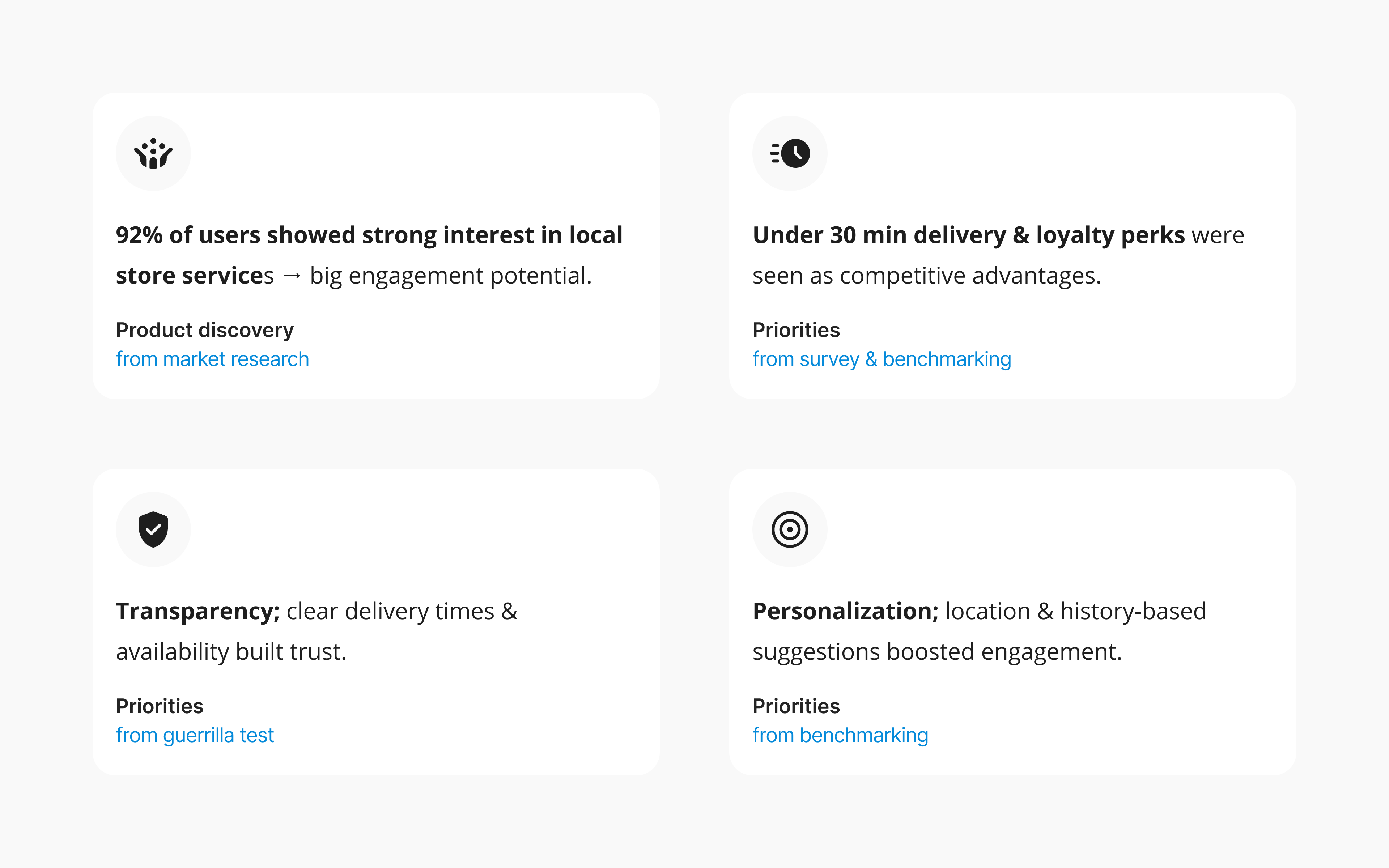
In Turkey, users loved their neighborhood shops, but the digital experience didn’t reflect that. 92% of users across Europe and Asia engaged with local store services, yet in Turkey there was no simple way to reorder trusted products or buy from familiar stores online.
For users, this meant friction and wasted time. For Yemeksepeti, it meant a missed chance to grow in a space people already valued.
The challenge was to design a local store experience that felt personal and intuitive to Turkish users—while still being scalable across other markets.
Impacts
+9.7%
Engagement
Uplift
10K+
Orders in the
First Month
Research & Insights
To design something people would actually use, I needed to ground it in real behavior. I started with user journey mapping to capture how people shopped day-to-day. Then, I ran benchmarking against global players to see what worked elsewhere — and where the gaps were.
Process at a Glance
I treated Mahalle as a full-cycle design project, balancing speed with evidence.
- Discovery: user journeys, benchmarks, and surveys shaped the roadmap.
- Design: wireframes and prototypes translated insights into flows.
- Validation: guerrilla usability tests caught friction before launch.
- Delivery: partnered with PMs and engineers to ship the MVP, then tracked adoption and engagement.
Design Decisions
Given the scope of building an entirely new local-store experience, we knew we couldn’t solve everything at once. To move fast while still learning, we divided the project into phases.
Each phase focused on solving the most pressing user needs first — starting with trust and speed — and layering in more complex flows as we validated the foundation.
Starting with Deals, Realizing Trust Mattered More
Early prototypes emphasized discounts, but research showed users cared most about shopping from familiar local stores.
I shifted the homepage from deals-first to vendor-first, building trust from the start.
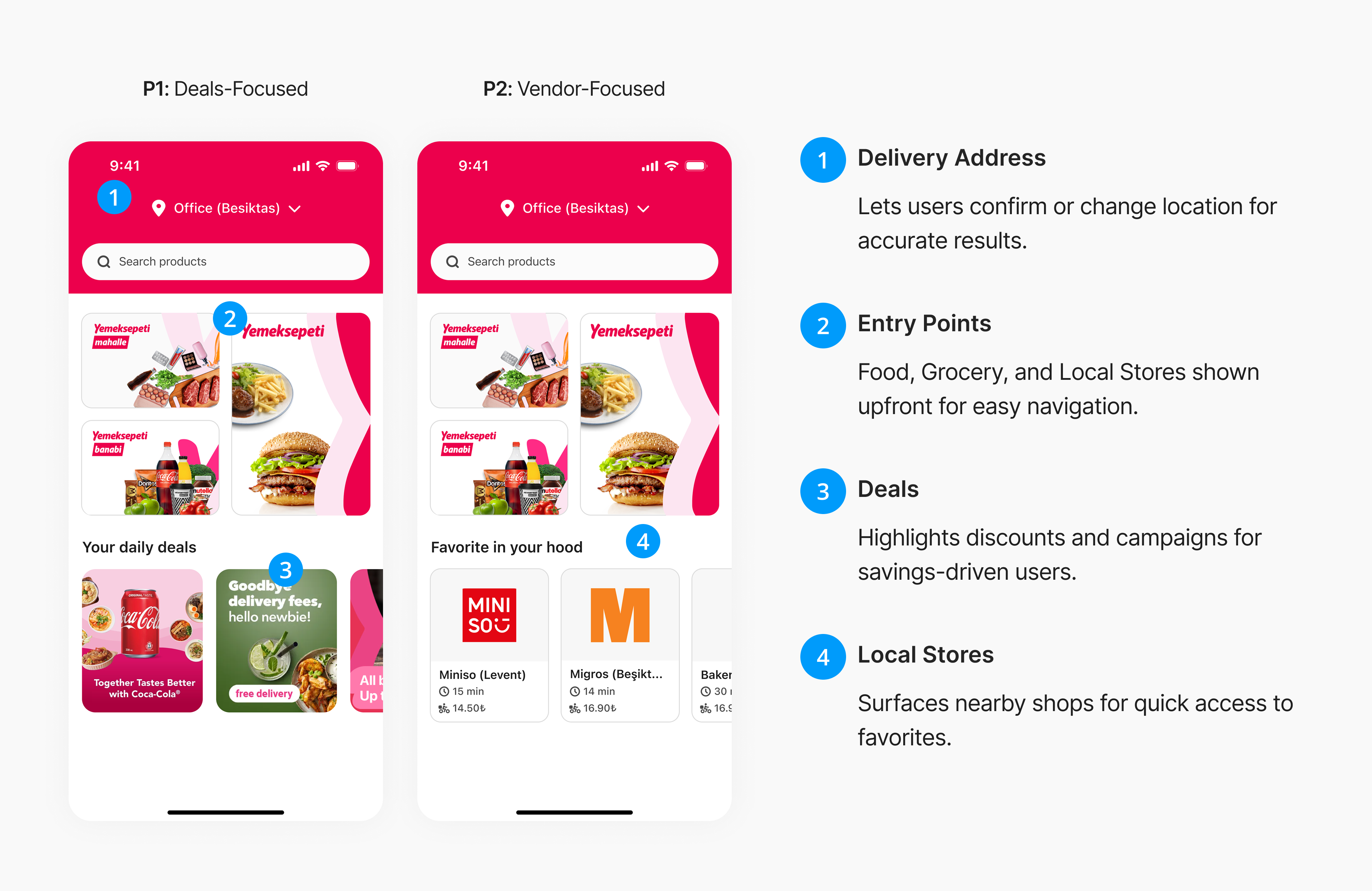
Browsing & Listings: Reducing Friction
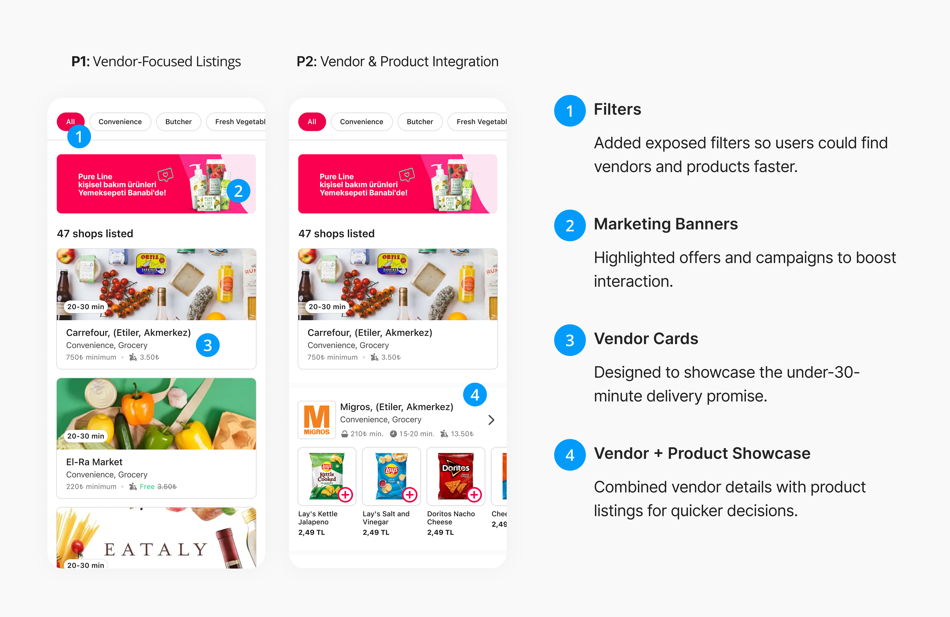
Research showed that long, unfiltered lists frustrated users, creating demand for shortcuts.
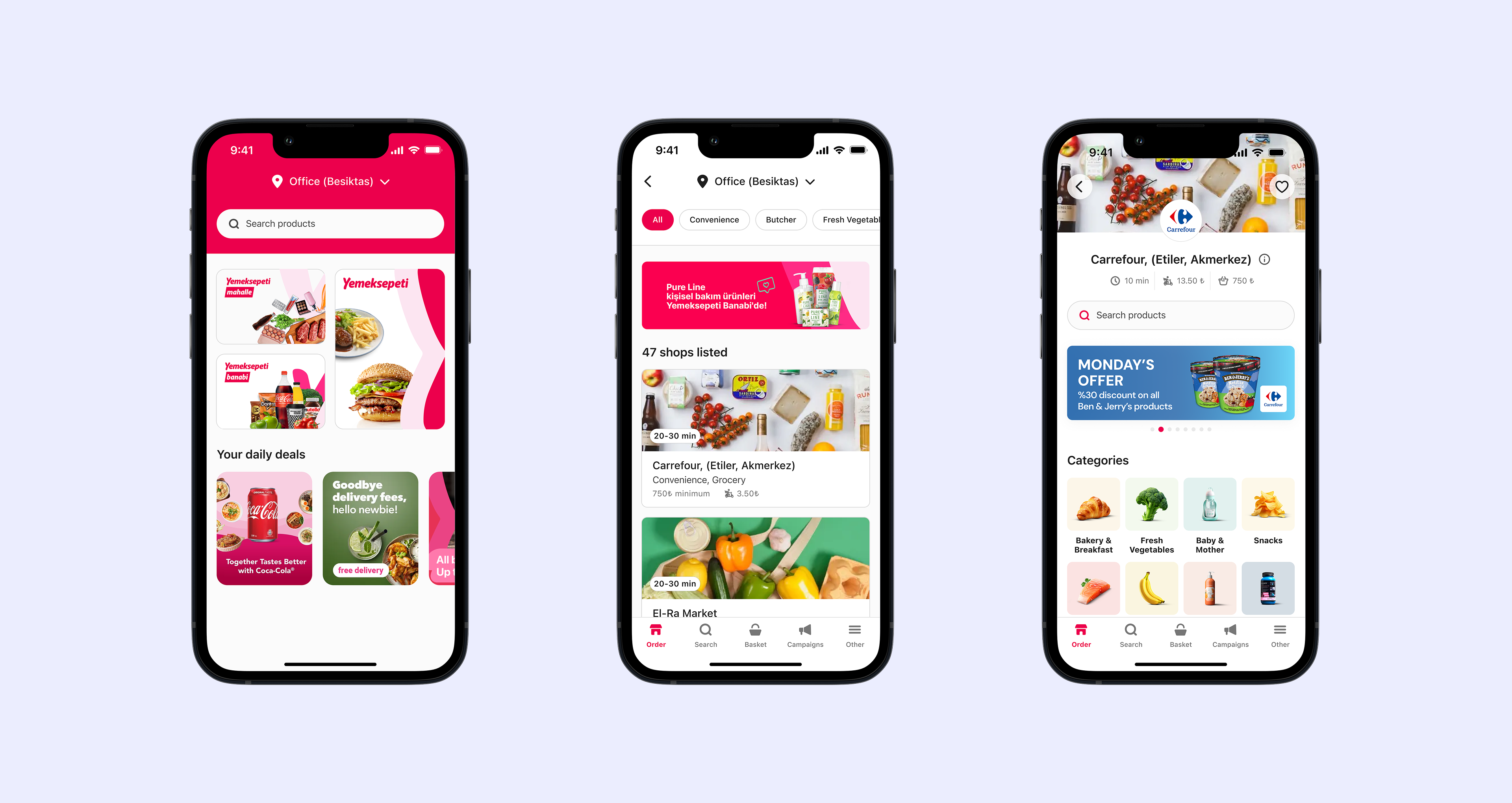
I introduced exposed filters for instant refinement and redesigned vendor cards to highlight under-30-minute delivery promises. Later, I integrated vendors and products in a single view — cutting browsing time dramatically.
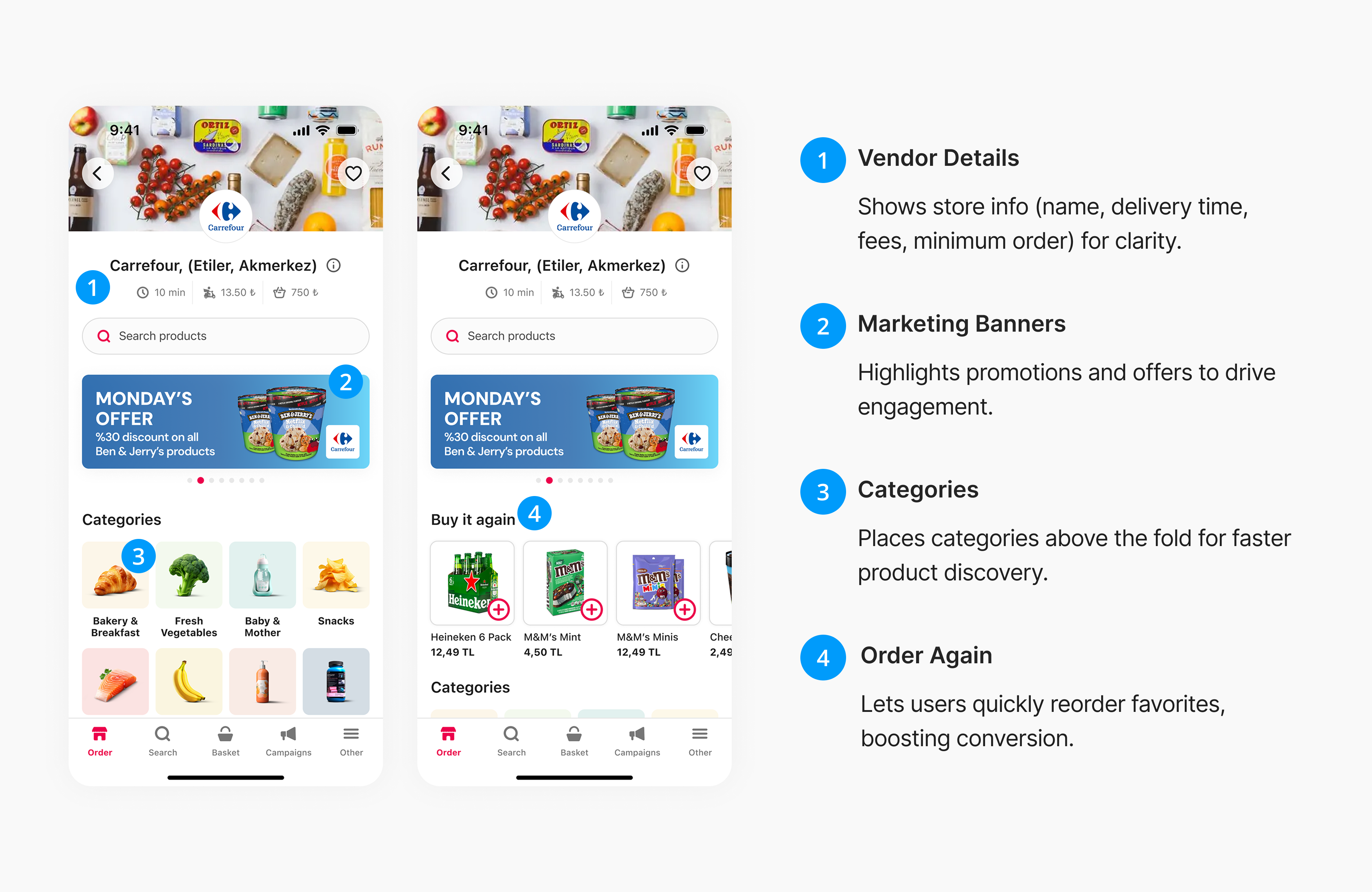
Building Confidence Inside Stores
Once inside a vendor page, users needed reassurance. We brought categories above the fold, added clear fees and delivery times, and introduced Order Again turning trust into repeat engagement.
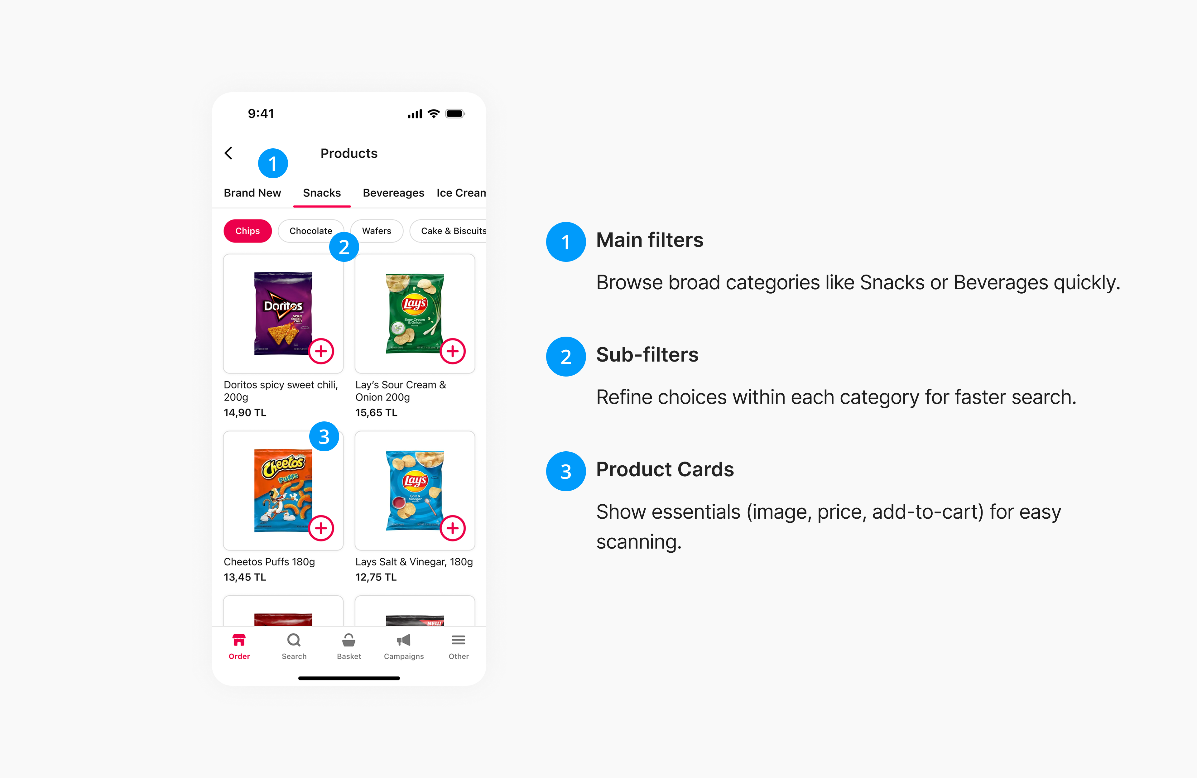
Scaling Product Discovery Without Overwhelm
Big catalogs can confuse users. I designed a two-level filter system (main + subcategories) and simplified product cards so users could scan and add items quickly.
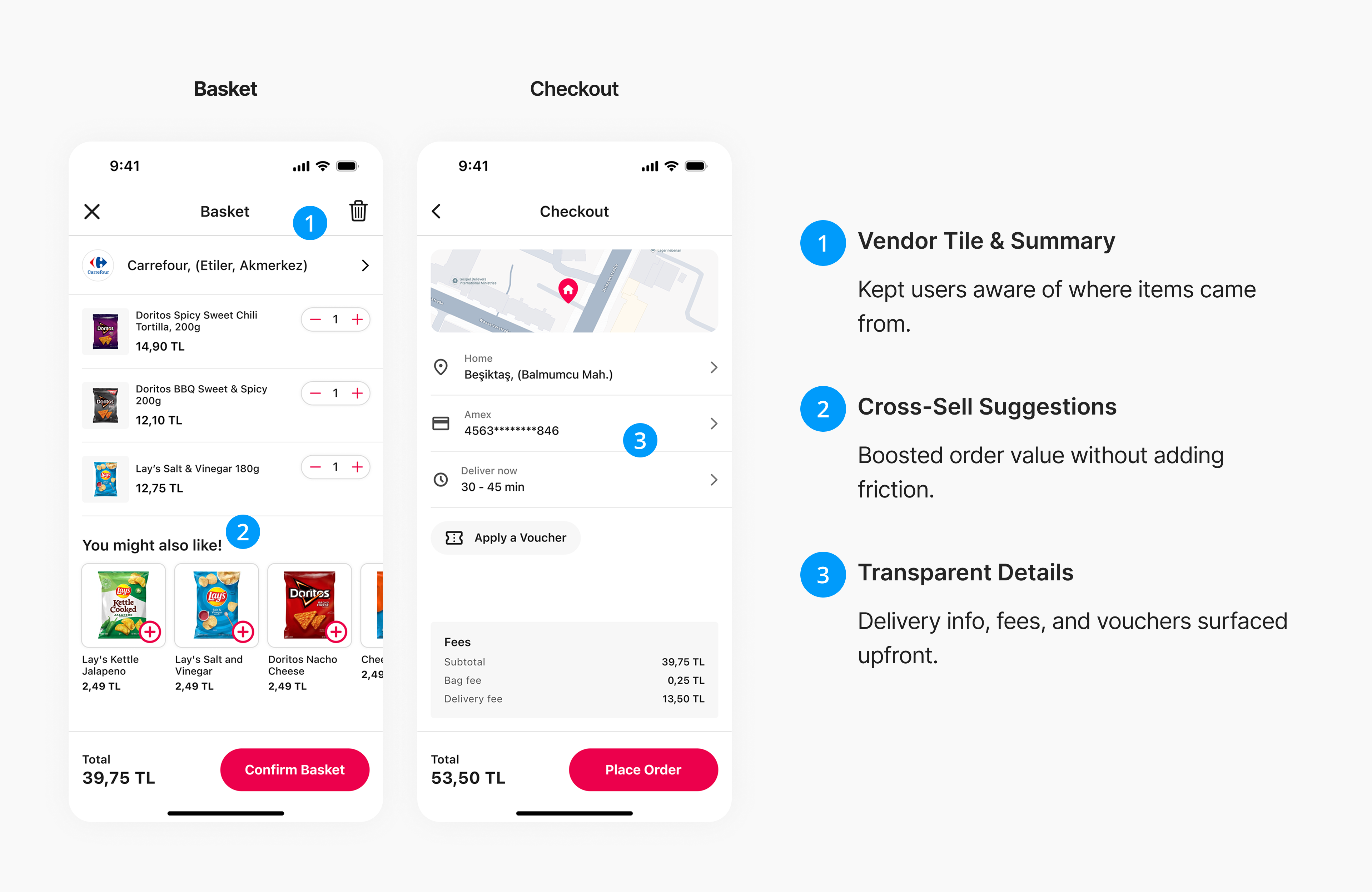
Basket & Checkout
As users moved closer to purchase, small frictions could easily derail the flow. The goal was to make the basket and checkout feel clear, trustworthy, and effortless.
Happy Path
Challenges & Trade-offs
- One tough call: Item replacement logic. Users wanted options if items were out of stock (replace, remove, cancel). I designed the flow, but due to tight MVP timelines, we postponed it. This was a lesson in prioritization under constraints.
- Stakeholder alignment: Promotions vs. trust. Marketing initially pushed for promotions-first layouts, but research showed users trusted familiar shops more than discounts. I presented the evidence and worked with them to integrate promotions without undermining shop-first design.
Learnings
- This project sharpened my ability to balance strategy with hands-on design. I learned to deliver high-quality work under tight timelines, improve communication with cross-functional teams, and manage stakeholders effectively.
- It was also a chance to take end-to-end ownership — from discovery to delivery — while making trade-offs and grounding every decision in insight.
Thank You
Reducing Drop-offs: Discovery Redesign Lifted Conversions by +19.1%
Across three major Delivery Hero brands, I led an end-to-end redesign of the discovery experience.
Expanding a Deposit Return Platform into Everyday Banking
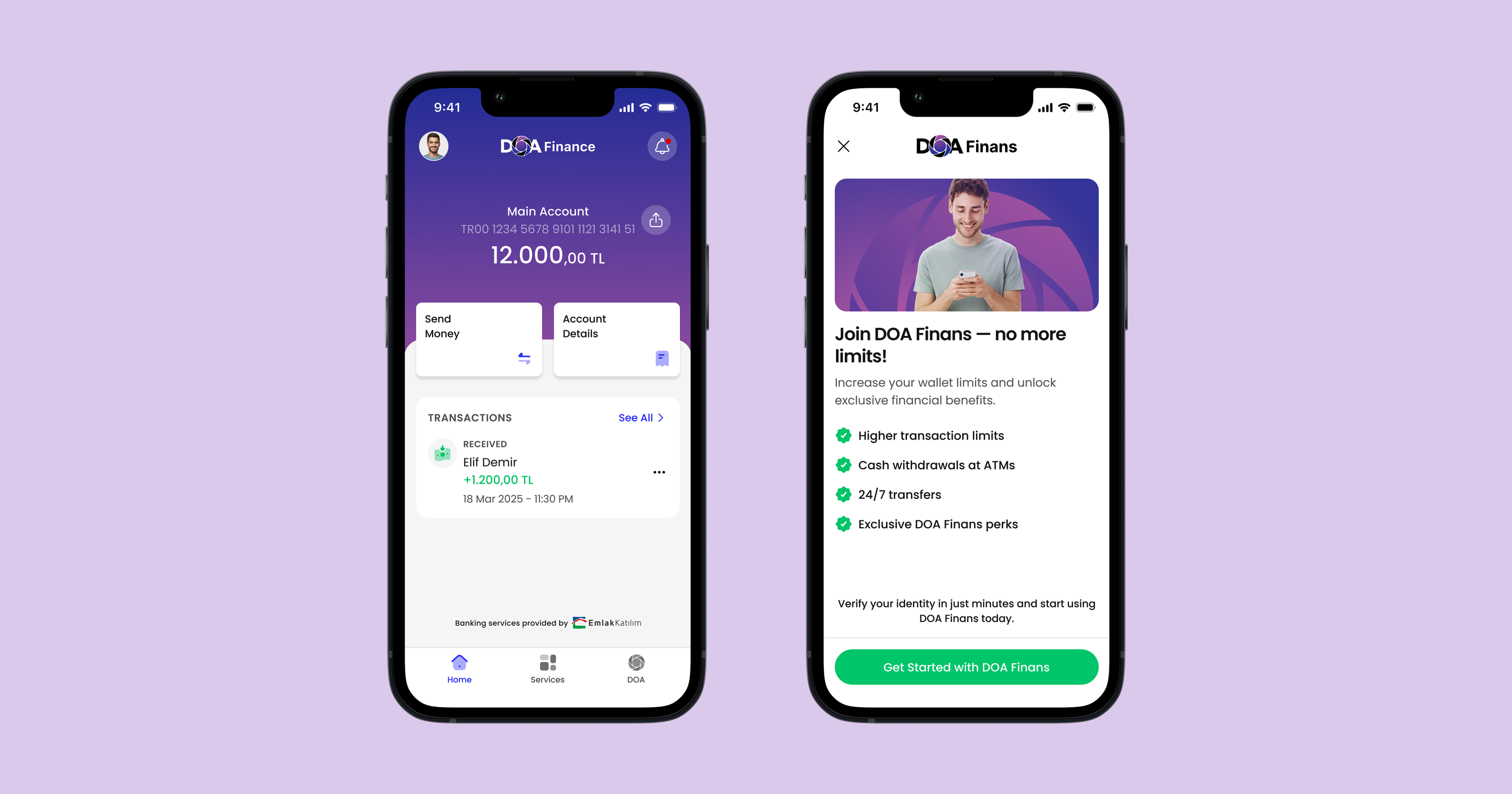
I led the design of Doa Finans, expanding Turkey’s leading deposit-return app into a full financial service for 50M users.

Building the First Local Store Delivery Experience in Turkey
End-to-End
MVP Design
UX Research
UX-UI Design
In 2021, I led the design of Yemeksepeti Mahalle — Turkey’s first local store delivery experience, connecting users with neighborhood shops for everyday essentials.
My Role
I owned the full design process end-to-end, covering discovery, UX/UI design, prototyping, and validation, while working closely with product, engineering, and operations teams to ensure a smooth launch.
Team
Nagehan C.
(PM)
Sercan A.
(Sr. PM)
Berker E.
(Project M.)
Engineers
(8 People)
Duration
Sep 2021 - Dec 2021
The Problem
In Turkey, users loved their neighborhood shops, but the digital experience didn’t reflect that. 92% of users across Europe and Asia engaged with local store services, yet in Turkey there was no simple way to reorder trusted products or buy from familiar stores online.
For users, this meant friction and wasted time. For Yemeksepeti, it meant a missed chance to grow in a space people already valued.
The challenge was to design a local store experience that felt personal and intuitive to Turkish users—while still being scalable across other markets.
Impacts
+9.7%
Engagement
Uplift
10K+
Orders in the
First Month
Research & Insights
To design something people would actually use, I needed to ground it in real behavior. I started with user journey mapping to capture how people shopped day-to-day. Then, I ran benchmarking against global players to see what worked elsewhere — and where the gaps were.
Process at a Glance
I treated Mahalle as a full-cycle design project, balancing speed with evidence.
- Discovery: user journeys, benchmarks, and surveys shaped the roadmap.
- Design: wireframes and prototypes translated insights into flows.
- Validation: guerrilla usability tests caught friction before launch.
- Delivery: partnered with PMs and engineers to ship the MVP, then tracked adoption and engagement.
Design Decisions
Given the scope of building an entirely new local-store experience, we knew we couldn’t solve everything at once. To move fast while still learning, we divided the project into phases.
Each phase focused on solving the most pressing user needs first — starting with trust and speed — and layering in more complex flows as we validated the foundation.
Starting with Deals, Realizing Trust Mattered More
Early prototypes emphasized discounts, but research showed users cared most about shopping from familiar local stores.
I shifted the homepage from deals-first to vendor-first, building trust from the start.
Browsing & Listings: Reducing Friction
Research showed that long, unfiltered lists frustrated users, creating demand for shortcuts.
I introduced exposed filters for instant refinement and redesigned vendor cards to highlight under-30-minute delivery promises. Later, I integrated vendors and products in a single view — cutting browsing time dramatically.
Building Confidence Inside Stores
Once inside a vendor page, users needed reassurance. We brought categories above the fold, added clear fees and delivery times, and introduced Order Again turning trust into repeat engagement.
Scaling Product Discovery Without Overwhelm
Big catalogs can confuse users. I designed a two-level filter system (main + subcategories) and simplified product cards so users could scan and add items quickly.
Basket & Checkout
As users moved closer to purchase, small frictions could easily derail the flow. The goal was to make the basket and checkout feel clear, trustworthy, and effortless.
Happy Path
Challenges & Trade-offs
- One tough call: Item replacement logic. Users wanted options if items were out of stock (replace, remove, cancel). I designed the flow, but due to tight MVP timelines, we postponed it. This was a lesson in prioritization under constraints.
- Stakeholder alignment: Promotions vs. trust. Marketing initially pushed for promotions-first layouts, but research showed users trusted familiar shops more than discounts. I presented the evidence and worked with them to integrate promotions without undermining shop-first design.
Learnings
- This project sharpened my ability to balance strategy with hands-on design. I learned to deliver high-quality work under tight timelines, improve communication with cross-functional teams, and manage stakeholders effectively.
- It was also a chance to take end-to-end ownership — from discovery to delivery — while making trade-offs and grounding every decision in insight.
Thank You
Reducing Drop-offs: Discovery Redesign Lifted Conversions by +19.1%
Across three major Delivery Hero brands, I led an end-to-end redesign of the discovery.
Expanding a Deposit Return Platform into Everyday Banking
I led the design of Doa Finans, expanding Turkey’s leading deposit-return app into a full financial service for 50M users.
Building the First Local Store Delivery Experience in Turkey
End-to-End
MVP Design
UX Research
UX-UI Design
In 2021, I led the design of Yemeksepeti Mahalle — Turkey’s first local store delivery experience, connecting users with neighborhood shops for everyday essentials.
My Role
I owned the full design process end-to-end, covering discovery, UX/UI design, prototyping, and validation, while working closely with product, engineering, and operations teams to ensure a smooth launch.
Team
Nagehan C.
(PM)
Sercan A.
(Sr. PM)
Berker E.
(Project M.)
Engineers
(8 People)
Duration
Sep 2021 - Dec 2021
The Problem
In Turkey, users loved their neighborhood shops, but the digital experience didn’t reflect that. 92% of users across Europe and Asia engaged with local store services, yet in Turkey there was no simple way to reorder trusted products or buy from familiar stores online.
For users, this meant friction and wasted time. For Yemeksepeti, it meant a missed chance to grow in a space people already valued.
The challenge was to design a local store experience that felt personal and intuitive to Turkish users—while still being scalable across other markets.
Impacts
+9.7%
Engagement
Uplift
10K+
Orders in the
First Month
Research & Insights
To design something people would actually use, I needed to ground it in real behavior. I started with user journey mapping to capture how people shopped day-to-day. Then, I ran benchmarking against global players to see what worked elsewhere — and where the gaps were.
Process at a Glance
I treated Mahalle as a full-cycle design project, balancing speed with evidence.
- Discovery: user journeys, benchmarks, and surveys shaped the roadmap.
- Design: wireframes and prototypes translated insights into flows.
- Validation: guerrilla usability tests caught friction before launch.
- Delivery: partnered with PMs and engineers to ship the MVP, then tracked adoption and engagement.
Design Decisions
Given the scope of building an entirely new local-store experience, we knew we couldn’t solve everything at once. To move fast while still learning, we divided the project into phases.
Each phase focused on solving the most pressing user needs first — starting with trust and speed — and layering in more complex flows as we validated the foundation.
Starting with Deals, Realizing Trust Mattered More
Early prototypes emphasized discounts, but research showed users cared most about shopping from familiar local stores.
I shifted the homepage from deals-first to vendor-first, building trust from the start.
Browsing & Listings: Reducing Friction
Research showed that long, unfiltered lists frustrated users, creating demand for shortcuts.
I introduced exposed filters for instant refinement and redesigned vendor cards to highlight under-30-minute delivery promises. Later, I integrated vendors and products in a single view — cutting browsing time dramatically.
Building Confidence Inside Stores
Once inside a vendor page, users needed reassurance. We brought categories above the fold, added clear fees and delivery times, and introduced Order Again turning trust into repeat engagement.
Scaling Product Discovery Without Overwhelm
Big catalogs can confuse users. I designed a two-level filter system (main + subcategories) and simplified product cards so users could scan and add items quickly.
Basket & Checkout
As users moved closer to purchase, small frictions could easily derail the flow. The goal was to make the basket and checkout feel clear, trustworthy, and effortless.
Happy Path
Challenges & Trade-offs
- One tough call: Item replacement logic. Users wanted options if items were out of stock (replace, remove, cancel). I designed the flow, but due to tight MVP timelines, we postponed it. This was a lesson in prioritization under constraints.
- Stakeholder alignment: Promotions vs. trust. Marketing initially pushed for promotions-first layouts, but research showed users trusted familiar shops more than discounts. I presented the evidence and worked with them to integrate promotions without undermining shop-first design.
Learnings
- This project sharpened my ability to balance strategy with hands-on design. I learned to deliver high-quality work under tight timelines, improve communication with cross-functional teams, and manage stakeholders effectively.
- It was also a chance to take end-to-end ownership — from discovery to delivery — while making trade-offs and grounding every decision in insight.
Thank You
Reducing Drop-offs: Discovery Redesign Lifted Conversions by +19.1%
Across three major Delivery Hero brands, I led an end-to-end redesign of the discovery experience.
Expanding a Deposit Return Platform into Everyday Banking
I led the design of Doa Finans, expanding Turkey’s leading deposit-return app into a full financial service for 50M users.