Expanding a Deposit Return Platform into Everyday Banking
End-to-End
MVP Design
UX Research
UX-UI Design
DOA is a superapp in Turkey, originally built to handle deposit returns for bottles. Over time, it grew into a platform for daily services like shopping and payments, supported by a basic wallet. To unlock broader value, we introduced DOA Finance (BaaS) — extending the wallet into a full financial service with deposits, withdrawals, and investments.
My Role
As the product designer, my challenge was to translate this product vision into a clear, intuitive user journey: balancing simplicity with trust, and designing flows that made banking feel as effortless and familiar as the daily tasks users were already completing in DOA.
Team
Aybüke Ö.
(PM)
Tolga G.
(PD Lead)
Tugba A.
(Project D.)
Büşra U.
(Project M.)
Kaan D.
(PA)
Engineers
(+10)
Duration
Dec 2024 - July 2025
The Challenge
Product perspective
DOA’s wallet supported basic payments and deposits but lacked advanced features like investments, unlimited transfers, or currency exchange. Users still relied on traditional banks, so the challenge was expanding DOA into a trusted financial service that could boost revenue and retention.
UX perspective
Users valued the wallet’s simplicity, yet turned to banks for complex needs. The UX challenge was adding flows like KYC, deposits, and interest without losing the lightweight experience they expected.
Goals
Business goals
- Expand beyond a basic wallet into a full financial service.
- Increase revenue streams through advanced features (deposits, investments, currency exchange).
- Improve user retention by keeping financial activity inside DOA.
User goals
- Manage money beyond simple payments — including deposits, investments, and transfers.
- Keep financial activity in one place, without switching to traditional banks.
- Maintain the speed and simplicity they already expect from DOA.
Impacts
+24%
Increase
EBITDA
8%
Net
Profit
3K
Users Activated Finance Accounts
Discovery Research & Insights
As part of the discovery, I combined interviews with users and benchmarking across banks and fintech challengers. The goal was to uncover where trust breaks down, what users really expect, and which gaps in the market we could turn into opportunities.
What we learned from users (core jobs-to-be-done):
- Trust breaks down easily. Even short transfer delays or unclear account history (like “provisioned” vs. “settled”) made users feel uncertain.
- Transparency is missing. People struggled to see transfer limits, SLA times, or what happens if a verification step fails.
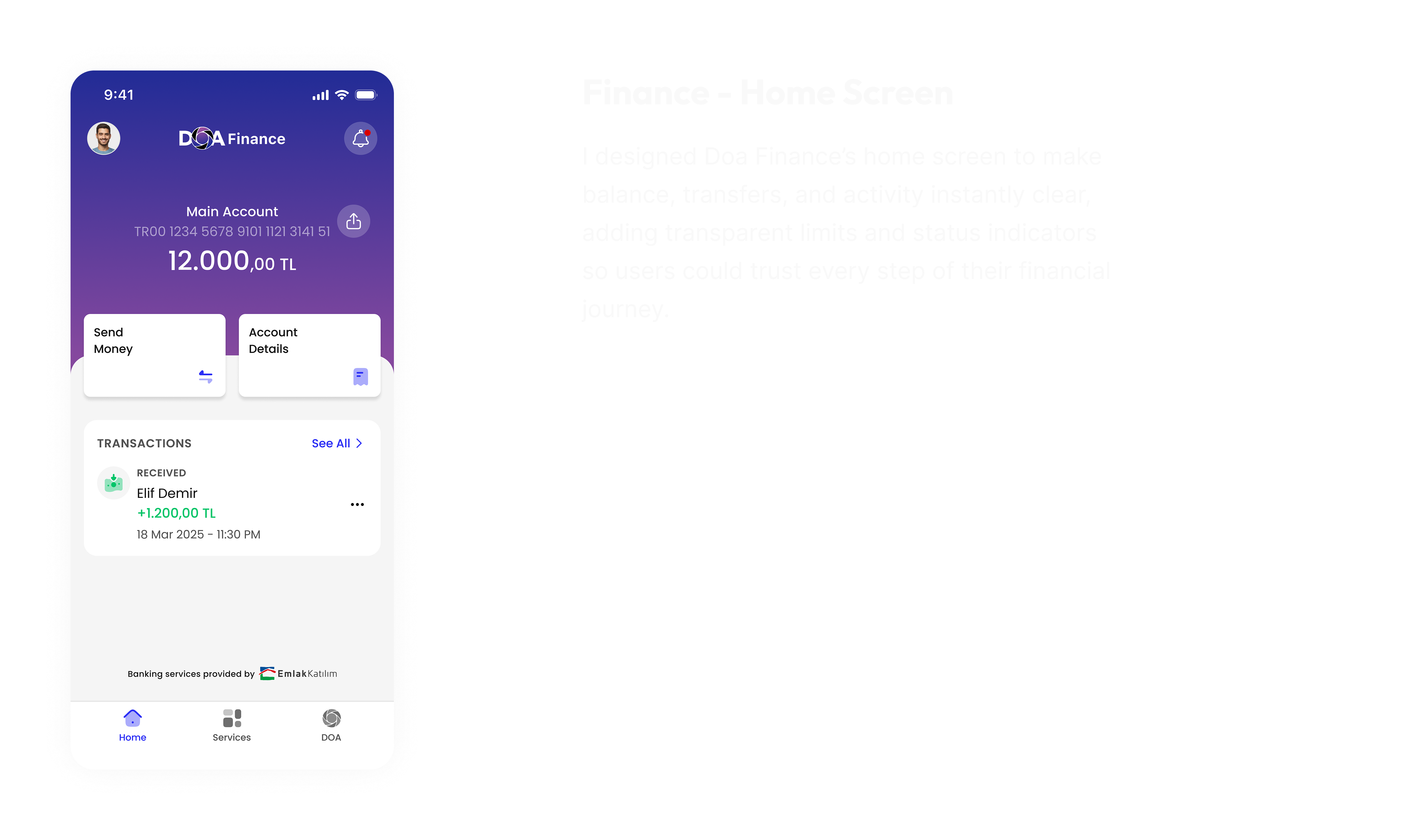
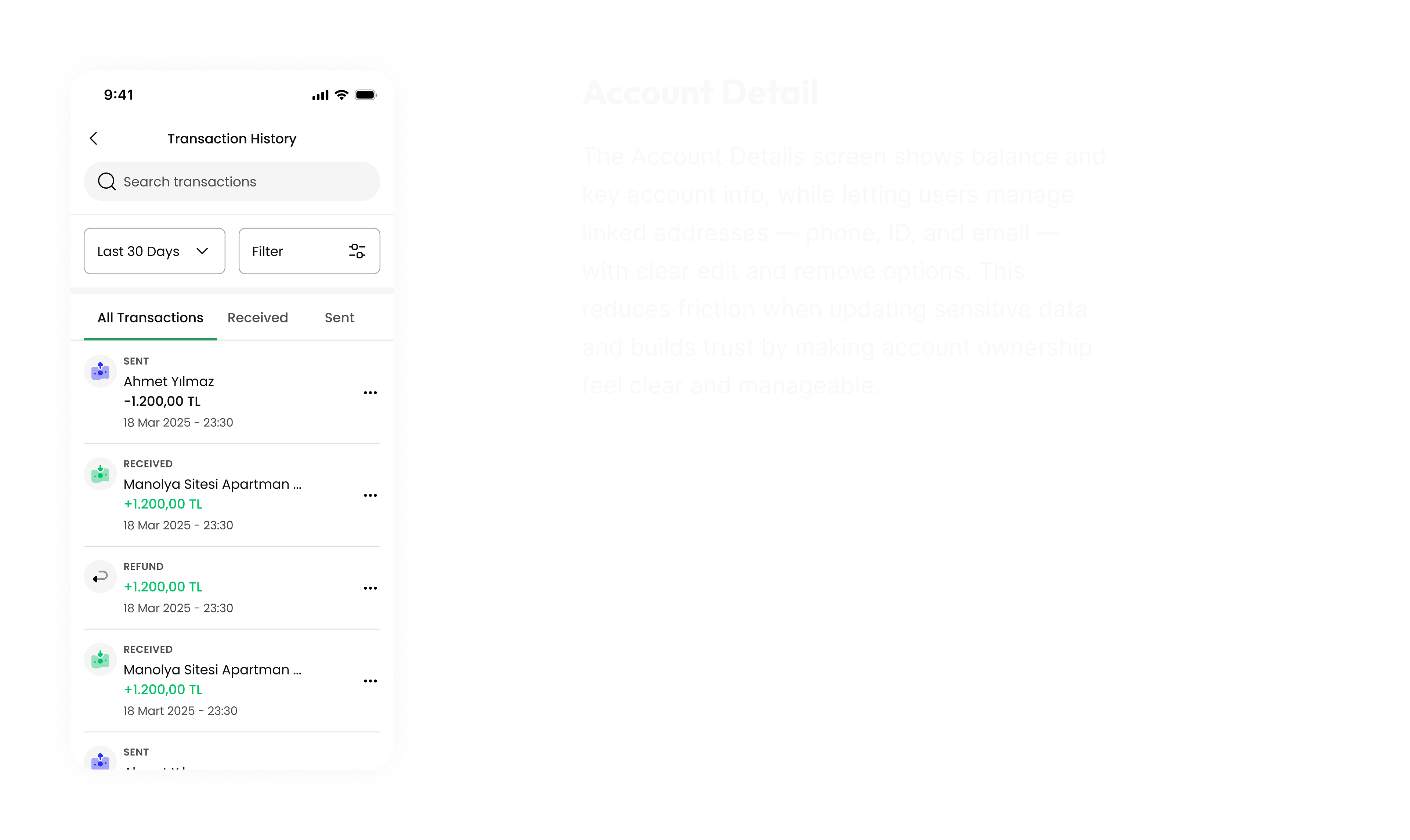
- Essentials come first. Balance, transfers, and history needed to be front and center, while promotions belonged in the background.
Design Process & Key Decisions
Switch Flow - DOA → DOA Finance
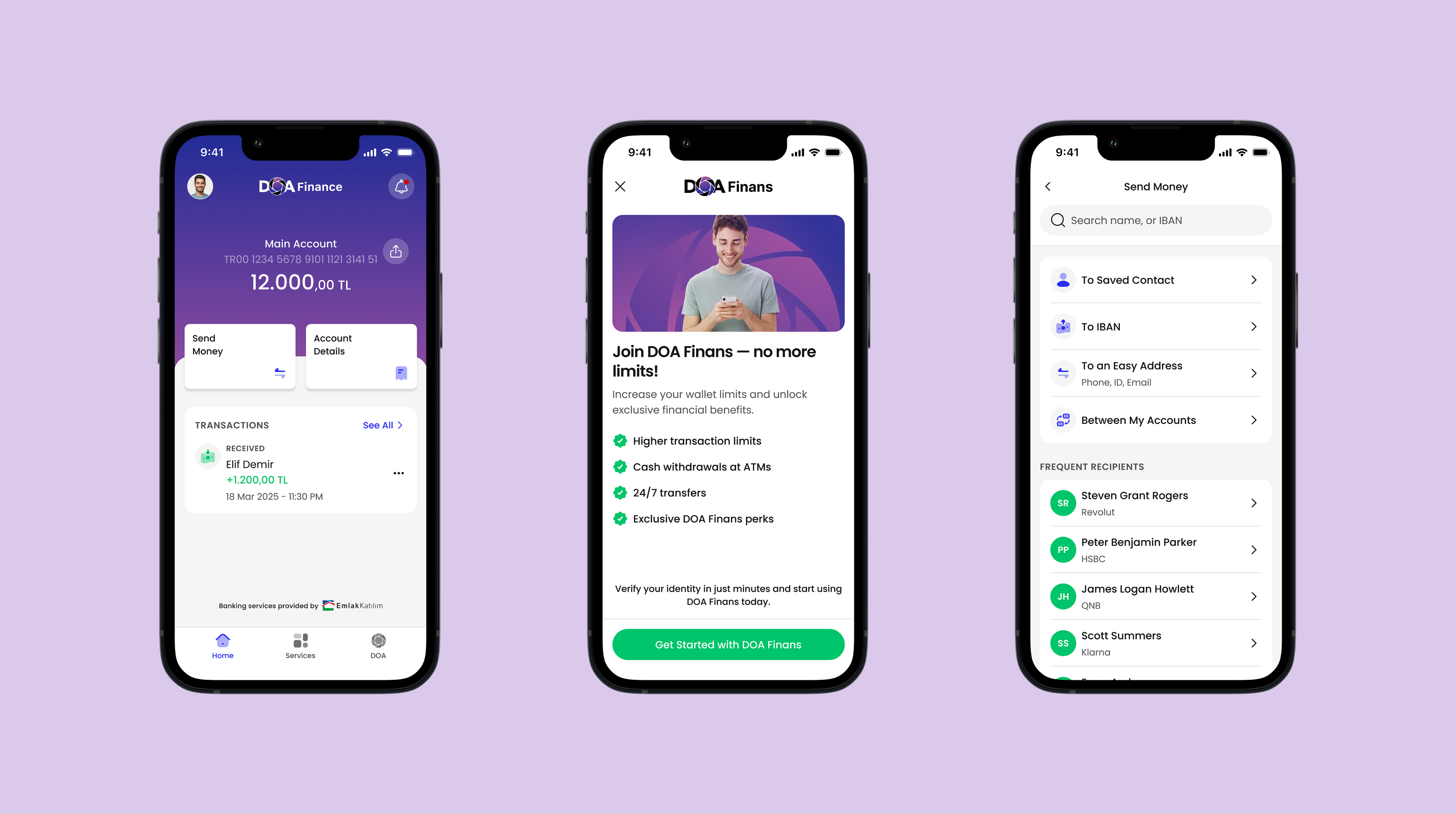
Finance adoption could not rely on a single entry point — users needed multiple, natural ways to discover it. To lower barriers, I added two complementary access paths: a Finance card on the home screen that users can swipe to open an account, and a dedicated item in the bottom navigation for persistent visibility.
This dual-entry approach balanced discovery and convenience, making Finance feel like a seamless extension of the Doa ecosystem.
Onboarding
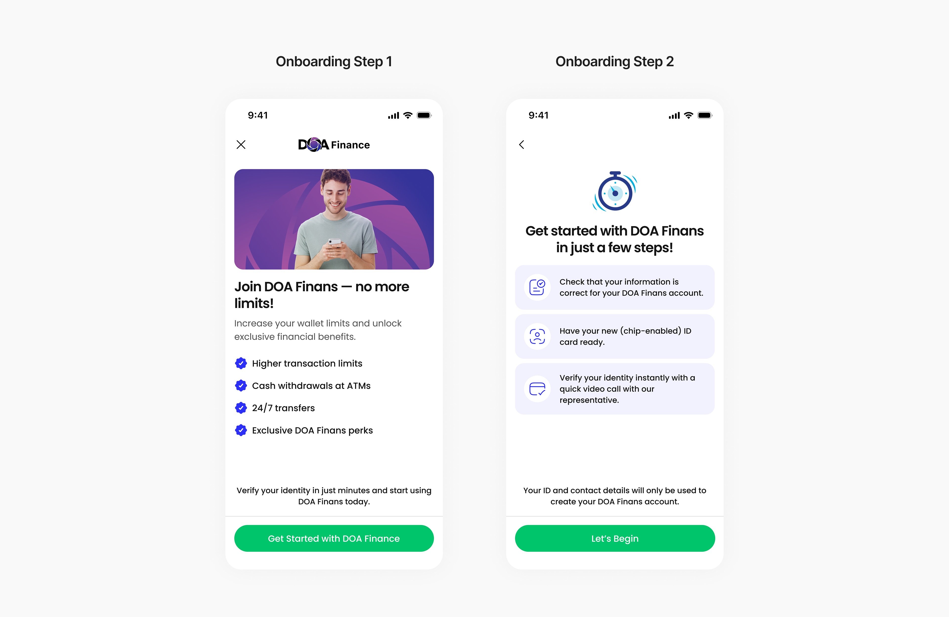
Finance onboarding initially caused hesitation: users didn’t see the value and weren’t sure what steps lay ahead.
I redesigned it into a guided journey — first highlighting benefits like higher limits and 24/7 transfers, then previewing the steps (verify info, ID, quick video call). With plain copy and supportive icons, the flow felt clear, simple, and trustworthy.
Account Creation
The original KYC flow left users uncertain about what would happen next and creating drop-off risks.
I redesigned the flow into a clear, step-by-step journey with previews of upcoming actions, plain-language guidance, and supportive micro-interactions like inline validation and auto-advance. Inspired by modern KYC platforms, I embedded real-time validation, fallback options, and trust cues at each stage to keep the process predictable and user-friendly.
Next Steps
The next step for Doa Finance is expanding beyond core banking tasks into value-added services. We plan to introduce investments with daily interest and foreign currency exchange, giving users more ways to grow and manage their money directly within the app.
Learnings
This was my first fintech project to lead end-to-end. I was involved in every stage — from discovery to delivery — and shaped the UX strategy along the way. It strengthened my ability to balance business goals with user trust, and gave me hands-on experience in building a financial product from the ground up.
Thank You
Reducing Drop-offs: A Discovery Redesign That Lifted Conversions by +19.1% Across 17 Markets
Across three major Delivery Hero brands, I led an end-to-end redesign of the discovery experience.
Building the First Local Store Delivery Experience in Turkey
In 2021, I led the design of Yemeksepeti Mahalle — Turkey’s first local store delivery experience.

Expanding a Deposit Return Platform into Everyday Banking
End-to-End
MVP Design
UX Research
UX-UI Design
Doa is a superapp in Turkey, originally built to handle deposit returns for bottles. Over time, it grew into a platform for daily services like shopping and payments, supported by a basic wallet. To unlock broader value, we introduced D Finance (BaaS) — extending the wallet into a full financial service with deposits, withdrawals, and investments.
My Role
As the product designer, my challenge was to translate this product vision into a clear, intuitive user journey: balancing simplicity with trust, and designing flows that made banking feel as effortless and familiar as the daily tasks users were already completing in DOA.
Team
Aybüke Ö.
(PM)
Tolga G.
(PD Lead)
Tugba A.
(Project D.)
Büşra U.
(Project M.)
Kaan D.
(PA)
Engineers
(+10)
Duration
Dec 2024 - July 2025
The Challenge
Product perspective
DOA’s wallet supported basic payments and deposits but lacked advanced features like investments, unlimited transfers, or currency exchange. Users still relied on traditional banks, so the challenge was expanding DOA into a trusted financial service that could boost revenue and retention.
UX perspective
Users valued the wallet’s simplicity, yet turned to banks for complex needs. The UX challenge was adding flows like KYC, deposits, and interest without losing the lightweight experience they expected.
Goals
Business goals
- Expand beyond a basic wallet into a full financial service.
- Increase revenue streams through advanced features (deposits, investments, currency exchange).
- Improve user retention by keeping financial activity inside DOA.
User goals
- Manage money beyond simple payments — including deposits, investments, and transfers.
- Keep financial activity in one place, without switching to traditional banks.
- Maintain the speed and simplicity they already expect from DOA.
Impacts
+24%
Increase
EBITDA
8%
Net
Profit
3K
Users Activated Finance Accounts
Discovery Research & Insights
As part of the discovery, I combined interviews with users and benchmarking across banks and fintech challengers. The goal was to uncover where trust breaks down, what users really expect, and which gaps in the market we could turn into opportunities.
What we learned from users (core jobs-to-be-done):
- Trust breaks down easily. Even short transfer delays or unclear account history (like “provisioned” vs. “settled”) made users feel uncertain.
- Transparency is missing. People struggled to see transfer limits, SLA times, or what happens if a verification step fails.
- Essentials come first. Balance, transfers, and history needed to be front and center, while promotions belonged in the background.
Design Process & Key Decisions
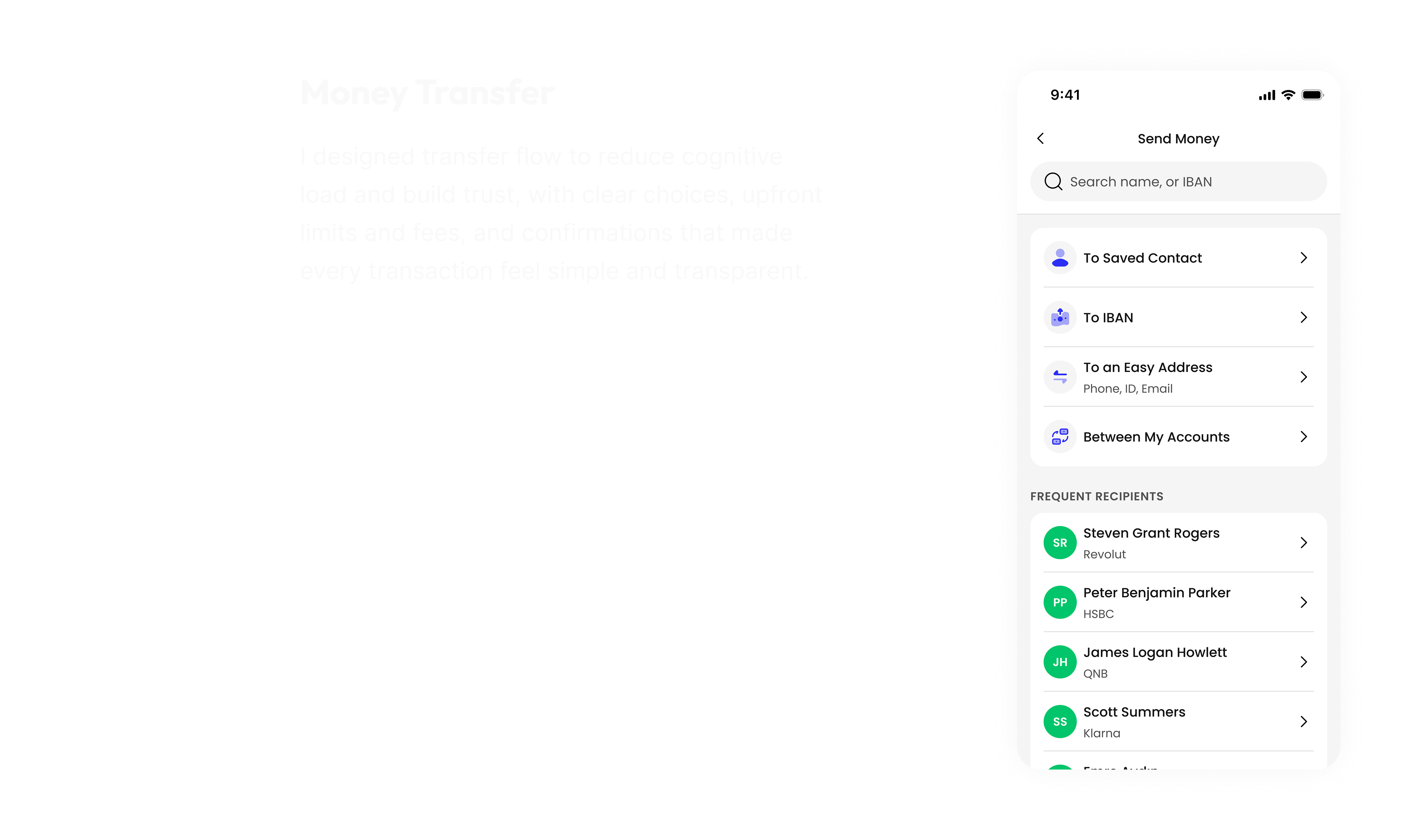
Switch Flow - DOA → DOA Finance
Finance adoption could not rely on a single entry point — users needed multiple, natural ways to discover it. To lower barriers, I added two complementary access paths: a Finance card on the home screen that users can swipe to open an account, and a dedicated item in the bottom navigation for persistent visibility.
This dual-entry approach balanced discovery and convenience, making Finance feel like a seamless extension of the Doa ecosystem.
Onboarding
Finance onboarding initially caused hesitation: users didn’t see the value and weren’t sure what steps lay ahead.
I redesigned it into a guided journey — first highlighting benefits like higher limits and 24/7 transfers, then previewing the steps (verify info, ID, quick video call). With plain copy and supportive icons, the flow felt clear, simple, and trustworthy.
Account Creation
The original KYC flow left users uncertain about what would happen next and creating drop-off risks.
I redesigned the flow into a clear, step-by-step journey with previews of upcoming actions, plain-language guidance, and supportive micro-interactions like inline validation and auto-advance. Inspired by modern KYC platforms, I embedded real-time validation, fallback options, and trust cues at each stage to keep the process predictable and user-friendly.
Next Steps
The next step for Doa Finance is expanding beyond core banking tasks into value-added services. We plan to introduce investments with daily interest and foreign currency exchange, giving users more ways to grow and manage their money directly within the app.
Learnings
This was my first fintech project to lead end-to-end. I was involved in every stage — from discovery to delivery — and shaped the UX strategy along the way. It strengthened my ability to balance business goals with user trust, and gave me hands-on experience in building a financial product from the ground up.
Thank You
Reducing Drop-offs: A Discovery Redesign That Lifted Conversions by +19.1% Across 17 Markets
Across three major Delivery Hero brands, I led an end-to-end redesign of the discovery experience.
Building the First Local Store Delivery Experience in Turkey
In 2021, I led the design of Yemeksepeti Mahalle — Turkey’s first local store delivery experience.
Expanding a Deposit Return Platform into Everyday Banking
End-to-End
MVP Design
UX Research
UX-UI Design
DOA is a superapp in Turkey, originally built to handle deposit returns for bottles. Over time, it grew into a platform for daily services like shopping and payments, supported by a basic wallet. To unlock broader value, we introduced DOA Finance (BaaS) — extending the wallet into a full financial service with deposits, withdrawals, and investments.
My Role
As the product designer, my challenge was to translate this product vision into a clear, intuitive user journey: balancing simplicity with trust, and designing flows that made banking feel as effortless and familiar as the daily tasks users were already completing in DOA.
Team
Aybüke Ö.
(PM)
Tolga G.
(PD Lead)
Tugba A.
(Project D.)
Büşra U.
(Project M.)
Kaan D.
(PA)
Engineers
(+10)
Duration
Dec 2024 - July 2025
The Challenge
Product perspective
DOA’s wallet supported basic payments and deposits but lacked advanced features like investments, unlimited transfers, or currency exchange. Users still relied on traditional banks, so the challenge was expanding DOA into a trusted financial service that could boost revenue and retention.
UX perspective
Users valued the wallet’s simplicity, yet turned to banks for complex needs. The UX challenge was adding flows like KYC, deposits, and interest without losing the lightweight experience they expected.
Goals
Business goals
- Expand beyond a basic wallet into a full financial service.
- Increase revenue streams through advanced features (deposits, investments, currency exchange).
- Improve user retention by keeping financial activity inside DOA.
User goals
- Manage money beyond simple payments — including deposits, investments, and transfers.
- Keep financial activity in one place, without switching to traditional banks.
- Maintain the speed and simplicity they already expect from DOA.
Impacts
+24%
Increase
EBITDA
8%
Net
Profit
3K
Users Activated Finance Accounts
Discovery Research & Insights
As part of the discovery, I combined interviews with users and benchmarking across banks and fintech challengers. The goal was to uncover where trust breaks down, what users really expect, and which gaps in the market we could turn into opportunities.
What we learned from users (core jobs-to-be-done):
- Trust breaks down easily. Even short transfer delays or unclear account history (like “provisioned” vs. “settled”) made users feel uncertain.
- Transparency is missing. People struggled to see transfer limits, SLA times, or what happens if a verification step fails.
- Essentials come first. Balance, transfers, and history needed to be front and center, while promotions belonged in the background.
Design Process & Key Decisions
Switch Flow - DOA → DOA Finance
Finance adoption could not rely on a single entry point — users needed multiple, natural ways to discover it. To lower barriers, I added two complementary access paths: a Finance card on the home screen that users can swipe to open an account, and a dedicated item in the bottom navigation for persistent visibility.
This dual-entry approach balanced discovery and convenience, making Finance feel like a seamless extension of the Doa ecosystem.
Onboarding
Finance onboarding initially caused hesitation: users didn’t see the value and weren’t sure what steps lay ahead.
I redesigned it into a guided journey — first highlighting benefits like higher limits and 24/7 transfers, then previewing the steps (verify info, ID, quick video call). With plain copy and supportive icons, the flow felt clear, simple, and trustworthy.
Account Creation
The original KYC flow left users uncertain about what would happen next and creating drop-off risks.
I redesigned the flow into a clear, step-by-step journey with previews of upcoming actions, plain-language guidance, and supportive micro-interactions like inline validation and auto-advance. Inspired by modern KYC platforms, I embedded real-time validation, fallback options, and trust cues at each stage to keep the process predictable and user-friendly.
Next Steps
The next step for Doa Finance is expanding beyond core banking tasks into value-added services. We plan to introduce investments with daily interest and foreign currency exchange, giving users more ways to grow and manage their money directly within the app.
Learnings
This was my first fintech project to lead end-to-end. I was involved in every stage — from discovery to delivery — and shaped the UX strategy along the way. It strengthened my ability to balance business goals with user trust, and gave me hands-on experience in building a financial product from the ground up.
Thank You
Reducing Drop-offs: Discovery Redesign Lifted Conversions by +19.1%
Across three major Delivery Hero brands, I led an end-to-end redesign of the discovery experience.
Building the First Local Store Delivery Experience in Turkey
In 2021, I led the design of Yemeksepeti Mahalle — Turkey’s first local store delivery experience.