Reframing Discovery Around User Behavior Across 3 Markets
Foodpanda’s discovery experience is one of the highest-traffic entry points for grocery and hyperlocal commerce, helping users browse and compare vendors before ordering.
The project focused on understanding why millions of users were browsing but not engaging, and redesigning discovery around the behaviors that actually drove ordering decisions.
ROLE
Sr. Product Designer
DOMAIN
E-Commerce
DURATION
6 Months
TEAM
PM, UXR, PA, Marketing, iOs & Android dev. team
Impact
By reducing navigation friction, improving vendor comparison, and surfacing decision-making information earlier, users were able to find relevant stores faster and move more confidently toward ordering.
+19.1%
Increase in
conversions
+76.4%
Increase in
click through rates
+0.86%
Increase in
order per user
Challenge
Users struggled to discover relevant vendors and make confident purchase decisions.
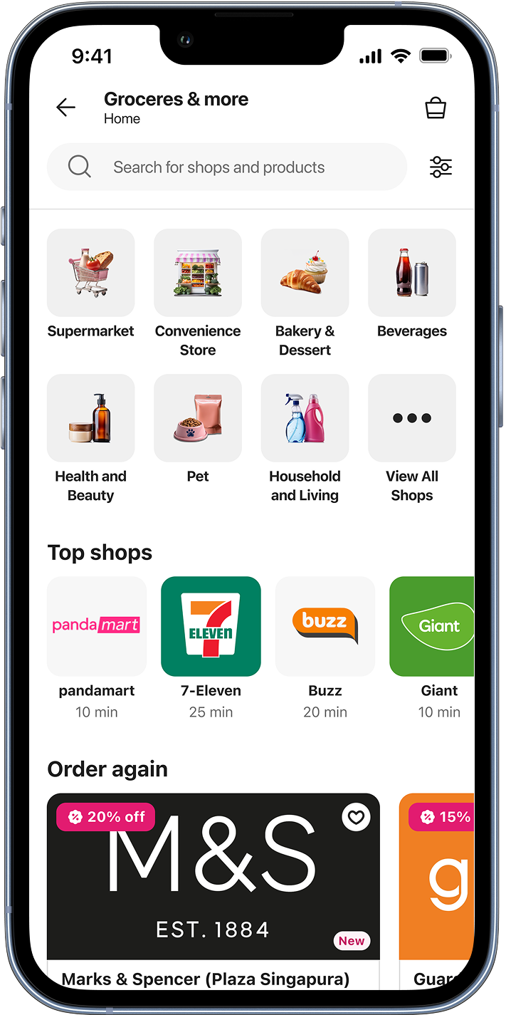
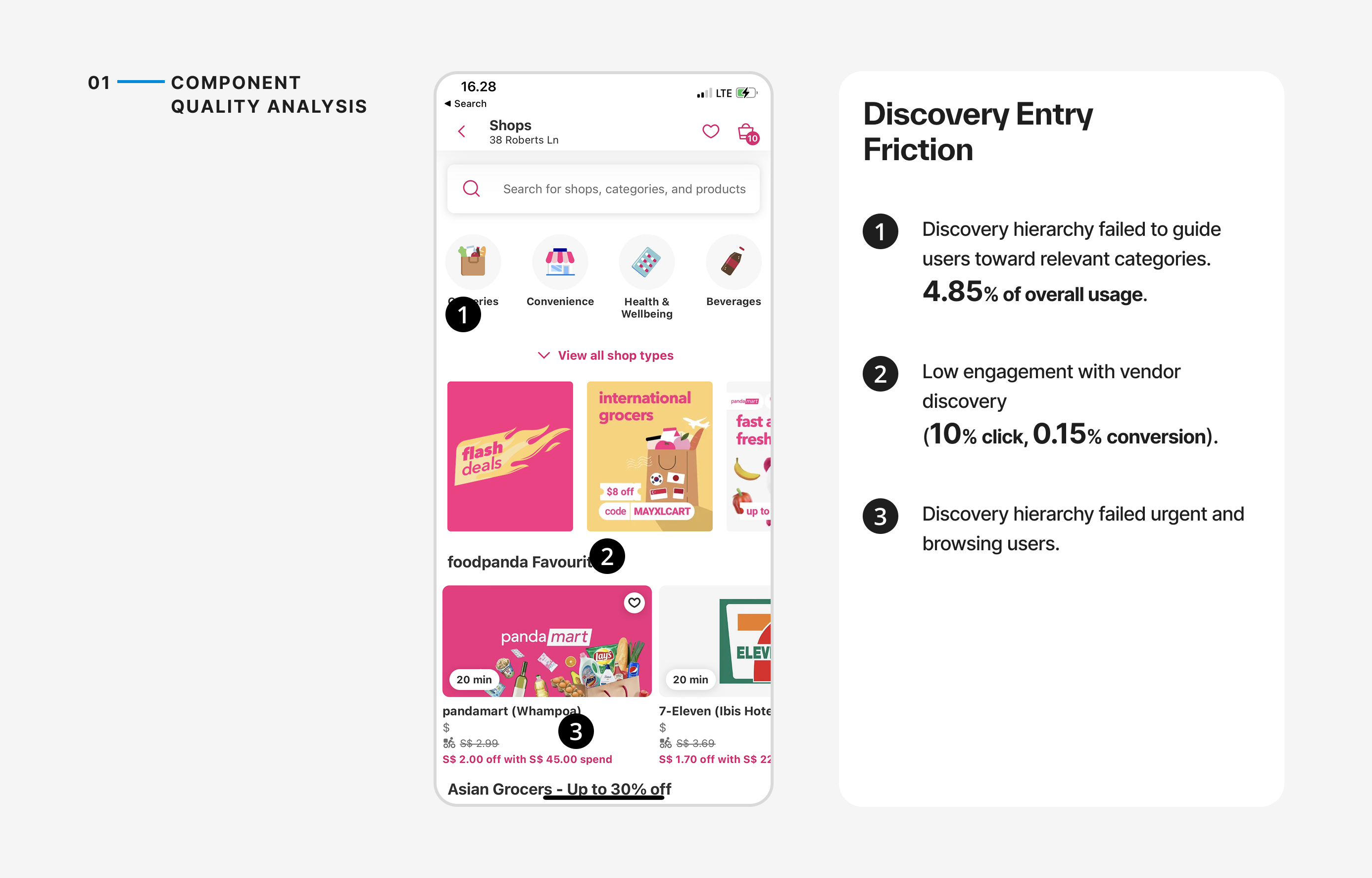
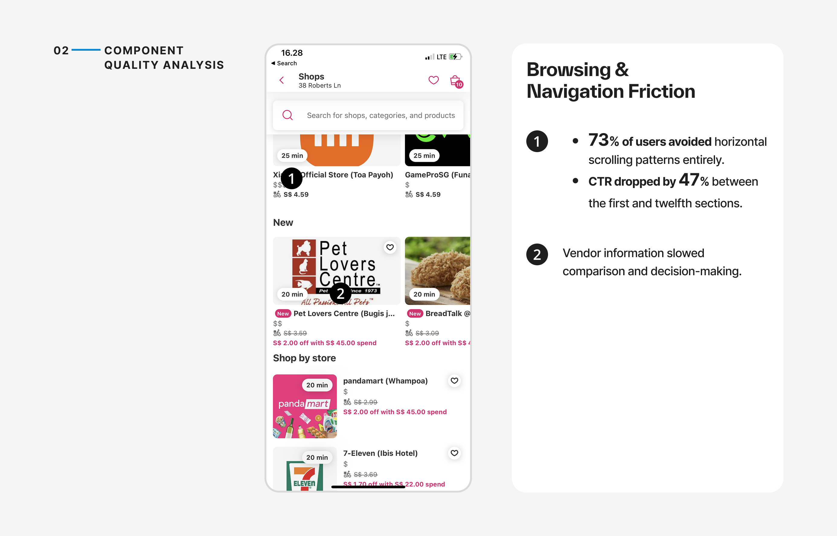
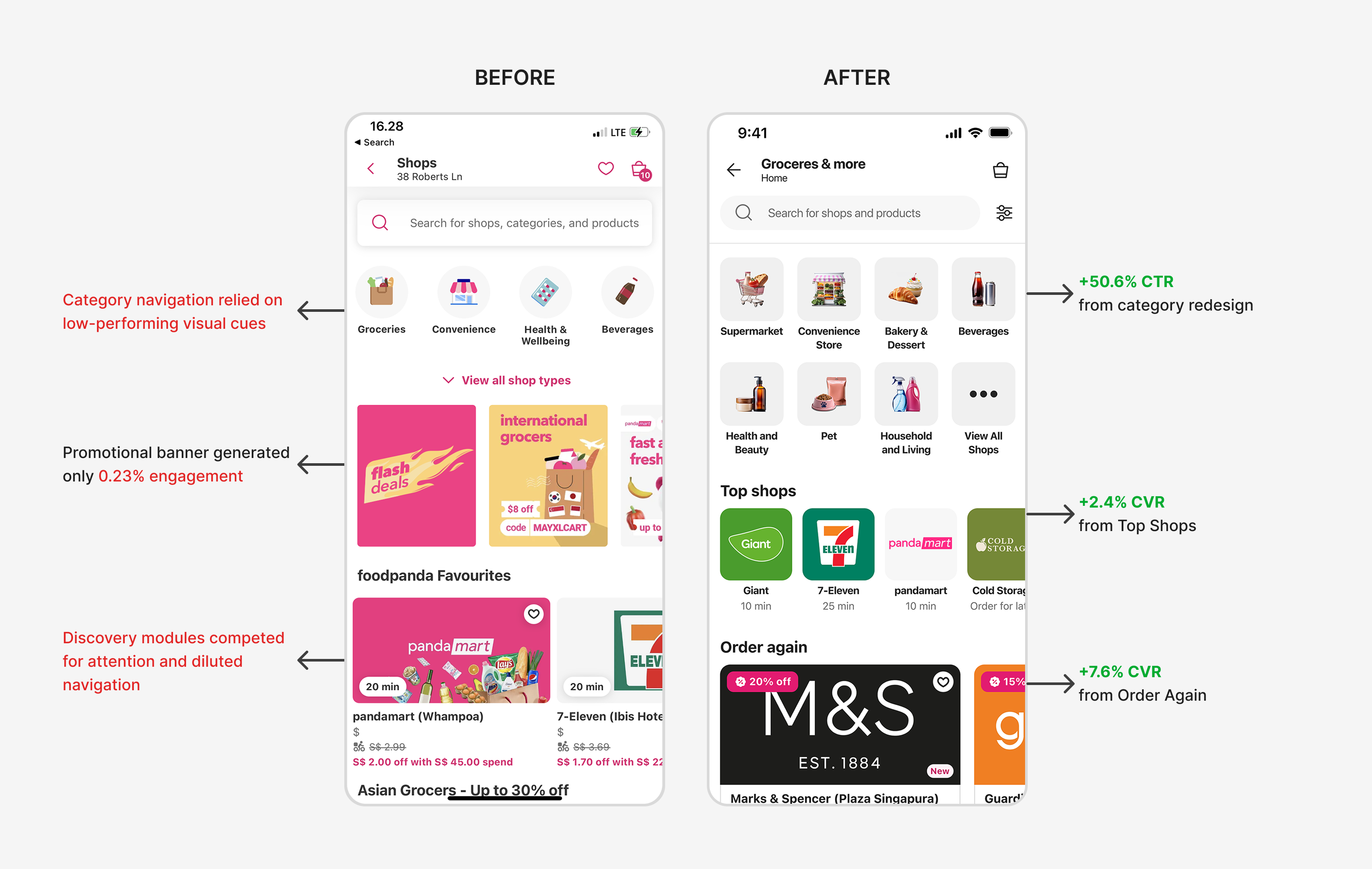
Despite attracting over 7.6 million visits, only 21% of users engaged with discovery modules, and engagement rarely translated into vendor exploration or ordering behavior.
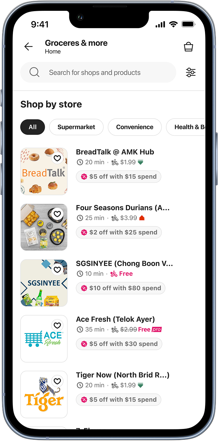
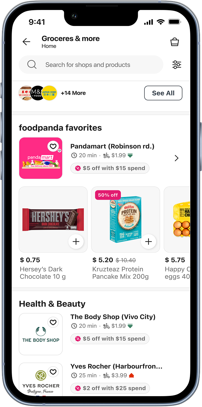
The experience was optimized for promotional exposure, but users needed a faster way to navigate categories, compare vendors, and find relevant stores.
Impact on Users;
- Low engagement with discovery pathways
- Friction in vendor comparison and decision-making
- Increased abandonment before ordering
One Experience, Different Intentions
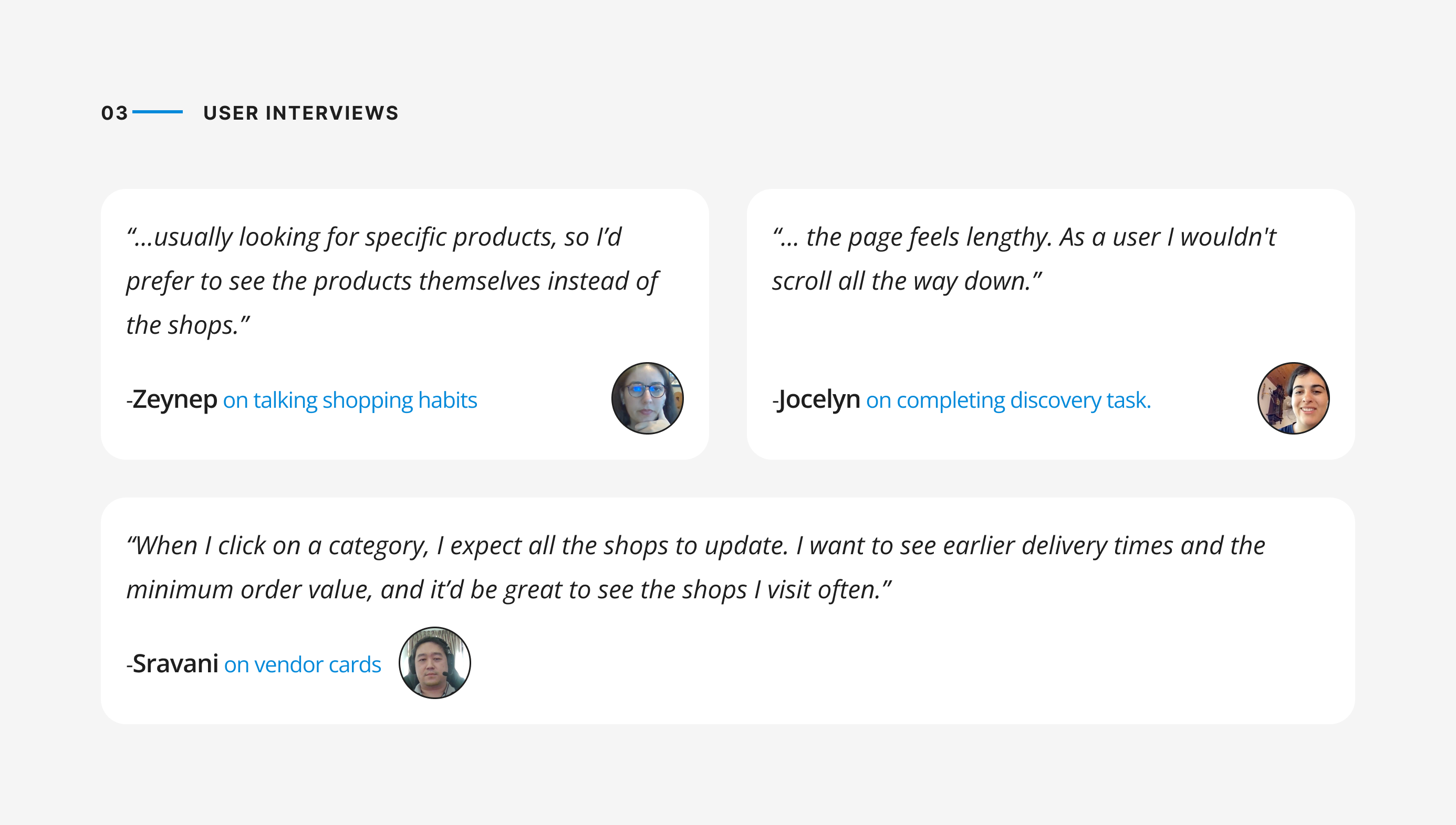
Research revealed that users weren’t visiting discovery for the same reason.
84% of orders were urgent and task-driven, while others used the experience to browse, compare products, and explore promotions before purchasing.
Discovery needed to support both behaviors without forcing users into a single path.
User Needs
Understanding Where Discovery Was Failing
I combined quantitative analysis with qualitative research across multiple markets to understand how users decide, browse, and purchase in quick commerce.
Key Insights
Users weren’t simply looking for a store.
Some wanted to complete a purchase as quickly as possible, while others used discovery to browse products, explore promotions, and build their basket.
The existing experience was optimized for merchandising and promotional exposure, but it wasn’t helping users efficiently navigate these different shopping missions.
Approach
Stakeholder Alignment
Aligning Business And User Needs
Users wanted to find vendors and complete purchases quickly, while marketing teams relied on discovery modules and promotional placements to drive campaign visibility.
As discovery became increasingly optimized for merchandising, it became harder for users to navigate efficiently.
This created a difficult question:
“How might we make discovery easier without reducing business visibility?”
To answer it, I facilitated workshops with product, marketing, and design stakeholders, using research findings and behavioral data to align on evaluation criteria before exploring solutions.
Exploration
To align business goals with user needs, I explored three alternative navigation models. Each approach represented a different balance between promotional visibility and user decision-making.
Option A — Marketing-Led Discovery
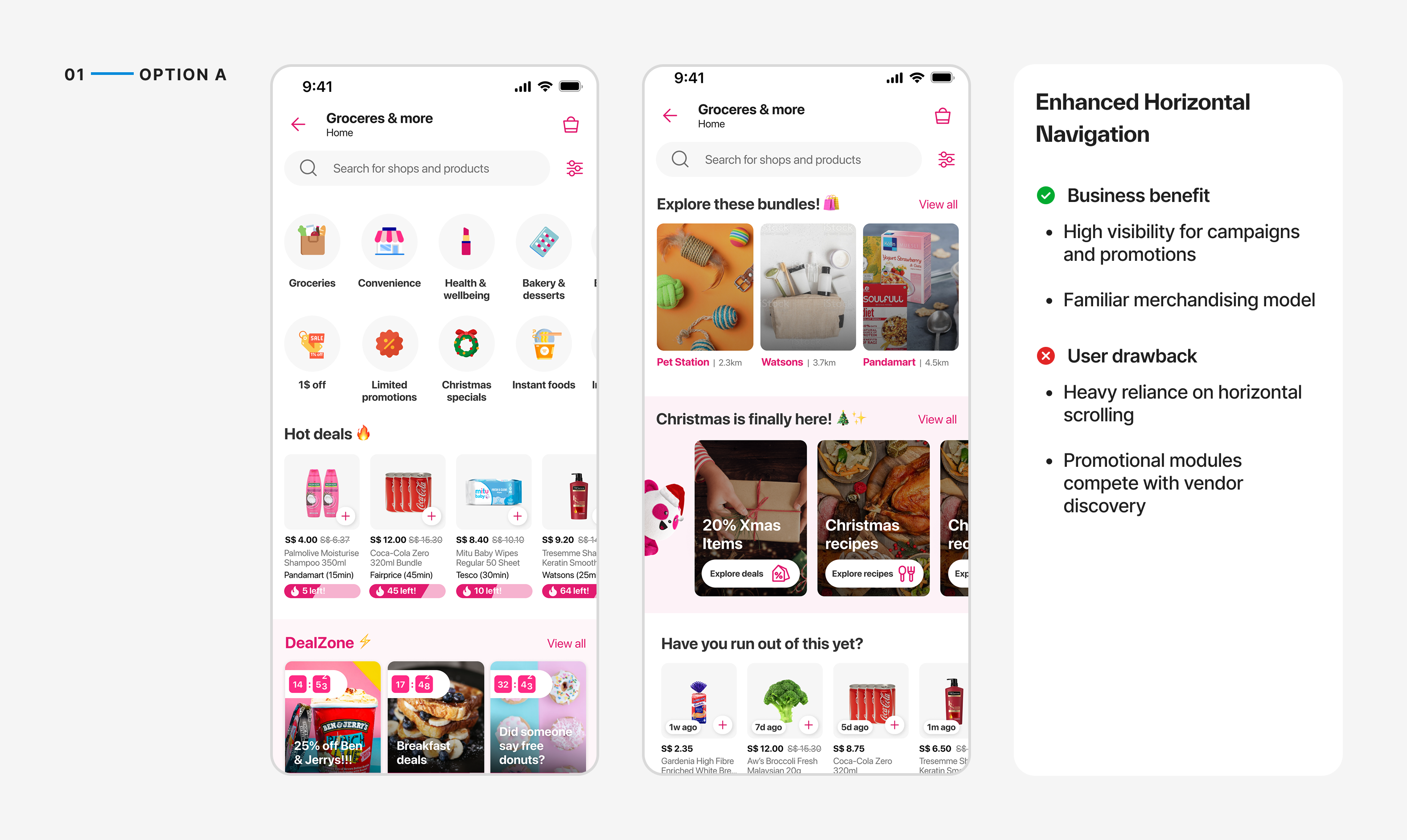
Outcome
Not selected because it improved visibility for campaigns but failed to address the discovery behaviors identified in research.
Option B — Balancing Discovery and Promotion
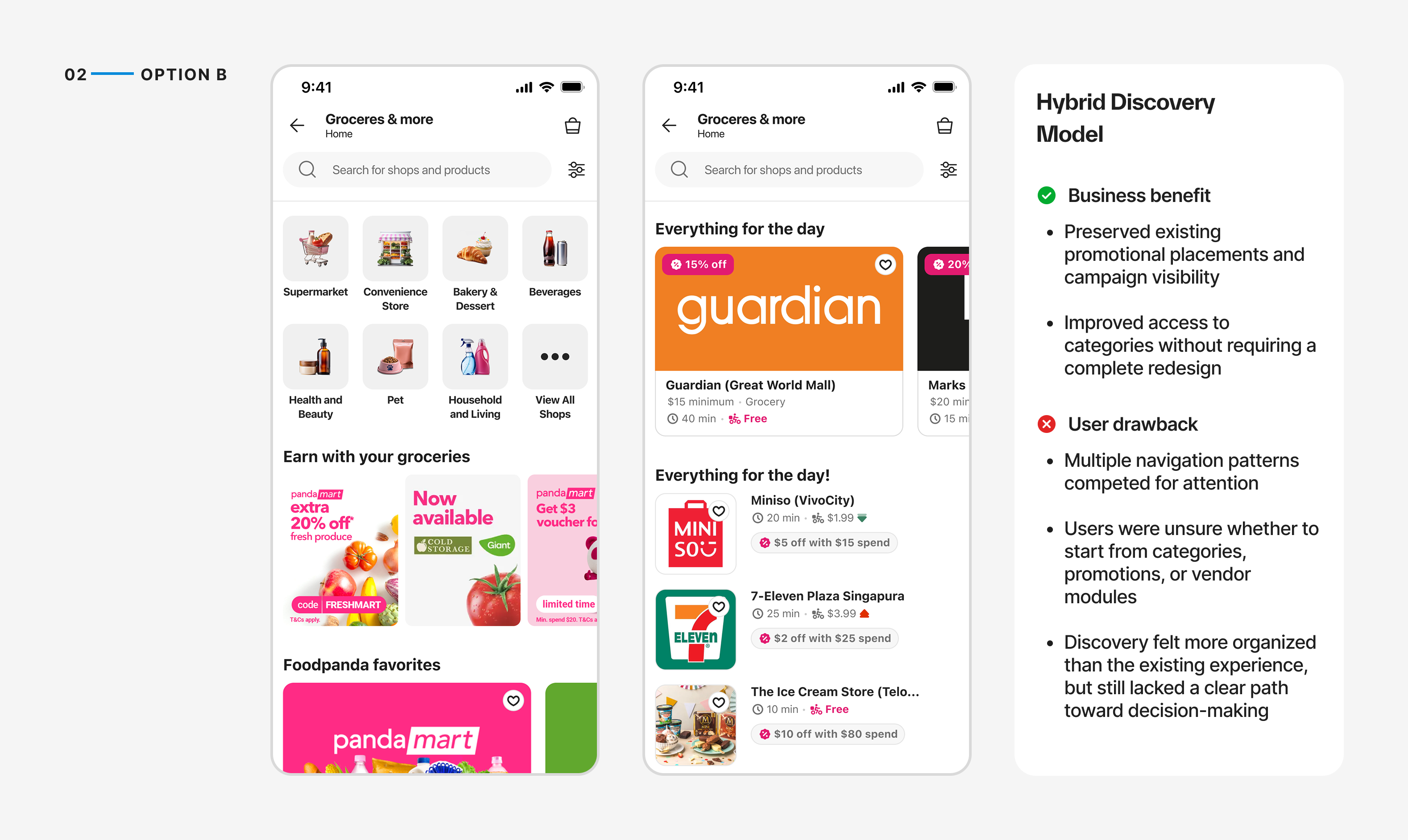
Outcome
Selected for usability testing because it balanced business visibility with improved navigation. However, testing revealed that users still struggled to prioritize information, resulting in slower decision-making compared to the vertical navigation approach.
Option C — Behavior-Driven Discovery
To prioritize faster decision-making, I explored a vendor-first discovery model that surfaced categories as navigation and organized content around vendor selection rather than promotional modules.
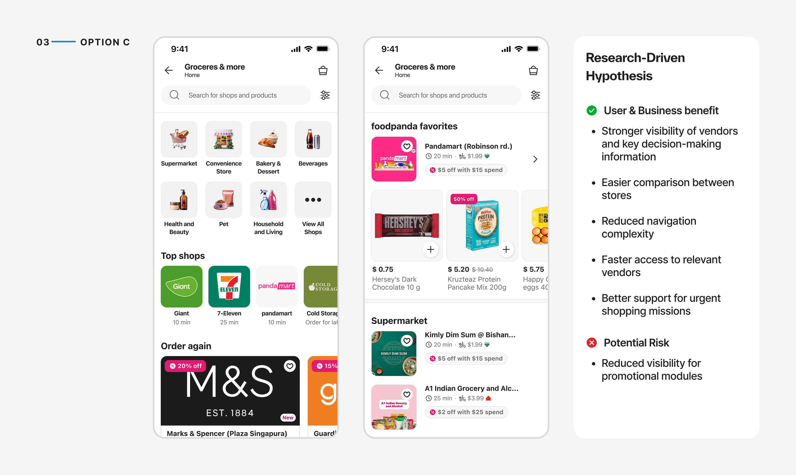
Outcome
Selected for usability testing because it created the clearest path from discovery to vendor selection while addressing the navigation issues identified during research.
Validation
Testing Alternative Discovery Models
To validate the proposed directions, I conducted moderated usability tests with nine participants across common grocery shopping scenarios.
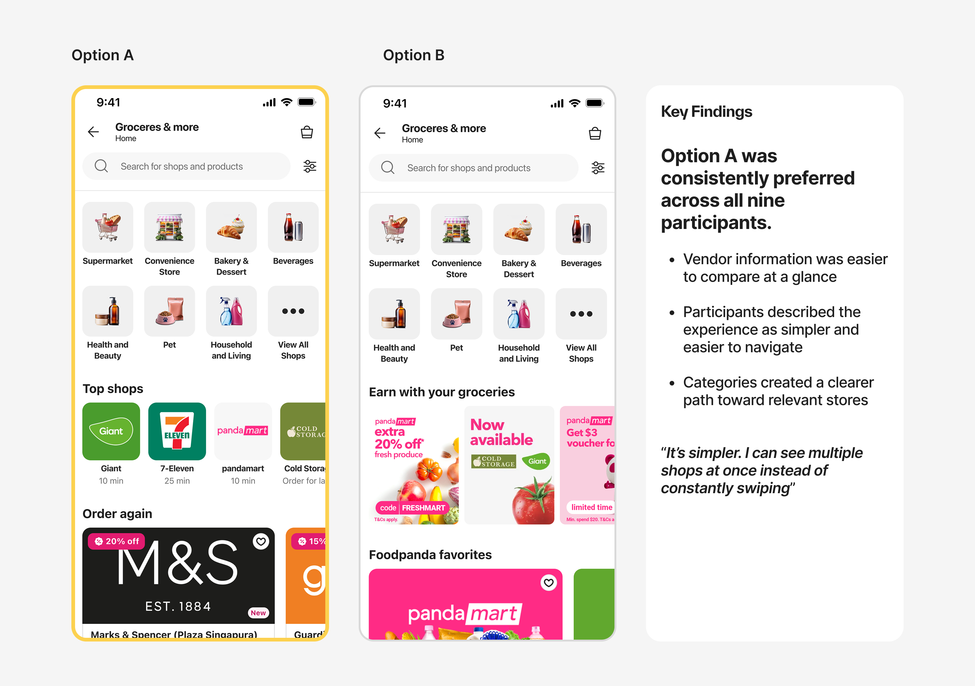
Outcome
Participants consistently preferred the vendor-first approach because it made store comparison easier, reduced scanning effort, and created a clearer path toward decision-making.
Final Solution
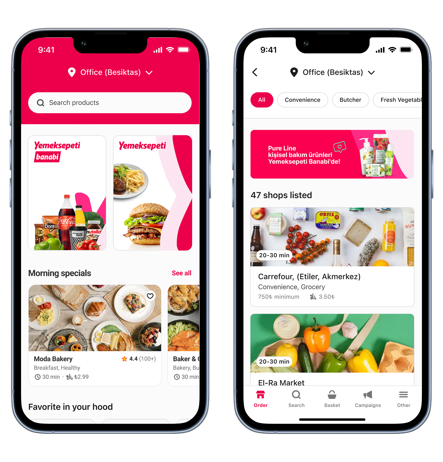
The final experience prioritized faster vendor discovery, clearer category navigation, and surfacing decision-making information earlier in the journey.
Designing for Faster Vendor Discovery
The final experience reduced navigation friction by surfacing categories, trusted vendors, and repeat-purchase pathways earlier in the journey.
By aligning the information hierarchy with real shopping behaviors, users could find relevant stores faster and move more confidently toward ordering.
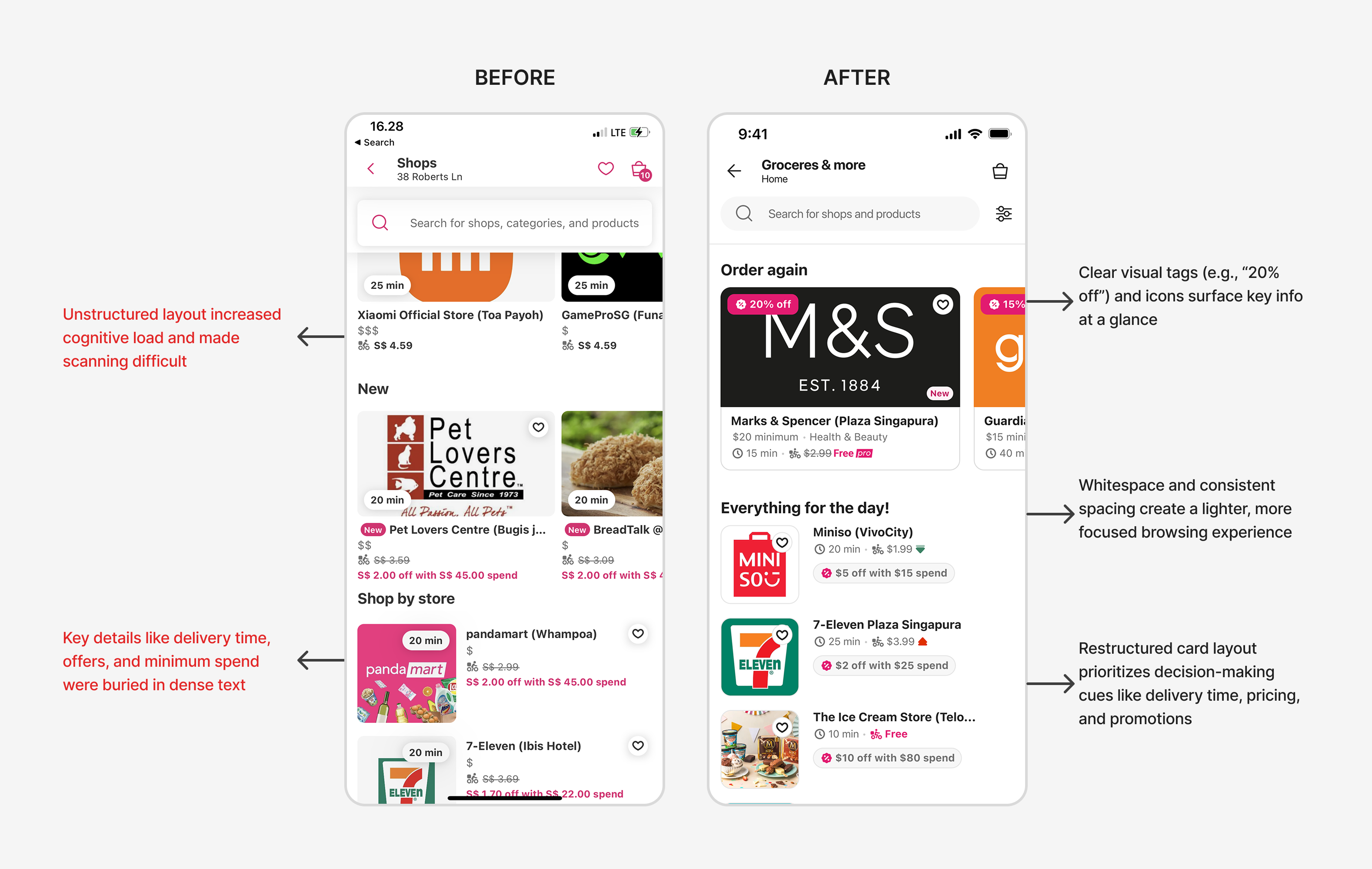
Improving Vendor Scanability
Vendor cards were redesigned to surface delivery time, pricing, and promotions more clearly, helping users compare options faster and make decisions with less effort.
Key Takeaways & Reflections
This project reminded me that discovery problems are not always solved by adding more content. The biggest impact came from reducing friction: clearer navigation, stronger vendor visibility, and better information hierarchy.
It also showed that stakeholder alignment is part of the design work itself; once we used research and behavioral data as the common ground, the team could move from opinions to better decisions.
Future Opportunities
I would further personalize discovery by adapting category and vendor prioritization based on user intent, order history, and shopping behavior, reducing the time required to find relevant stores.
Peer Feedback
While working with him on the Discovery Revamp project, he was open-minded, receptive to new methodologies, and willing to collaborate. These qualities help him do well with any problem space and working with new stakeholders and peers.

Shahzeb B.
Lead PD
Mehmet's ability to translate user insights and requirements into visually appealing and intuitive designs has significantly enhanced the usability and engagement of the Discovery Page.

Ahmet E.
PM
Mehmet's dedication to understanding users' needs reflects his work on significant projects like the Discovery Revamp. By testing his designs meticulously, Mehmet unearthed valuable insights.

Kelly Z.
UXR


Reframing Discovery Around User Behavior Across 3 Markets
Foodpanda’s discovery experience is one of the highest-traffic entry points for grocery and hyperlocal commerce, helping users browse and compare vendors before ordering.
The project focused on understanding why millions of users were browsing but not engaging, and redesigning discovery around the behaviors that actually drove ordering decisions.
ROLE
Sr. Product Designer
DOMAIN
E-Commerce
DURATION
6 Months
TEAM
PM, UXR, PA, Marketing, iOs & Android dev. team
Impact
By reducing navigation friction, improving vendor comparison, and surfacing decision-making information earlier, users were able to find relevant stores faster and move more confidently toward ordering.
+19.1%
Increase in
conversions
+76.4%
Increase in
click through rates
+0.86%
Increase in
order per user
Challenge
Users struggled to discover relevant vendors and make confident purchase decisions.
Despite attracting over 7.6 million visits, only 21% of users engaged with discovery modules, and engagement rarely translated into vendor exploration or ordering behavior.
The experience was optimized for promotional exposure, but users needed a faster way to navigate categories, compare vendors, and find relevant stores.
Impact on Users;
- Low engagement with discovery pathways
- Friction in vendor comparison and decision-making
- Increased abandonment before ordering
One Experience, Different Intentions
Research revealed that users weren’t visiting discovery for the same reason.
84% of orders were urgent and task-driven, while others used the experience to browse, compare products, and explore promotions before purchasing.
Discovery needed to support both behaviors without forcing users into a single path.
User Needs
Understanding Where Discovery Was Failing
I combined quantitative analysis with qualitative research across multiple markets to understand how users decide, browse, and purchase in quick commerce.
Key Insights
Users weren’t simply looking for a store.
Some wanted to complete a purchase as quickly as possible, while others used discovery to browse products, explore promotions, and build their basket.
The existing experience was optimized for merchandising and promotional exposure, but it wasn’t helping users efficiently navigate these different shopping missions.
Approach
Stakeholder Alignment
Aligning Business And User Needs
Users wanted to find vendors and complete purchases quickly, while marketing teams relied on discovery modules and promotional placements to drive campaign visibility.
As discovery became increasingly optimized for merchandising, it became harder for users to navigate efficiently.
This created a difficult question:
“How might we make discovery easier without reducing business visibility?”
To answer it, I facilitated workshops with product, marketing, and design stakeholders, using research findings and behavioral data to align on evaluation criteria before exploring solutions.
Exploration
To align business goals with user needs, I explored three alternative navigation models. Each approach represented a different balance between promotional visibility and user decision-making.
Option A — Marketing-Led Discovery
Outcome
Not selected because it improved visibility for campaigns but failed to address the discovery behaviors identified in research.
Option B — Balancing Discovery and Promotion
Outcome
Selected for usability testing because it balanced business visibility with improved navigation. However, testing revealed that users still struggled to prioritize information, resulting in slower decision-making compared to the vertical navigation approach.
Option C — Behavior-Driven Discovery
To prioritize faster decision-making, I explored a vendor-first discovery model that surfaced categories as navigation and organized content around vendor selection rather than promotional modules.
Outcome
Selected for usability testing because it created the clearest path from discovery to vendor selection while addressing the navigation issues identified during research.
Validation
Testing Alternative Discovery Models
To validate the proposed directions, I conducted moderated usability tests with nine participants across common grocery shopping scenarios.
Outcome
Participants consistently preferred the vendor-first approach because it made store comparison easier, reduced scanning effort, and created a clearer path toward decision-making.
Final Solution
The final experience prioritized faster vendor discovery, clearer category navigation, and surfacing decision-making information earlier in the journey.
Designing for Faster Vendor Discovery
The final experience reduced navigation friction by surfacing categories, trusted vendors, and repeat-purchase pathways earlier in the journey.
By aligning the information hierarchy with real shopping behaviors, users could find relevant stores faster and move more confidently toward ordering.
Improving Vendor Scanability
Vendor cards were redesigned to surface delivery time, pricing, and promotions more clearly, helping users compare options faster and make decisions with less effort.
Key Takeaways & Reflections
This project reminded me that discovery problems are not always solved by adding more content. The biggest impact came from reducing friction: clearer navigation, stronger vendor visibility, and better information hierarchy.
It also showed that stakeholder alignment is part of the design work itself; once we used research and behavioral data as the common ground, the team could move from opinions to better decisions.
Future Opportunities
I would further personalize discovery by adapting category and vendor prioritization based on user intent, order history, and shopping behavior, reducing the time required to find relevant stores.
Peer Feedback
While working with him on the Discovery Revamp project, he was open-minded, receptive to new methodologies, and willing to collaborate. These qualities help him do well with any problem space and working with new stakeholders and peers.
Shahzeb B.
Lead PD
Mehmet's ability to translate user insights and requirements into visually appealing and intuitive designs has significantly enhanced the usability and engagement of the Discovery Page.
Ahmet E.
PM
Mehmet's dedication to understanding users' needs reflects his work on significant projects like the Discovery Revamp. By testing his designs meticulously, Mehmet unearthed valuable insights.
Kelly Z.
UXR