Scaling an Account-Centric Home into a Multi-Product Financial Platform
DOA began as a digital wallet that received refunds from returned bottles. DOA Finance expanded this model into a broader financial platform (BaaS), but its single-account home could not support the upcoming product roadmap.
I led the product and experience direction for a modular home designed to scale across new accounts, cards, and financing products.
ROLE
Lead Product Designer
DOMAIN
Fintech
DURATION
3 Months
TEAM
PM, PA, UXR, Marketing
Impact
Supported DOA Finance’s rapid growth after launch.
In the first 24 days after launch, DOA Finance acquired 17.5K users while daily participation-account adoption and money-transfer activity increased significantly compared with the February–June baseline.
17.5K
New users acquired within
the first 24 days
19.7x
Increase in daily distinct
saving-account users
8.8x
Increase in daily
money transfers
Challenge
DOA Finance was evolving into a multi-product financial platform. However, its existing homepage was not designed to support this transition, creating business, product, and user challenges
Why This is Concerning?
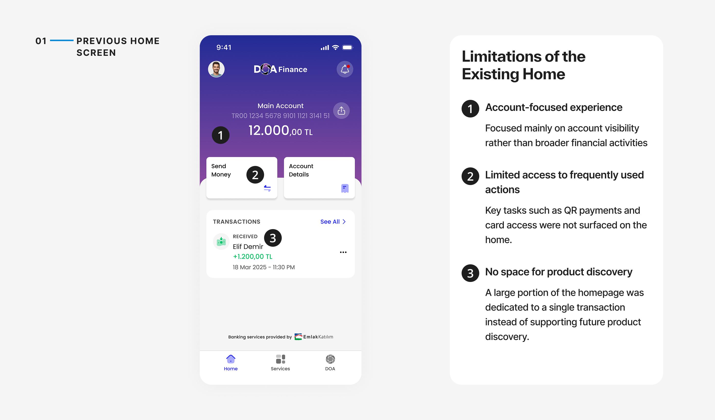
- User Experience Friction: Users needed fast access to everyday banking tasks, but unclear account information and buried actions added unnecessary friction.
- Business Friction: The existing homepage lacked the structure needed to introduce new products and encourage users to keep more financial activity within the ecosystem.
- Product & IA Bottleneck: The upcoming product roadmap introduced new financial products. Without a scalable structure, adding these experiences would create a fragmented information architecture and make future expansion harder.
Existing Experience
The original homepage was built around a wallet experience, prioritizing account visibility over broader financial activities.
Discovery Research & Insights
To understand how users manage their money and what they expect from a financial home,we conducted moderated interviews with existing and potential users.
1/ Users Rely on Financial Apps For Quick Actions
Users open the app to complete fast micro-tasks, but the existing home surface buried critical features like QR payments and digital card access.
Insight: The home screen must function as an action launcher rather than a passive account view.
6/7
Participants explicitly prioritized instant access to Send Money and QR Payments on the main screen.
2/ Users Need a Clear Overview of Their Financial State
Ambiguity around total versus usable funds created user anxiety upon opening the app.
Insight: A financial home should provide immediate clarity before asking users to take action.
7/7
Participants preferred a structured card layout explicitly highlighting "Available Balance".
3/ Users Engage with Financial Products when Relevance is Clear
Traditional promotional banners are typically ignored by users as irrelevant visual clutter.
Insight: Marketing placements must be framed around clear user benefits rather than aggressive sales pitches.
4/7
Participants expressed clear interest when offers were presented via benefit-led contextual opportunity cards.
Design Direction
Transforming a single-purpose wallet experience into a modular financial home that supports everyday banking and future product growth.
Approach
I started by exploring how the homepage could evolve beyond an account view into a flexible financial home for everyday tasks and future products.
Exploration
To define this foundation, I explored different models for how a financial home could organize accounts, actions, and product discovery.
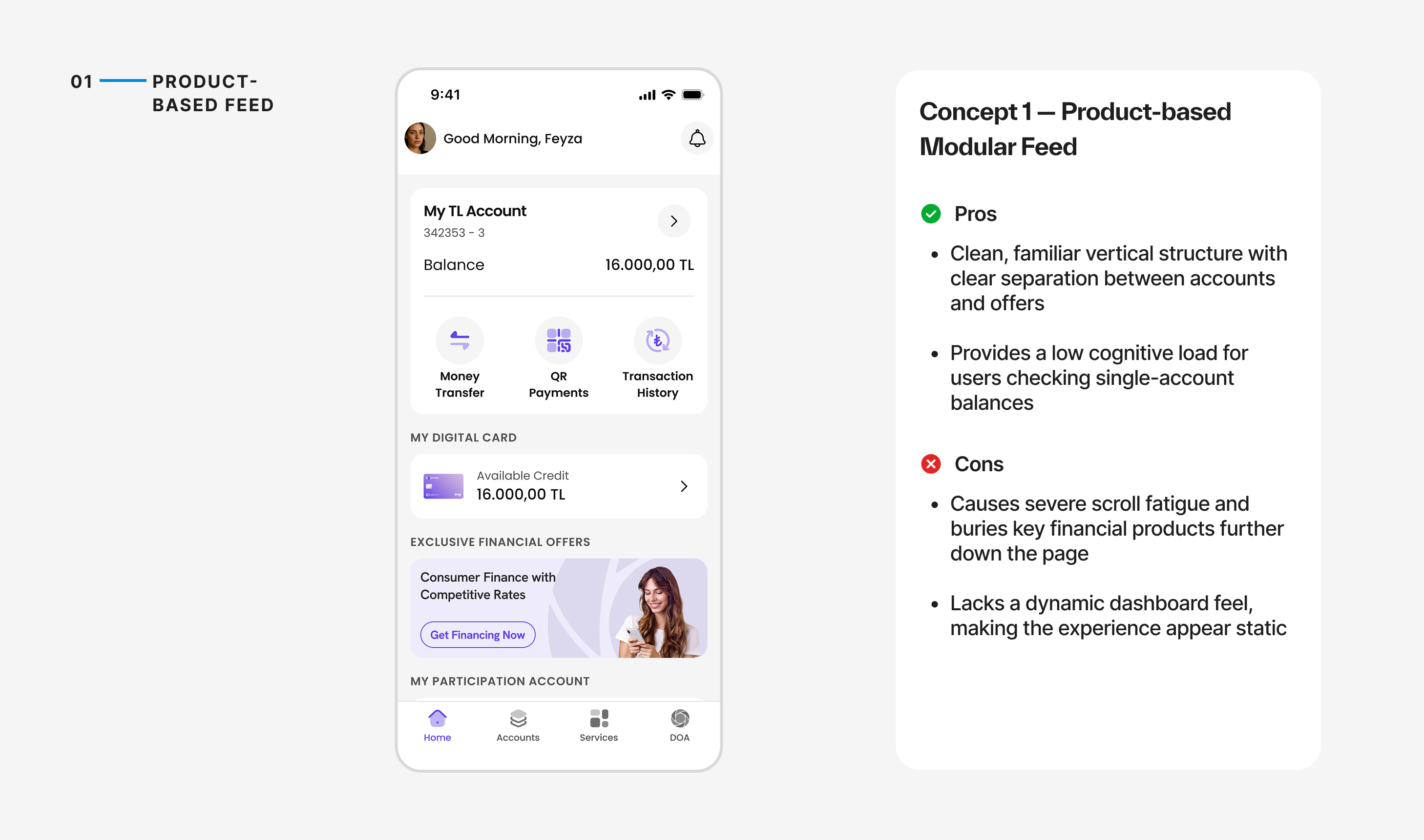
Concept 1 — Product-Based Modular Feed
Outcome
Not selected because created excessive vertical scroll fatigue. Burying new financial products at the bottom of the page failed to support the business's multi-product growth strategy.
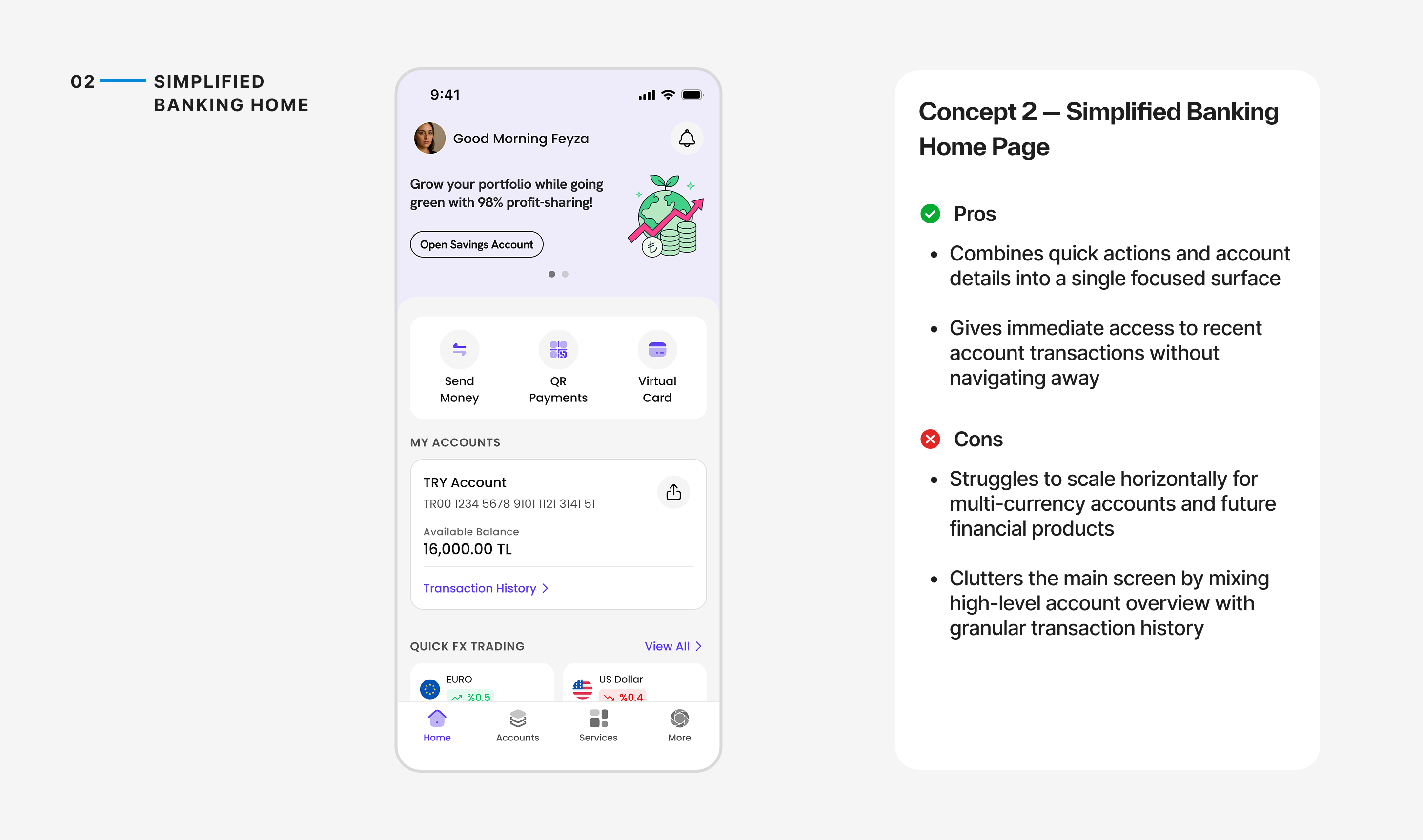
Concept 2 — Simplified Banking Home
Outcome
Not selected because remained locked in a single-account view and cluttered the home screen with transaction history, taking away valuable space needed for product discovery.
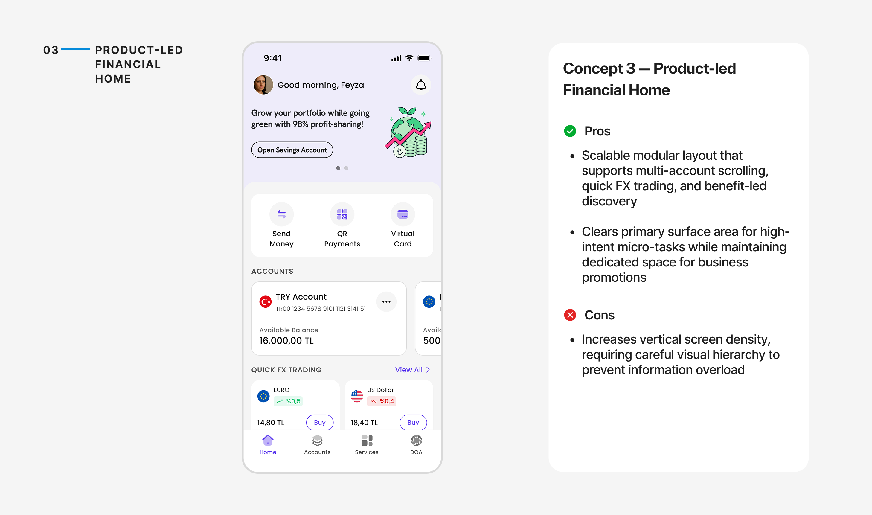
Concept 3 — Product-Led Financial Home
Combined quick actions, multiple accounts, and market products within a configurable modular home.
Outcome
Selected for validation because provided a truly scalable architecture, balancing fast micro-tasks with the flexibility to surface new accounts and financial products without breaking the experience.
Final Solution
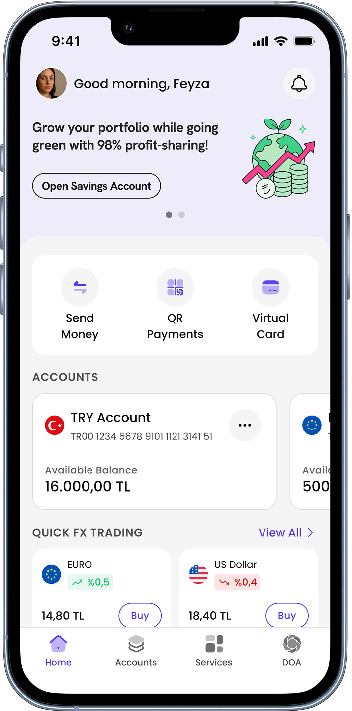
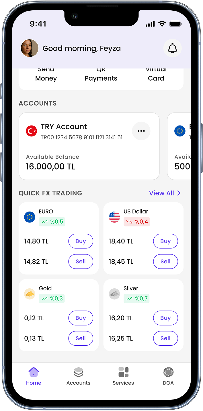
The selected direction combined quick access to everyday actions with a modular structure for accounts, product discovery, and future financial services.
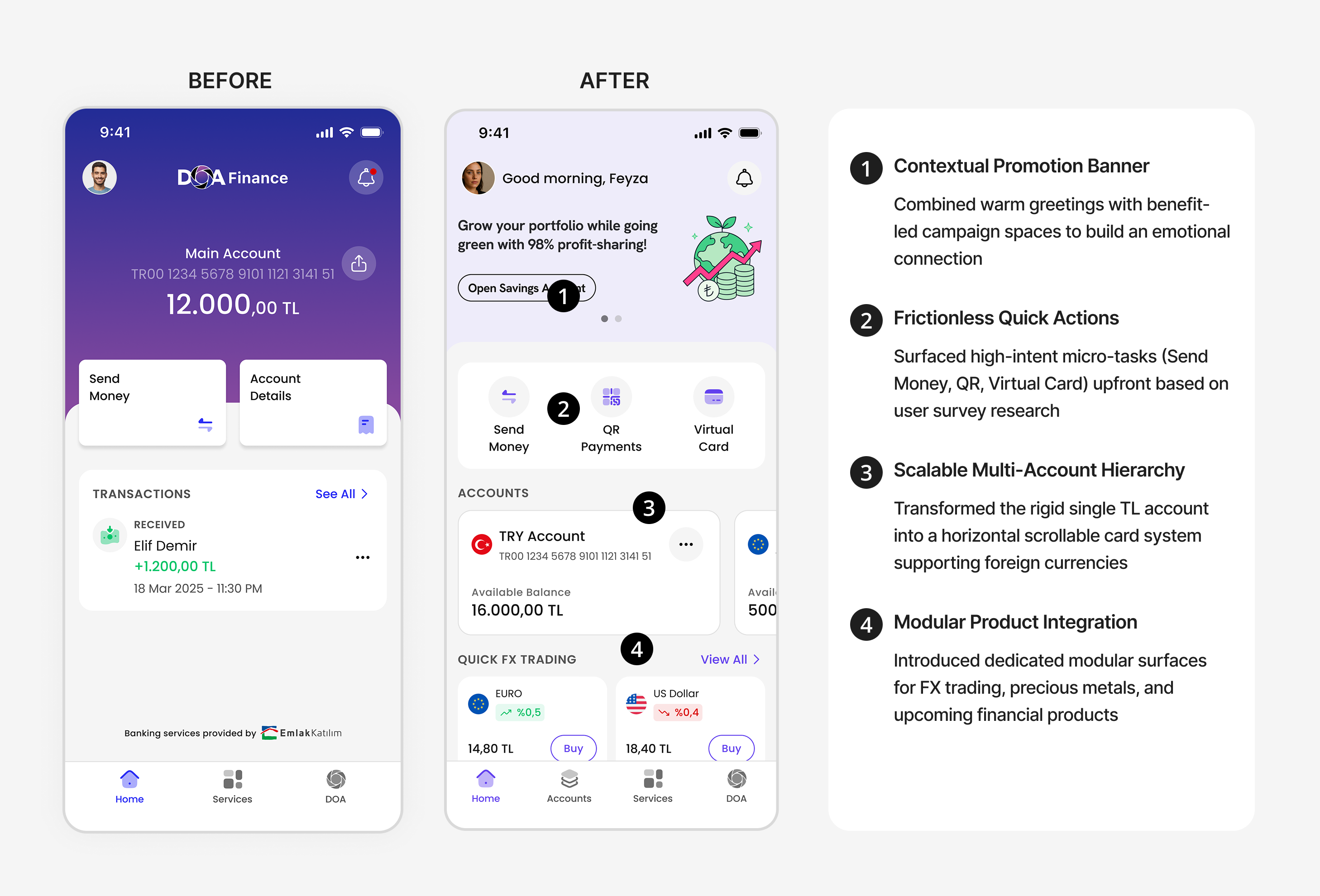
From a Single-Account Home to a Scalable Financial Dashboard
The redesign transformed a static, account-centric wallet into an intuitive and scalable financial dashboard.
By reorganizing the information architecture around daily user intent and modular product discovery, we created a seamless experience ready for future roadmap expansion.
Key Takeaways
Designing for a platform transition requires looking beyond the current interface to build systemic scalability. By replacing an account-centric view with a modular financial dashboard, we successfully balanced high-frequency user micro-tasks with business discovery goals.
Ultimately, using research evidence to guide feature prioritization and stakeholder tradeoffs proved that aligning business strategy with user intent creates the strongest foundation for product growth.



Scaling an Account-Centric Home into a Multi-Product Financial Platform
DOA began as a digital wallet that received refunds from returned bottles. DOA Finance expanded this model into a broader financial platform (BaaS), but its single-account home could not support the upcoming product roadmap.
I led the product and experience direction for a modular home designed to scale across new accounts, cards, and financing products.
ROLE
Lead Product Designer
DOMAIN
Fintech
DURATION
3 Months
TEAM
PM, PA, UXR, Marketing
Impact
Supported DOA Finance’s rapid growth after launch.
In the first 24 days after launch, DOA Finance acquired 17.5K users while daily participation-account adoption and money-transfer activity increased significantly compared with the February–June baseline.
17.5K
New users acquired within
the first 24 days
19.7x
Increase in engagement compared to the previous experience
8.8x
Marketplace launch /
validated a new business model
Challenge
DOA Finance was evolving into a multi-product financial platform. However, its existing homepage was not designed to support this transition, creating business, product, and user challenges
Why This is Concerning?
- User Experience Friction: Users needed fast access to everyday banking tasks, but unclear account information and buried actions added unnecessary friction.
- Business Friction: The existing homepage lacked the structure needed to introduce new products and encourage users to keep more financial activity within the ecosystem.
- Product & IA Bottleneck: The upcoming product roadmap introduced new financial products. Without a scalable structure, adding these experiences would create a fragmented information architecture and make future expansion harder.
Existing Experience
The original homepage was built around a wallet experience, prioritizing account visibility over broader financial activities.
Discovery Research & Insights
To understand how users manage their money and what they expect from a financial home,we conducted moderated interviews with existing and potential users.
1/ Users Rely on Financial Apps For Quick Actions
Users open the app to complete fast micro-tasks, but the existing home surface buried critical features like QR payments and digital card access.
Insight: The home screen must function as an action launcher rather than a passive account view.
6/7
Participants explicitly prioritized instant access to Send Money and QR Payments on the main screen.
7/7
Participants preferred a structured card layout explicitly highlighting "Available Balance".
2/ Users Need a Clear Overview of Their Financial State
Ambiguity around total versus usable funds created user anxiety upon opening the app.
Insight: A financial home should provide immediate clarity before asking users to take action.
3/ Users Engage with Financial Products when Relevance is Clear
Traditional promotional banners are typically ignored by users as irrelevant visual clutter.
Insight: Marketing placements must be framed around clear user benefits rather than aggressive sales pitches.
4/7
Participants expressed clear interest when offers were presented via benefit-led contextual opportunity cards.
Design Direction
Transforming a single-purpose wallet experience into a modular financial home that supports everyday banking and future product growth.
Approach
I started by exploring how the homepage could evolve beyond an account view into a flexible financial home for everyday tasks and future products.
Exploration
To define this foundation, I explored different models for how a financial home could organize accounts, actions, and product discovery.
Concept 1 — Product-Based Modular Feed
Outcome
Not selected because created excessive vertical scroll fatigue. Burying new financial products at the bottom of the page failed to support the business's multi-product growth strategy.
Concept 2 — Simplified Banking Home
Outcome
Not selected because remained locked in a single-account view and cluttered the home screen with transaction history, taking away valuable space needed for product discovery.
Concept 3 — Product-Led Financial Home
Combined quick actions, multiple accounts, and market products within a configurable modular home.
Outcome
Selected for validation because provided a truly scalable architecture, balancing fast micro-tasks with the flexibility to surface new accounts and financial products without breaking the experience.
Final Solution
The selected direction combined quick access to everyday actions with a modular structure for accounts, product discovery, and future financial services.
From a Single-Account Home to a Scalable Financial Dashboard
The redesign transformed a static, account-centric wallet into an intuitive and scalable financial dashboard.
By reorganizing the information architecture around daily user intent and modular product discovery, we created a seamless experience ready for future roadmap expansion.
Key Takeaways
Designing for a platform transition requires looking beyond the current interface to build systemic scalability. By replacing an account-centric view with a modular financial dashboard, we successfully balanced high-frequency user micro-tasks with business discovery goals.
Ultimately, using research evidence to guide feature prioritization and stakeholder tradeoffs proved that aligning business strategy with user intent creates the strongest foundation for product growth.
Scaling an Account-Centric Home into a Multi-Product Financial Platform
DOA began as a digital wallet that received refunds from returned bottles. DOA Finance expanded this model into a broader financial platform (BaaS), but its single-account home could not support the upcoming product roadmap.
I led the product and experience direction for a modular home designed to scale across new accounts, cards, and financing products.
ROLE
Lead Product Designer
DOMAIN
Fintech
DURATION
3 Months
TEAM
PM, PA, UXR, Marketing
Impact
Supported DOA Finance’s rapid growth after launch.
In the first 24 days after launch, DOA Finance acquired 17.5K users while daily participation-account adoption and money-transfer activity increased significantly compared with the February–June baseline.
17.5K
New users acquired within
the first 24 days
19.7x
Increase in daily distinct
saving-account users
8.8x
Increase in daily
money transfers
Challenge
DOA Finance was evolving into a multi-product financial platform. However, its existing homepage was not designed to support this transition, creating business, product, and user challenges
Why This is Concerning?
- User Experience Friction: Users needed fast access to everyday banking tasks, but unclear account information and buried actions added unnecessary friction.
- Business Friction: The existing homepage lacked the structure needed to introduce new products and encourage users to keep more financial activity within the ecosystem.
- Product & IA Bottleneck: The upcoming product roadmap introduced new financial products. Without a scalable structure, adding these experiences would create a fragmented information architecture and make future expansion harder.
Existing Experience
The original homepage was built around a wallet experience, prioritizing account visibility over broader financial activities.
Discovery Research & Insights
To understand how users manage their money and what they expect from a financial home,we conducted moderated interviews with existing and potential users.
1/ Users Rely on Financial Apps For
Quick Actions
Users open the app to complete fast micro-tasks, but the existing home surface buried critical features like QR payments and digital card access.
Insight: The home screen must function as an action launcher rather than a passive account view.
6/7
Participants explicitly prioritized instant access to Send Money and QR Payments on the main screen.
7/7
Participants preferred a structured card layout explicitly highlighting "Available Balance".
2/ Users Need a Clear Overview of
Their Financial State
Ambiguity around total versus usable funds created user anxiety upon opening the app.
Insight: A financial home should provide immediate clarity before asking users to take action.
3/ Users Engage with Financial Products when Relevance is Clear
Traditional promotional banners are typically ignored by users as irrelevant visual clutter.
Insight: Marketing placements must be framed around clear user benefits rather than aggressive sales pitches.
4/7
Participants expressed clear interest when offers were presented via benefit-led contextual opportunity cards.
Design Direction
Transforming a single-purpose wallet experience into a modular financial home that supports everyday banking and future product growth.
Approach
I started by exploring how the homepage could evolve beyond an account view into a flexible financial home for everyday tasks and future products.
Exploration
To define this foundation, I explored different models for how a financial home could organize accounts, actions, and product discovery.
Concept 1 — Product-Based Modular Feed
Outcome
Not selected because created excessive vertical scroll fatigue. Burying new financial products at the bottom of the page failed to support the business's multi-product growth strategy.
Concept 2 — Simplified Banking Home
Outcome
Not selected because remained locked in a single-account view and cluttered the home screen with transaction history, taking away valuable space needed for product discovery.
Concept 3 — Product-Led Financial Home
Combined quick actions, multiple accounts, and market products within a configurable modular home.
Outcome
Selected for validation because provided a truly scalable architecture, balancing fast micro-tasks with the flexibility to surface new accounts and financial products without breaking the experience.
Final Solution
The selected direction combined quick access to everyday actions with a modular structure for accounts, product discovery, and future financial services.
From a Single-Account Home to a Scalable Financial Dashboard
The redesign transformed a static, account-centric wallet into an intuitive and scalable financial dashboard.
By reorganizing the information architecture around daily user intent and modular product discovery, we created a seamless experience ready for future roadmap expansion.
Key Takeaways
Designing for a platform transition requires looking beyond the current interface to build systemic scalability. By replacing an account-centric view with a modular financial dashboard, we successfully balanced high-frequency user micro-tasks with business discovery goals.
Ultimately, using research evidence to guide feature prioritization and stakeholder tradeoffs proved that aligning business strategy with user intent creates the strongest foundation for product growth.