Discovery Redesign that Boosted Conversions by +19.1% Across 3 Markets

foodpanda, foodora & Yemeksepeti

Redesign

UX Research

Interaction Design

A/B Testing

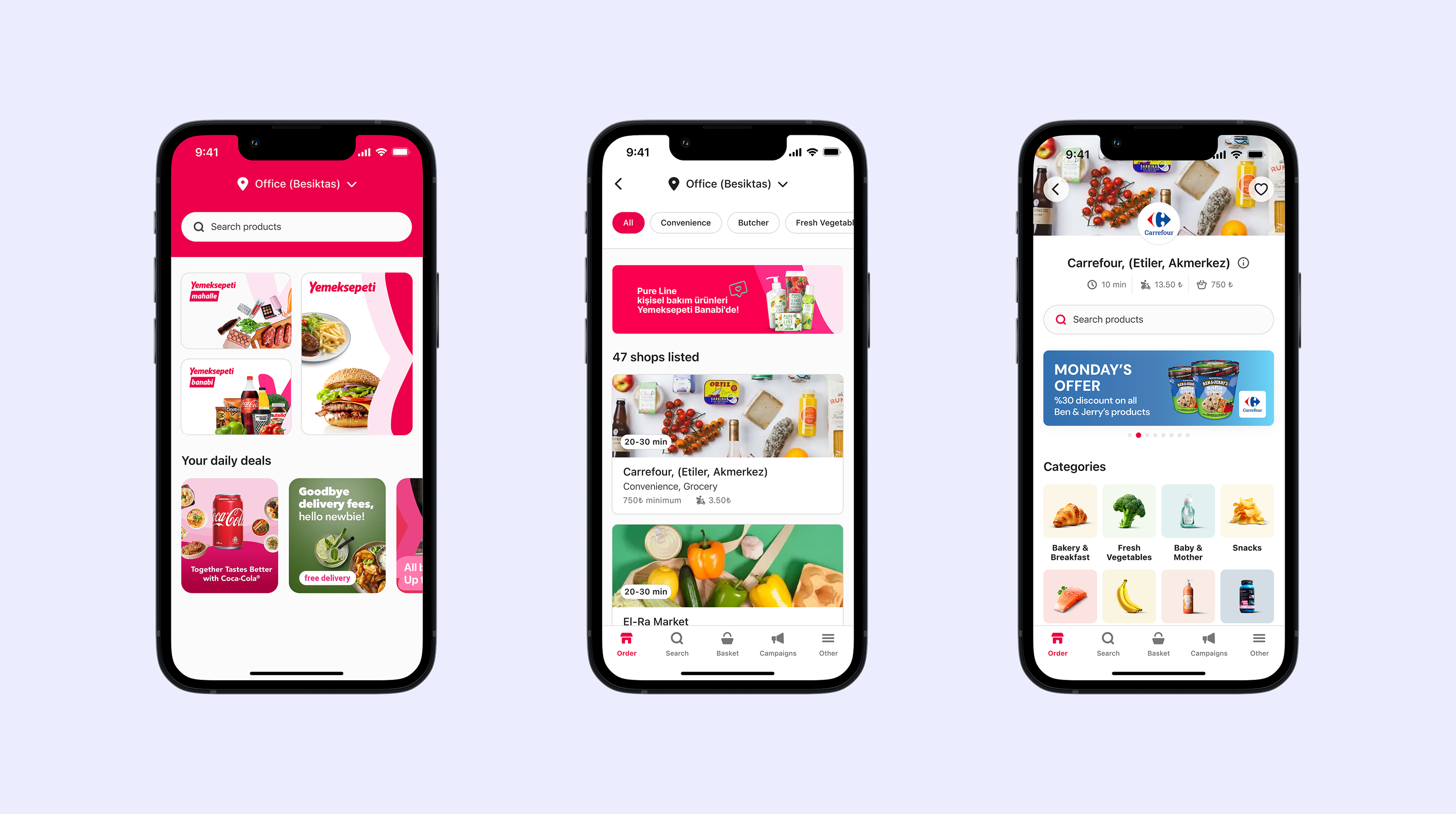
Across three major Delivery Hero brands, I led an end-to-end redesign of the discovery experience — from research to rollout. By surfacing high-intent moments, cutting friction, and rethinking navigation, we helped millions of shoppers find the right store faster, shop smarter, and convert more often.

My Role

I redesigned the discovery experience, translating complex multi-market problems into intuitive mobile flows that balanced business priorities with user needs.


I was responsible for leading the end-to-end redesign of the discovery experience covering everything from user research and ideation to prototyping, usability testing, and final delivery.

Team

Ahmet E.

(PM)

Kelly Z.

(UXR)

Josh H.

(PA)

Engineers

(10+)

Duration

March 2023 - July 2023

The Challenge

The discovery page shapes how users browse, compare, and decide where to order. Our research across multiple markets revealed two main shopping modes: urgent (84% of Q-commerce orders placed within one hour of adding to cart) and exploratory browsing.


The existing discovery flow didn’t support either mode well. It made it hard for users to find a single store that could fulfill their entire order, causing wasted time, extra delivery fees from multi-vendor checkouts, and more drop-offs.


  • Low engagement with vendor discovery. (10% click, 0.15% conversion).
  • Layout and components placement misaligned with user priorities in both urgent and browsing scenarios.
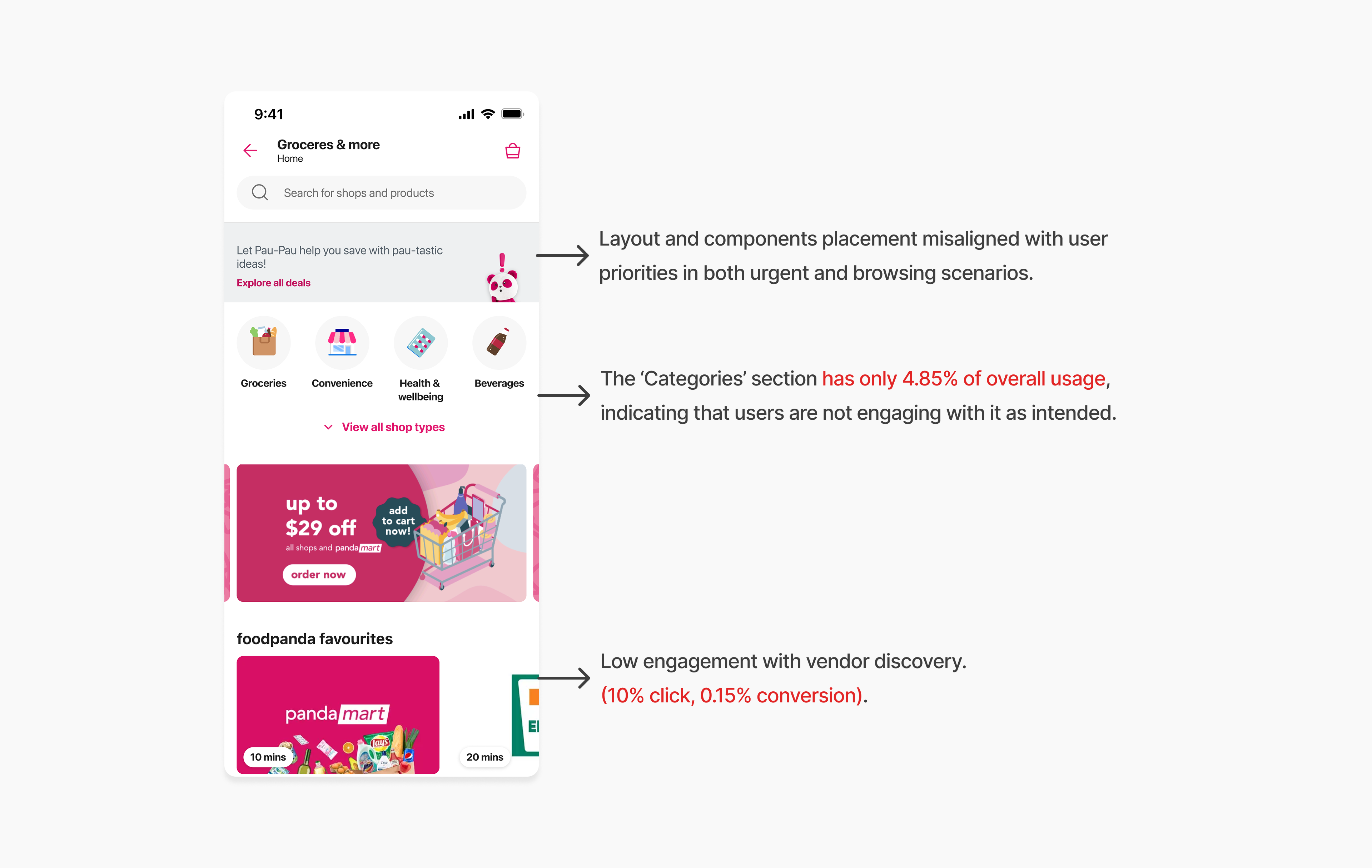
Previous “above the fold”
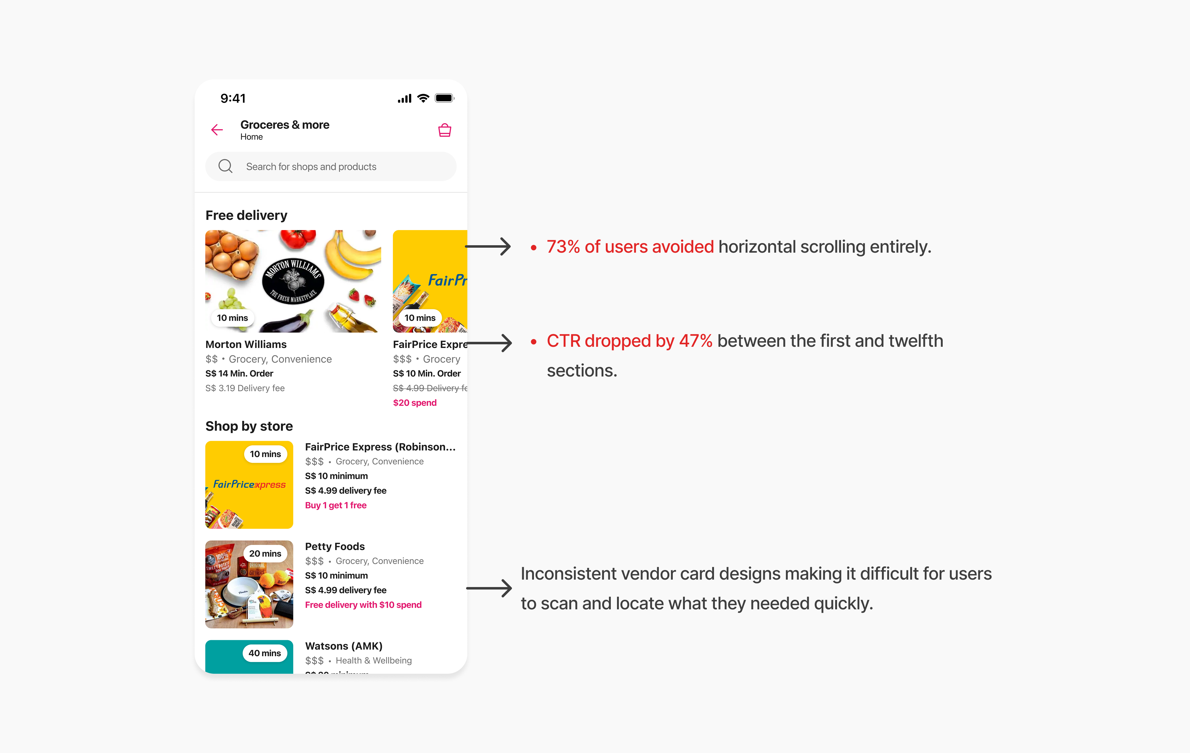
Previous vendor listing and navigation

User & Business Goals

User Goals:

  • Quickly find and reorder and explore new options.
  • Compare vendors based on availability, price, and delivery time at a glance.
  • Have a discovery experience that matches shopping intent — urgent or exploratory.


Business Goals:

  • Increase conversion rate by making the discovery flow faster and reducing friction.
  • Boost order volume by surfacing more relevant vendors and products.
  • Encourage adoption of new vendors.

Hearing It From the Users

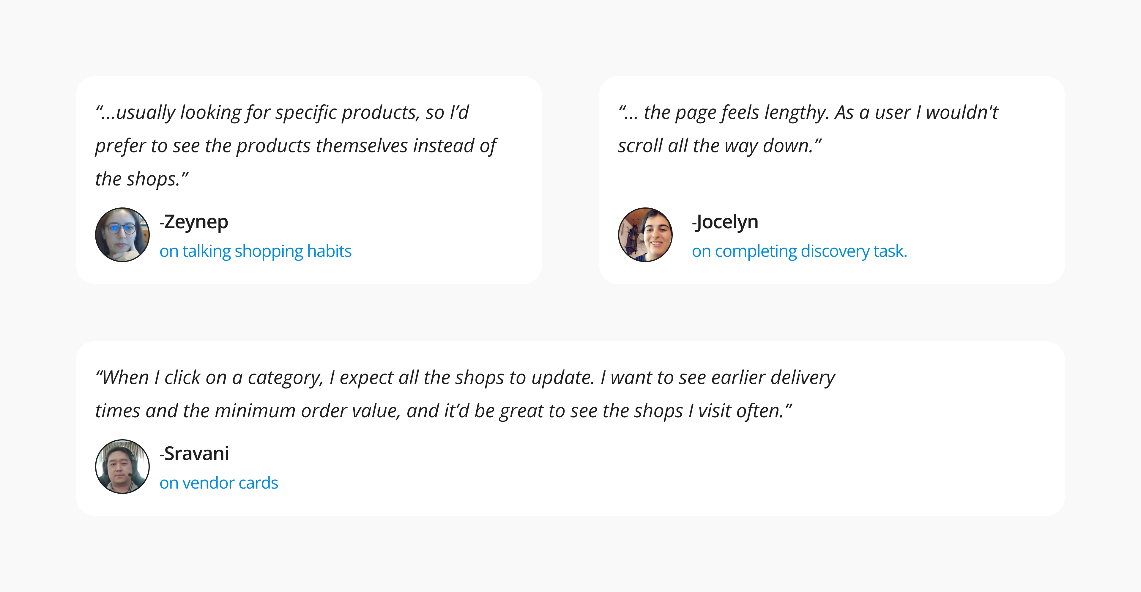
Before jumping into solutions, I conducted interviews and collaborated with researchers to deep-dive into discovery research — including grocery use case analysis and usability testing of discovery flows.


Key Insights:


  • Priority hierarchy: Availability → Price & promos → Delivery cost → ETA.
  • High-intent triggers: “Order Again” and “Top Shops” drove the fastest conversions.
  • Trust cues: Brand logos, delivery badges, and dietary labels boosted adoption of new vendors.
  • Category navigation: Users preferred exposed categories at the top for quick scanning.


These insights shaped how I prioritised the interface and restructured information to match user decision-making patterns.
Design Actions

Throughout the redesign, I designed new, reusable components and developed marketing-focused strategies to better highlight vendors and their products — giving users quicker access to relevant offers and trusted shops.


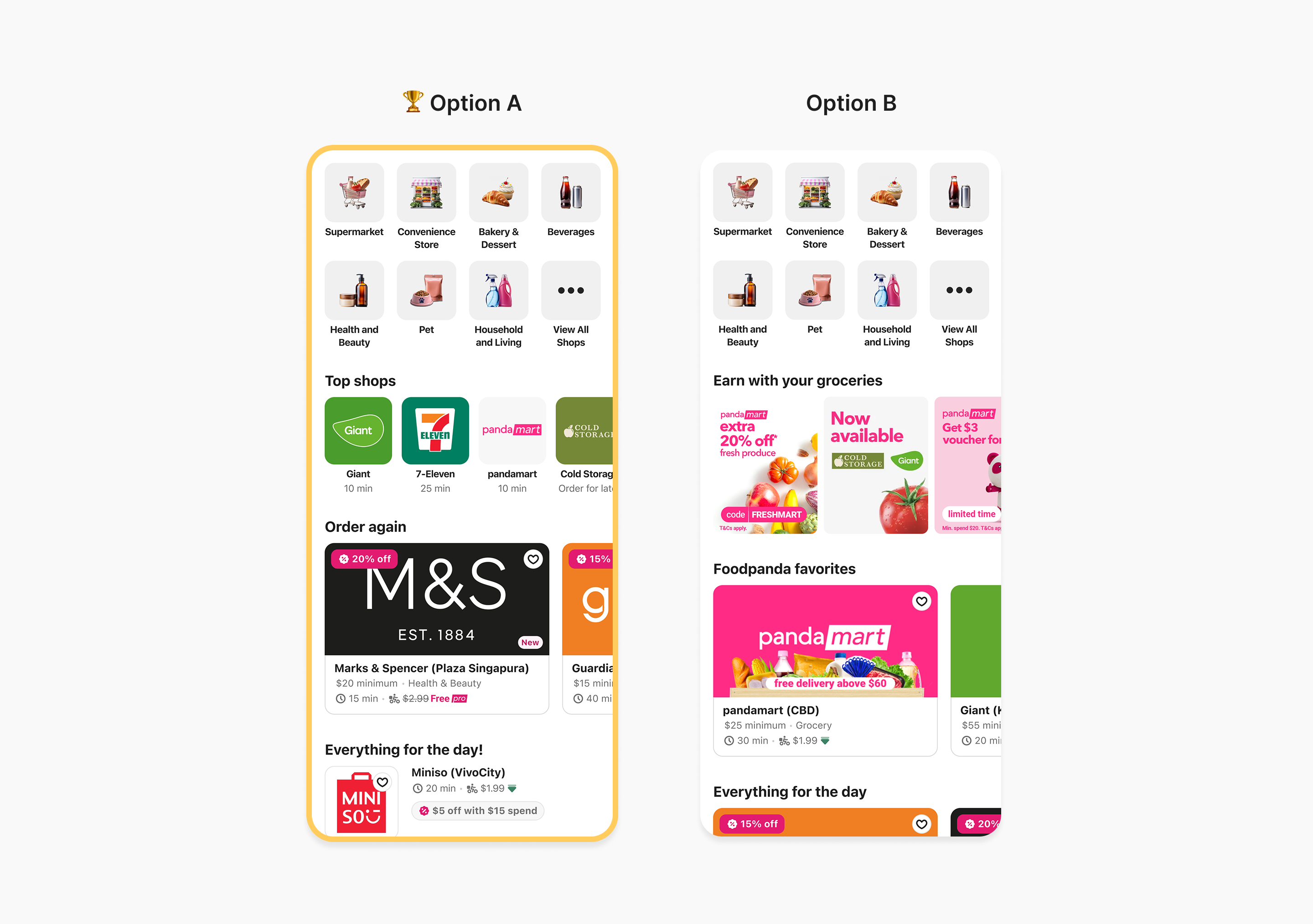
To validate the new direction, I conducted a moderated usability test with nine participants, presenting two design alternatives for the listing experience. The vendor-focused layout emerged as the clear winner — helping users compare options at a glance, scan faster, and make confident purchase decisions with fewer interactions.


Key insights;


  • Users called the design vendor-focused, simple, and easy to navigate. One noted, “It’s simpler, with four shops on one screen instead of endless swiping.
  • Showing key vendor info upfront sped up comparisons, reduced scrolling, and improved decision-making.
  • The organized categories gave a sense of completeness and control.

Improving Visibility and Engagement on the First Page

I started the redesign by reworking the above the fold ( first page) which suffered from low engagement due to abstract icons, visual inconsistency.


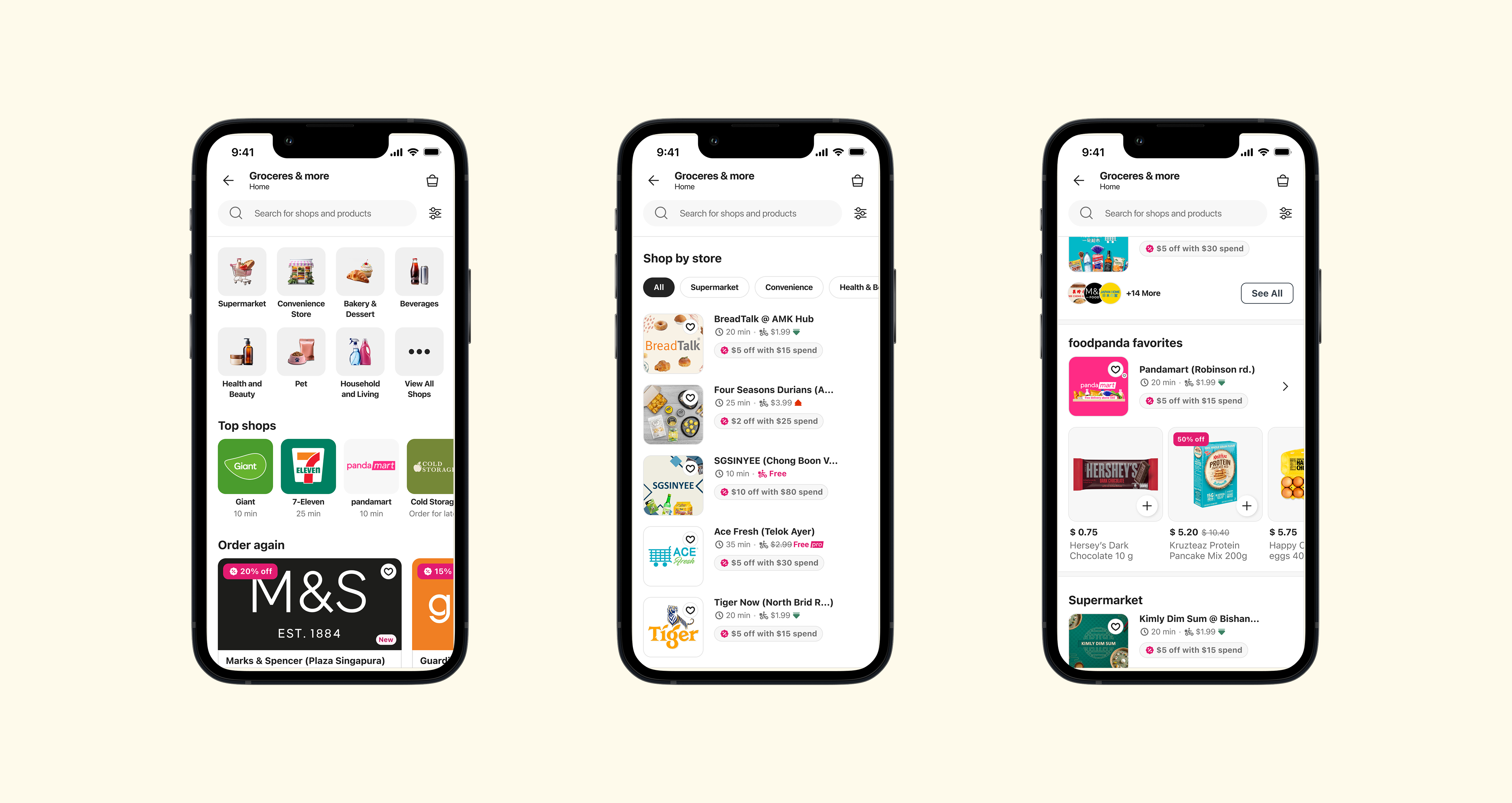
  • Since 84% of orders happen within an hour of adding the first item to cart, I prioritized speed and clarity in the UI — surfacing high-intent modules like ‘Order Again’ and reducing visual friction in vendor cards.
  • I also redesigned the categories to feature real images—responding to user feedback that abstract icons created uncertainty.

Redesigning Navigation for Better Usability

After redesigning the first page, I tackled a major usability issue on the listing page: the horizontal navigation buried shop content and caused scroll fatigue.


I replaced it with a floating vertical navigation, enabling users to switch categories without losing context. Based on click data, I also restructured and renamed outdated categories to improve clarity and orientation.

BEFORE

AFTER

Redesigning Vendor Cards for Clarity and Engagement

After the navigation redesign, I shifted focus to vendor cards — the moment where users decide to engage.


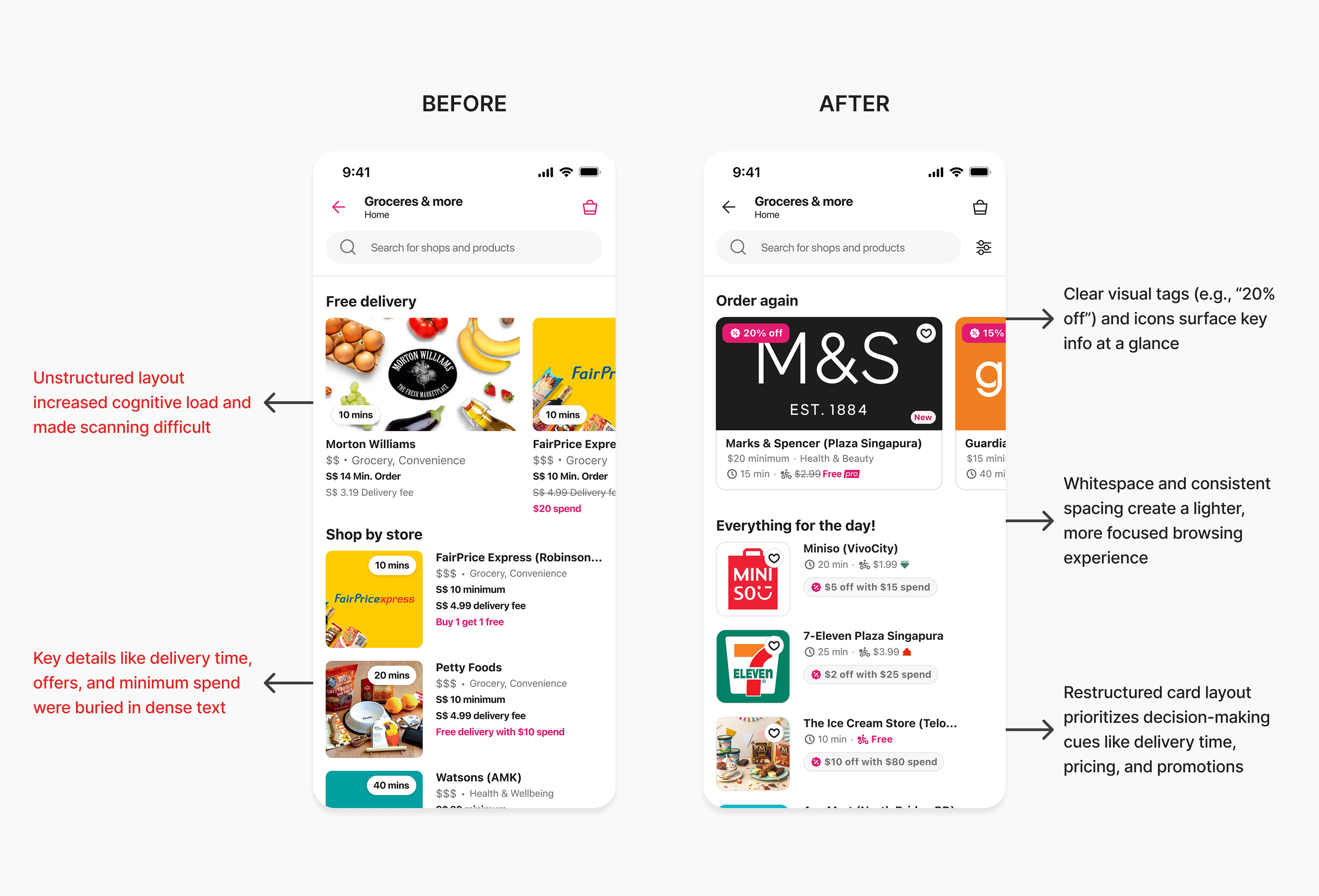
Research showed that returning users arrive with a clear goal and tend to trust familiar vendors. To speed up decision-making, I surfaced the most critical details — delivery time, fees, promotions, and trust signals — directly on the card.


I also restructured the layout with a sharper visual hierarchy, consistent spacing, and refined typography, making cards easier to scan and reducing friction for high-intent shoppers.

Impacts

+19.1%

Increase In

Conversion Rates

+76.4%

Increase In

Click Through Rates

+0.86%

Increase In

Orders Per User

Next Steps

  • We’re exploring a ratings and reviews system to support indecisive users and help them feel more confident in their choices.


  • On the business side, the next phase will focus on measuring component performance—identifying which modules drive engagement, and using those insights to evolve a more targeted, data-informed listing strategy.

Reflections

  • Designing for three brands across multiple markets was one of the toughest—and most valuable—parts of this project. Balancing consistency with localization required tough decisions on layout, labeling, and content hierarchy.


  • User research at every stage helped us navigate that complexity. It gave us the clarity to move faster and the confidence to prioritize what truly mattered to users.


  • This experience reinforced a core belief for me: great design isn’t just about solving problems—it’s about aligning people, insights, and intent.

Thank You

Discovery Redesign that Boosted Conversions by +19.1% Across 3 Markets

foodpanda, foodora & Yemeksepeti

Redesign

UX Research

Interaction Design

A/B Testing

Across three major Delivery Hero brands, I led an end-to-end redesign of the discovery experience — from research to rollout. By surfacing high-intent moments, cutting friction, and rethinking navigation, we helped millions of shoppers find the right store faster, shop smarter, and convert more often.

My Role

I redesigned the discovery experience, translating complex multi-market problems into intuitive mobile flows that balanced business priorities with user needs.


I was responsible for leading the end-to-end redesign of the discovery experience covering everything from user research and ideation to prototyping, usability testing, and final delivery.

Team

Ahmet E.

(PM)

Kelly Z.

(UXR)

Josh H.

(PA)

Engineers

(10+)

Duration

March 2023 - July 2023

The Challenge

The discovery page shapes how users browse, compare, and decide where to order. Our research across multiple markets revealed two main shopping modes: urgent (84% of Q-commerce orders placed within one hour of adding to cart) and exploratory browsing.


The existing discovery flow didn’t support either mode well. It made it hard for users to find a single store that could fulfill their entire order, causing wasted time, extra delivery fees from multi-vendor checkouts, and more drop-offs.


  • Low engagement with vendor discovery. (10% click, 0.15% conversion).
  • Layout and components placement misaligned with user priorities in both urgent and browsing scenarios.

Previous “above the fold”

Previous vendor listing and navigation

User & Business Goals

User Goals:

  • Quickly find and reorder and explore new options.
  • Compare vendors based on availability, price, and delivery time at a glance.
  • Have a discovery experience that matches shopping intent — urgent or exploratory.


Business Goals:

  • Increase conversion rate by making the discovery flow faster and reducing friction.
  • Boost order volume by surfacing more relevant vendors and products.
  • Encourage adoption of new vendors.

Hearing It From the Users

Before jumping into solutions, I conducted interviews and collaborated with researchers to deep-dive into discovery research — including grocery use case analysis and usability testing of discovery flows.


Key Insights:


  • Priority hierarchy: Availability → Price & promos → Delivery cost → ETA.
  • High-intent triggers: “Order Again” and “Top Shops” drove the fastest conversions.
  • Trust cues: Brand logos, delivery badges, and dietary labels boosted adoption of new vendors.
  • Category navigation: Users preferred exposed categories at the top for quick scanning.


These insights shaped how I prioritised the interface and restructured information to match user decision-making patterns.
Design Actions

Throughout the redesign, I designed new, reusable components and developed marketing-focused strategies to better highlight vendors and their products — giving users quicker access to relevant offers and trusted shops.


To validate the new direction, I conducted a moderated usability test with nine participants, presenting two design alternatives for the listing experience. The vendor-focused layout emerged as the clear winner — helping users compare options at a glance, scan faster, and make confident purchase decisions with fewer interactions.


Key insights;


  • Users called the design vendor-focused, simple, and easy to navigate. One noted, “It’s simpler, with four shops on one screen instead of endless swiping.
  • Showing key vendor info upfront sped up comparisons, reduced scrolling, and improved decision-making.
  • The organized categories gave a sense of completeness and control.

Improving Visibility and Engagement on the First Page

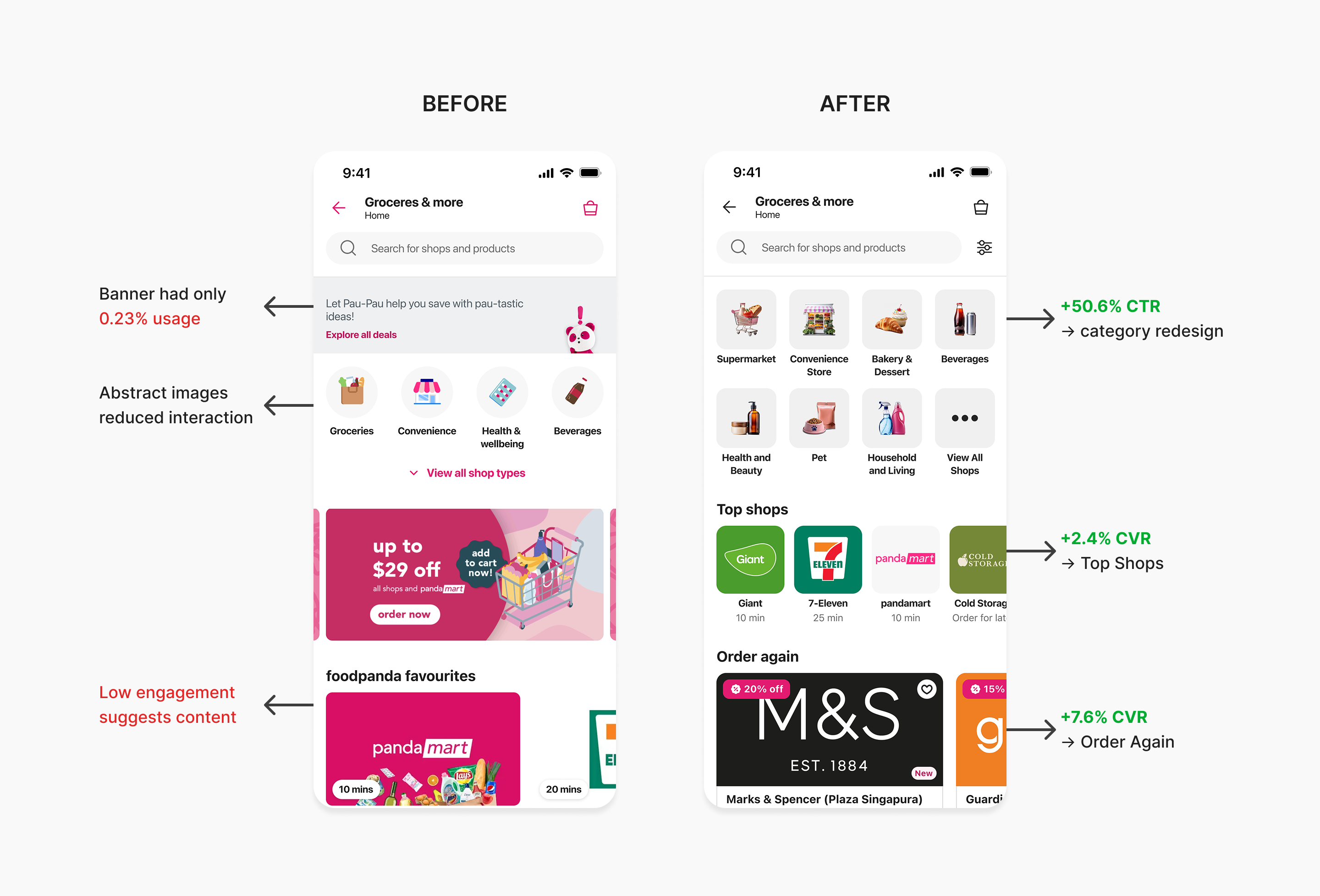
I started the redesign by reworking the above the fold ( first page) which suffered from low engagement due to abstract icons, visual inconsistency.


  • Since 84% of orders happen within an hour of adding the first item to cart, I prioritized speed and clarity in the UI — surfacing high-intent modules like ‘Order Again’ and reducing visual friction in vendor cards.
  • I also redesigned the categories to feature real images—responding to user feedback that abstract icons created uncertainty.

Redesigning Navigation for Better Usability

After redesigning the first page, I tackled a major usability issue on the listing page: the horizontal navigation buried shop content and caused scroll fatigue.


I replaced it with a floating vertical navigation, enabling users to switch categories without losing context. Based on click data, I also restructured and renamed outdated categories to improve clarity and orientation.

BEFORE

AFTER

Redesigning Vendor Cards for Clarity and Engagement

After the navigation redesign, I shifted focus to vendor cards — the moment where users decide to engage.


Research showed that returning users arrive with a clear goal and tend to trust familiar vendors. To speed up decision-making, I surfaced the most critical details — delivery time, fees, promotions, and trust signals — directly on the card.


I also restructured the layout with a sharper visual hierarchy, consistent spacing, and refined typography, making cards easier to scan and reducing friction for high-intent shoppers.

Impacts

+19.1%

Increase In

Conversion Rates

+76.4%

Increase In

Click Through Rates

+0.86%

Increase In

Orders Per User

Next Steps

  • We’re exploring a ratings and reviews system to support indecisive users and help them feel more confident in their choices.


  • On the business side, the next phase will focus on measuring component performance—identifying which modules drive engagement, and using those insights to evolve a more targeted, data-informed listing strategy.

Reflections

  • Designing for three brands across multiple markets was one of the toughest—and most valuable—parts of this project. Balancing consistency with localization required tough decisions on layout, labeling, and content hierarchy.


  • User research at every stage helped us navigate that complexity. It gave us the clarity to move faster and the confidence to prioritize what truly mattered to users.


  • This experience reinforced a core belief for me: great design isn’t just about solving problems—it’s about aligning people, insights, and intent.

Thank You

Discovery Redesign that Boosted Conversions by +19.1% Across 3 Markets

foodpanda, foodora & Yemeksepeti

Redesign

UX Research

Interaction Design

A/B Testing

Across three major Delivery Hero brands, I led an end-to-end redesign of the discovery experience — from research to rollout. By surfacing high-intent moments, cutting friction, and rethinking navigation, we helped millions of shoppers find the right store faster, shop smarter, and convert more often.

My Role

I redesigned the discovery experience, translating complex multi-market problems into intuitive mobile flows that balanced business priorities with user needs.


I was responsible for leading the end-to-end redesign of the discovery experience covering everything from user research and ideation to prototyping, usability testing, and final delivery.

Team

Ahmet E.

(PM)

Kelly Z.

(UXR)

Josh H.

(PA)

Engineers

(10+)

Duration

March 2023 - July 2023

The Challenge

The discovery page shapes how users browse, compare, and decide where to order. Our research across multiple markets revealed two main shopping modes: urgent (84% of Q-commerce orders placed within one hour of adding to cart) and exploratory browsing.


Yet the existing discovery flow didn’t support either mode well. It made it hard for users to find a single store that could fulfill their entire order, causing wasted time, extra delivery fees from multi-vendor checkouts, and more drop-offs.

Previous “above the fold”

Previous vendor listing and navigation

User & Business Goals

User Goals:

  • Quickly find and reorder and explore new options.
  • Compare vendors based on availability, price, and delivery time at a glance.
  • Have a discovery experience that matches shopping intent — urgent or exploratory.


Business Goals:

  • Increase conversion rate by making the discovery flow faster and reducing friction.
  • Boost order volume by surfacing more relevant vendors and products.
  • Encourage adoption of new vendors.

Hearing It From the Users

Before jumping into solutions, I conducted interviews and collaborated with researchers to deep-dive into discovery research — including grocery use case analysis and usability testing of discovery flows.


Key Insights:


  • Priority hierarchy: Availability → Price & promos → Delivery cost → ETA.
  • High-intent triggers: “Order Again” and “Top Shops” drove the fastest conversions.
  • Trust cues: Brand logos, delivery badges, and dietary labels boosted adoption of new vendors.
  • Category navigation: Users preferred exposed categories at the top for quick scanning.


These insights shaped how I prioritised the interface and restructured information to match user decision-making patterns.

Design Actions

Throughout the redesign, I designed new, reusable components and developed marketing-focused strategies to better highlight vendors and their products — giving users quicker access to relevant offers and trusted shops.


To validate the new direction, I conducted a moderated usability test with nine participants, presenting two design alternatives for the listing experience. The vendor-focused layout emerged as the clear winner — helping users compare options at a glance, scan faster, and make confident purchase decisions with fewer interactions.


Key insights;


  • Users called the design vendor-focused, simple, and easy to navigate. One noted, “It’s simpler, with four shops on one screen instead of endless swiping.
  • Showing key vendor info upfront sped up comparisons, reduced scrolling, and improved decision-making.
  • The organized categories gave a sense of completeness and control.

Improving Visibility and Engagement on the First Page

I started the redesign by reworking the above the fold ( first page) which suffered from low engagement due to abstract icons, visual inconsistency.


  • Since 84% of orders happen within an hour of adding the first item to cart, I prioritized speed and clarity in the UI — surfacing high-intent modules like ‘Order Again’ and reducing visual friction in vendor cards.
  • I also redesigned the categories to feature real images—responding to user feedback that abstract icons created uncertainty.

Redesigning Navigation for Better Usability

After redesigning the first page, I tackled a major usability issue on the listing page: the horizontal navigation buried shop content and caused scroll fatigue.


I replaced it with a floating vertical navigation, enabling users to switch categories without losing context. Based on click data, I also restructured and renamed outdated categories to improve clarity and orientation.

BEFORE

AFTER

Redesigning Vendor Cards for Clarity and Engagement

After the navigation redesign, I shifted focus to vendor cards — the moment where users decide to engage.


Research showed that returning users arrive with a clear goal and tend to trust familiar vendors. To speed up decision-making, I surfaced the most critical details — delivery time, fees, promotions, and trust signals — directly on the card.


I also restructured the layout with a sharper visual hierarchy, consistent spacing, and refined typography, making cards easier to scan and reducing friction for high-intent shoppers.

Impacts

+19.1%

Increase In

Conversion Rates

+76.4%

Increase In

Click Through Rates

+0.86%

Increase In

Orders Per User

Next Steps

  • We’re exploring a ratings and reviews system to support indecisive users and help them feel more confident in their choices.


  • On the business side, the next phase will focus on measuring component performance—identifying which modules drive engagement, and using those insights to evolve a more targeted, data-informed listing strategy.

Reflections

  • Designing for three brands across multiple markets was one of the toughest—and most valuable—parts of this project. Balancing consistency with localization required tough decisions on layout, labeling, and content hierarchy.


  • User research at every stage helped us navigate that complexity. It gave us the clarity to move faster and the confidence to prioritize what truly mattered to users.


  • This experience reinforced a core belief for me: great design isn’t just about solving problems—it’s about aligning people, insights, and intent.

Thank You