Redesigning the Discovery Experience of Foodpanda
Introduction
In 2023, I redesigned Foodpanda's discovery experience, transforming how over 20 million users discover and engage with vendors across categories. This project included a complete revamp of the vendor listing page, browsing experience, navigation, and the design of a brand-new filter experience to address key user pain points.
My Role
Over six months, I led the end-to-end redesign process—from research to high-fidelity designs—resulting in a more intuitive and engaging user experience.
The Team

Ahmet Ertas
PM

Kelly Zhang
UXR

Josh Ho
PA

DevOps
+10 People
duration
March 2023 - July 2023
Problem
The discovery experience on Foodpanda faced significant challenges in driving user engagement and vendor exploration due to an outdated design and an ineffective navigation structure. Analytics revealed that users struggled to explore vendor options efficiently, leading to diminished user satisfaction and reduced vendor visibility.
1
2
Lack of user engagement in discovery
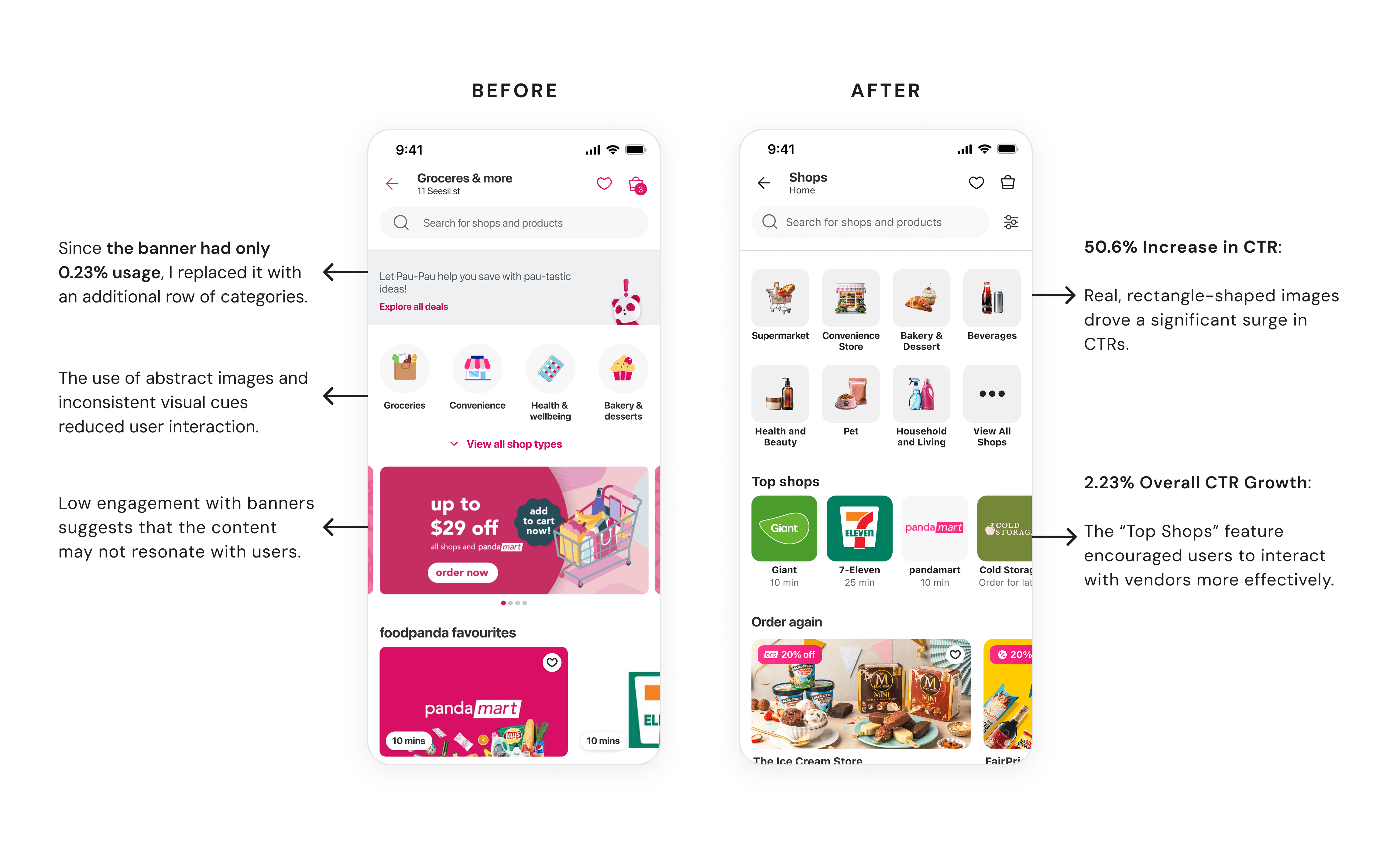
Users struggle to discover shop categories effectively, resulting in frustration and missed opportunities, as reflected in the ‘Categories’ section’s low engagement rate of just 10.85%.
With less than 2% engagement, banners are underutilized—a missed opportunity to highlight key offers or enhance the user experience.
previous above-the-fold

Challenges in exploration And navıgatıon
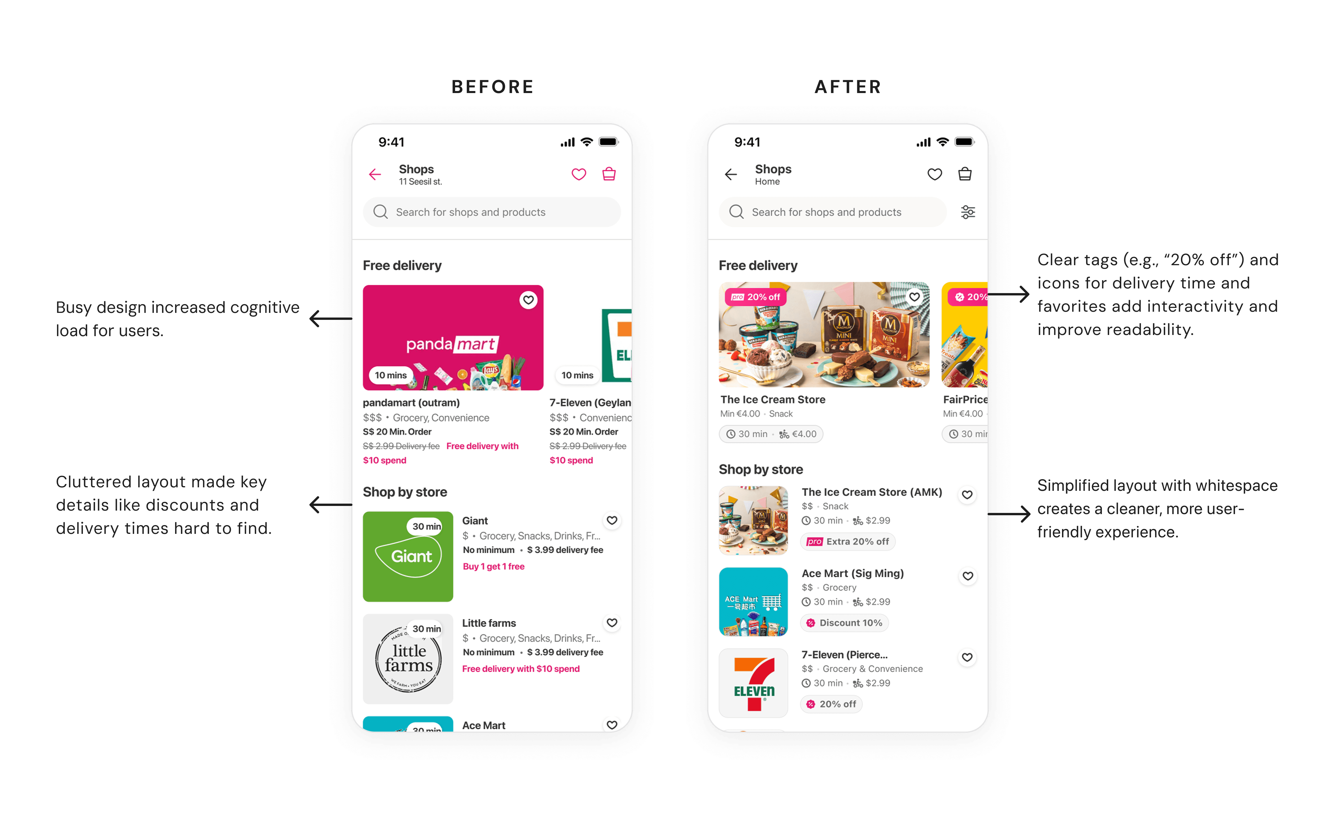
Horizontal scrolling discouraged exploration, with 73% of users avoiding it entirely and CTR dropping 50% from the first to the twelfth section.
High Cognitive Load: Inconsistent vendor card designs create significant barriers to vendor exploration, making it difficult for users to scan and find what they need quickly.
previous navigation and vendor cards
WHY is ıt CONCERNING?
Most of our users (84%) place orders for urgent needs, such as last-minute essentials, impulse snacks, or hosting visitors. This reliance on our platform for quick and efficient solutions underscores the importance of a seamless experience. Any confusion or friction on the listing page risks frustrating users and leading to potential drop-offs, directly impacting user trust and business outcomes.
GOAL
Streamline the discovery page to help users quickly find relevant vendors, reducing search time and bounce rates while driving higher engagement and conversions.
challenge
How might we redesign the discovery page to make it easier for users to find and explore more vendors, boosting engagement and helping vendors get more visibility.
My Approach
I redesigned the discovery experience from the ground up — replacing the outdated layout with a clean, intuitive structure. By simplifying navigation, improving visual hierarchy, and introducing new UI components, I made it easier for users to explore vendors. The result: a more engaging experience that drove higher conversion and click-through rates.
Impacts
This redesign led to;
+9.7% increase in conversions
+50.6% increase in CTR
Research & Discovery
With the key challenges identified, the next step was to dig deeper through research and discovery to uncover what users truly needed and how we could address their frustrations.
what we already know
Before diving into research, we reviewed existing data to understand what we already knew about user behavior and preferences.
Out of the top 25 searched terms, 23 are for specific items rather than stores, whit a trust in recognizable stores.
Users commonly revisit past purchases for items they need regularly to buy from familiar and trusted brands.
In the first two weeks of March 23,3% of sessions visited at least two chains, and 19% added items to the cart.
Delivery ETA, the ability to view all categories simultaneously, and robust filtering and sorting options are key priorities.
Users prefer to shop for all items in one store to avoid delivery fees, minimum order value which is their usual habit.
38% of returning customers ordered from at least three chains and 19% of were multi-vendor purchases.
interviews
With no discovery research or real user feedback to rely on, we needed a way to understand what users thought and what they needed from the discovery page. To bridge this gap, I collaborated with my researcher to lead user interviews, gathering valuable insights directly from our users.
“...usually looking for specific products, so I’d prefer to see the products themselves instead of the shops.”
-Zeynep on talking shopping habits

“When I click on a category, I expect all the shops to update. I want to see earlier delivery times and the minimum order value.
-Sravani on vendor cards

“... the page feels lengthy. As a user I wouldn't scroll all the way down.”
-Jocelyn on completing discovery task.

Component Quality Analysis
To build a strong foundation for our design strategy, I conducted a component quality assessment using Google Data Studio. I compared these findings with our interview insights to identify alignment and gaps in user expectations versus actual product performance.

Design Exploration
Design Strategy Workshop
To prioritize impactful solutions, I collaborated with product, engineering, and research teams in a design strategy workshop. Together, we aligned on a plan to address the most pressing user challenges. We decided to focus on three key areas:
Enhanced Navigation: Improving category visibility and redesigning flows to help users stay engaged and find what they need.
Simplified Product Discovery: Highlighting popular products to make frequently sought items easier to access.
Optimized Filtering & Sorting: Expanding options so users can filter by price, delivery time, and promotions more efficiently.
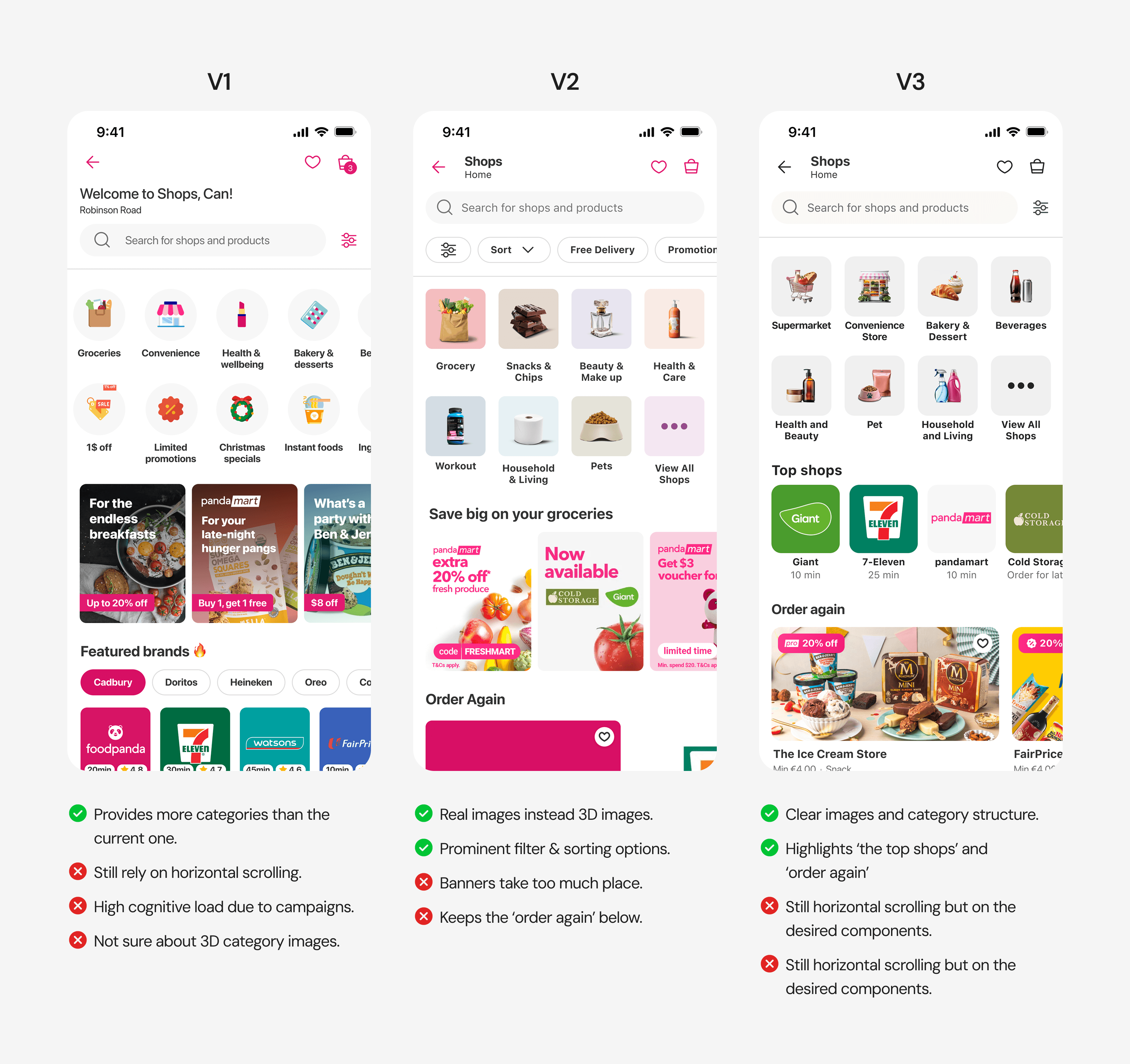
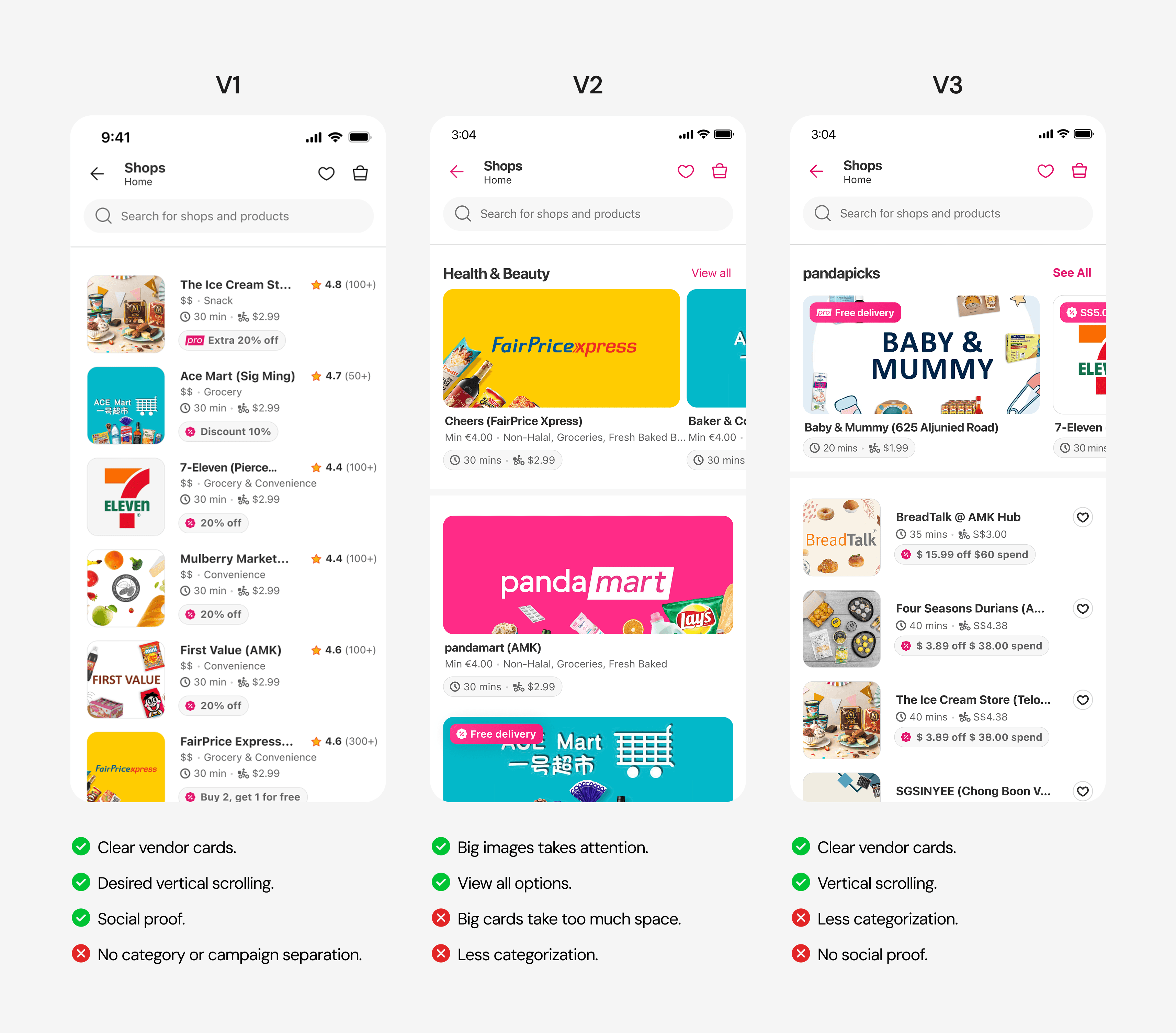
Design Iterations
Using insights from research, user interviews, and benchmarking, I moved into the design phase with a clear focus: addressing key pain points—simplifying product discovery, streamlining navigation, and enhancing the overall discovery experience.
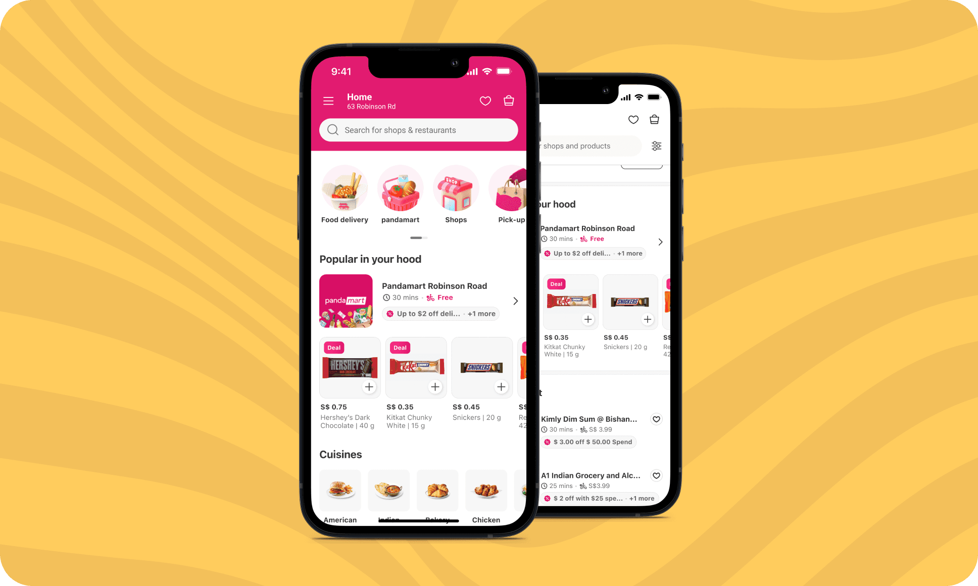
above-the-fold
Since users often revisit past purchases and trust familiar stores, I prioritized the “Order Again” and “Top Shops” sections to make them more visible and encourage exploration.
I worked with the marketing team to test real category images against 3D icons to see which best captured attention and fit our brand.
navigation
User data and usability tests showed that horizontal scrolling felt unintuitive, so I introduced vertical scrolling for a smoother, more accessible browsing experience.
Throughout the design process, I created over 40 pages, continuously refining each one with feedback from peers, the Product team, and other stakeholders. With each iteration, I made sure the design aligned closely with both user needs and business goals.
usability test
To validate the new design direction, I led a moderated usability test with nine users to evaluate how the updated navigation and layout supported decision-making and user engagement.
Key Insights
Users described the new design as vendor-focused, straightforward, detailed, and easy to navigate. One participant noted, “It’s simpler, with four shops on one screen, unlike the other option where I have to do a lot of swiping.”
Highlighting detailed vendor information upfront helped users compare options more easily. This approach reduced excessive scrolling and made it quicker for users to make purchasing decisions.
Users appreciated the layout’s comprehensive structure, with a variety of categories that felt organized and complete.
Why It Excels Over the Previous Design
The new design stood out for its vendor-centric focus, user-friendly navigation, and well-structured layout.
The vibrant and clear aesthetics make exploring new vendors and campaigns seamless, enhancing both engagement and usability.

winner alternative
Final Design
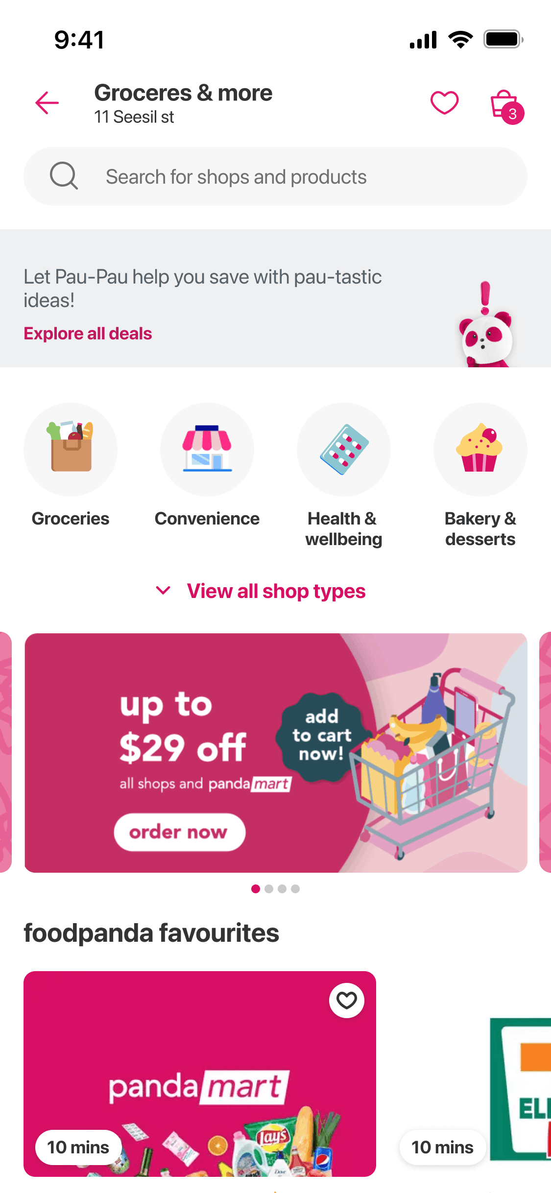
Improving Visibility and Engagement on the First Page
To address how users revisit past purchases and trust familiar stores, I decided to make the “Order Again” and “Top Shops” sections more visible.
During testing in Turkey, users found real images more attractive and informative, which confirmed the decision to use them for better engagement and a stronger brand fit.
ehnhancing product visibility
To enhance product discovery, I designed a unique element that promptly displays the chosen vendor and products' accessibility.
IMPACTS
+%2.7 Increase in overall CVR
+%2.23 Increase in Multi-vertical user share
+%7.8 Increase in CTR
Quick commerce order per user: +%0.86

Redesigning Navigation for Better Usability
With a 73% avoidance rate, I redesigned the navigation, shifting from horizontal to vertical scrolling for a more user-friendly experience.
IMPACTS
+%2.7 Increase in overall CVR
+%2.23 Increase in Multi-vertical user share
+%7.8 Increase in CTR
Quick commerce order per user: +%0.86
BEFORE
After

Simplifying Product Discovery with Filters
Interviews revealed that users were spending too much time browsing and struggling to find what they needed, leading to frustration and, in some cases, abandonment. To address this, I designed a filter option to help users quickly narrow down their choices and discover products that suited their needs.
IMPACTS
+%2.7 Increase in overall CVR
+%21 Reduction in browsing time


Redesigning Vendor Cards for Clarity and Engagement
I structured vendor information—such as discounts, MOV, and ETA—into clear, scannable sections, with discounts prominently featured to engage exploratory users and drive interaction.
Next Steps
We plan to incorporate a rating and review system to support indecisive users.
From a business standpoint, the next focus is on evaluating component rankings to identify what drives engagement and formulating a strategy to optimize the listing page accordingly.
Learnings
We plan to incorporate a rating and review system to support indecisive users.
From a business standpoint, the next focus is on evaluating component rankings to identify what drives engagement and formulating a strategy to optimize the listing page accordingly.
Reflections on Other Pages
The study revealed that horizontal scrolling patterns were often overlooked or underused by users, especially when browsing product lists on mobile. Based on this insight, I shared the findings with product leadership and proposed experimenting with vertical scroll alternatives to improve visibility and usability.
To validate this, we ran an A/B test on the Vendor Detail Page — comparing a horizontally scrolling product carousel with a vertically stacked list. The goal was to understand which layout encouraged more product interaction and conversions. Early results showed that the vertical layout increased product views per session by +%4.2 and simplified the user’s decision-making flow.
Peer Feedback
Mehmet's ability to translate user insights and requirements into visually appealing and intuitive designs has significantly enhanced the usability and engagement of the Shop Listing Page.

Ahmet Ertaş
PM
While working with him on the Shop Listing Page project, he was open-minded, receptive to new methodologies, and willing to collaborate. These qualities help him do well with any problem space and working with new stakeholders and peers.

Shahzeb Babar
Lead