Designing ‘Yemeksepeti Mahalle: Connecting Users to Local Stores
Overview
Mahalle is a local commerce platform by Yemeksepeti, Turkey’s leading food delivery service, built to seamlessly connect users with nearby stores and services.
In 2021, I designed a more intuitive and personalized shopping experience, introducing features like one-tap repeat orders, curated favorites, and flexible delivery scheduling — all aimed at supporting everyday needs and fostering a stronger sense of community.
My Role
As the sole Product Designer, I was responsible for every stage of the design process, including benchmarking, ideation, wireframes, prototypes, and polished UI designs.
The Team

Nagehan C.
PM

Sercan A.
Sr. PM

Berker E.
Project M.

DevOps
+10 People
duration
Sep 2021 - Dec 2021
Problem
As users increasingly prioritize convenience and personalization, they’re looking for platforms beyond groceries — platforms that make it easy to access everyday neighborhood services. Users want a simple way to shop, from local stores they already trust, such as butchers and bakeries, to pet stores and pharmacies.
GOAL
Build a seamless platform to connect users with local stores, fostering community and personalizing the delivery experience. Strengthen Yemeksepeti’s position as a super app while addressing the demand for hyper-local services.
challenge
Designing Mahalle meant solving diverse user needs while balancing personalization with scalability. We also needed to differentiate the platform from competitors and ensure smooth adoption by both users and local businesses.
To guide our process, we asked:
How might we create seamless connections between users and nearby stores they trust?
How might we personalize the experience while scaling across different neighborhoods and user behaviors?
How might we make it easy and valuable for small businesses to join and stay active on the platform?
Solution
By focusing on personalization and location-based relevance, we created a shopping experience that felt familiar, intuitive, and genuinely local. The design made it easy for users to reorder their go-tos, discover nearby favorites, and manage flexible deliveries — while also helping small businesses join the digital ecosystem with minimal friction.
Within three months of launch, Mahalle saw a 9.7% increase in user engagement, clearly reflecting the growing demand for hyper-local services and the value of a thoughtful, user-centered experience.

Impacts
+9.7% Increase in overall Q-Commerce orders.
5k+ Order The first two months.
User behavior across verticals;
Restaurants +81.27%,
Dark Store 7.58%, Mahalle 3.36%,
Multi-vertical usage reached 7.79%.
previous navigation and vendor cards
Designing Mahalle
Before diving into solutions, we needed to understand the people we were designing for and the market we were entering. This meant starting with in-depth research to uncover what users truly needed and how local businesses could fit into the picture.
market research - Global trends
To uncover what users truly need from a hyper-local delivery platform, we conducted market research to understand their evolving habits, identify untapped opportunities in the local store delivery market, and define our target audience.
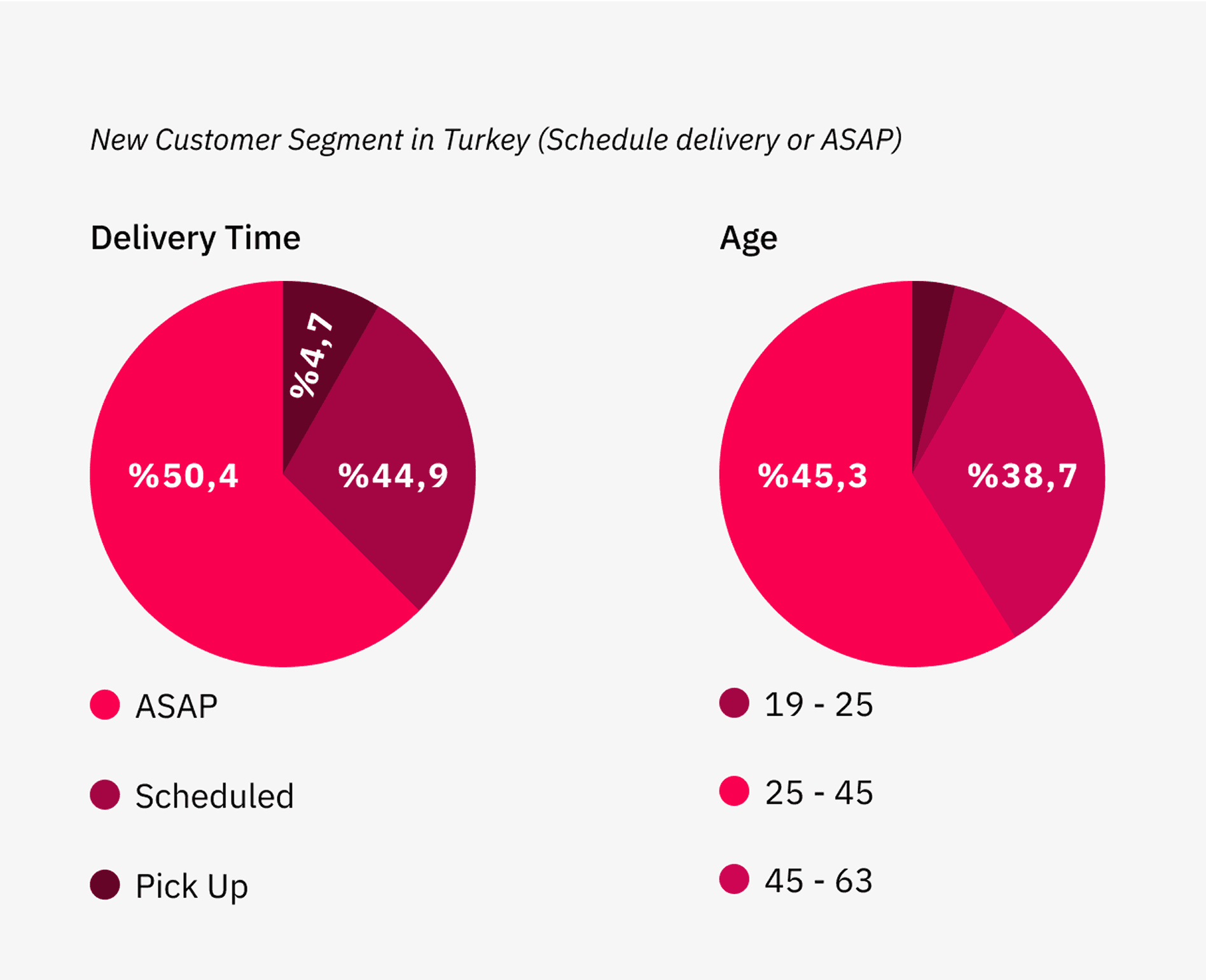
Delivery preferences
50.4% of users prefer ASAP delivery.
44.9% choose scheduled delivery for added convenience.
4.7% opt for pickup, reflecting a smaller but relevant user segment.
Demographics
45.3% of users are aged 25–45, representing the largest user base.
38.7% fall into the 45–63 age group, showcasing a notable segment of older users.
Turkey specific insights
feature analysis and benchmarking
We conducted a comprehensive benchmarking analysis, comparing Mahalle with key competitors across global markets. By examining four major players, we categorized features into Primary, Secondary, and Tertiary tiers, uncovering universal trends in personalization and loyalty that shaped our MVP. These insights ensured our platform met user expectations while remaining competitive on a global scale.

key insights
Our market research revealed important patterns about user needs and market opportunities. These insights became the foundation for shaping Mahalle, helping us focus on what truly matters to users. They also guided us in prioritizing the feature set and defining a clear design roadmap.
Up to 92% of active users demonstrate strong engagement potential. It shows strong interest in local store services, particularly in Asia and Europe.
Delivering within 40 minutes and implementing a loyalty program could provide a significant competitive advantage.
Personalized recommendations based on location, history, and preferences are essential for driving user engagement.
Clear communication around delivery times, order tracking, and store availability increases user confidence and satisfaction.
Design Exploration
roadmap
With just two months to deliver the Mahalle platform, I mapped out a clear design roadmap to keep the process efficient and focused. Using Jira, I organized the project into actionable tasks, set milestones, and tracked progress.
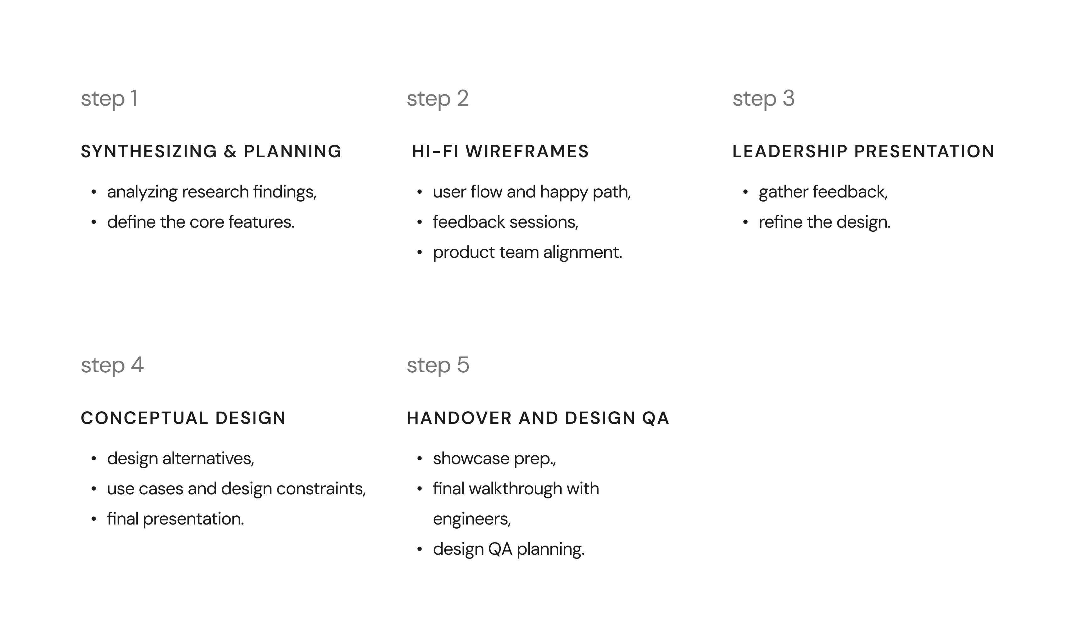
wireframes and interactions
After finalizing the roadmap, I created high-fidelity wireframes and interactive prototypes to translate ideas into tangible designs.
These deliverables helped me communicate my design decisions effectively during leadership presentations and team discussions, ensuring alignment and clarity at every stage.

Final Design
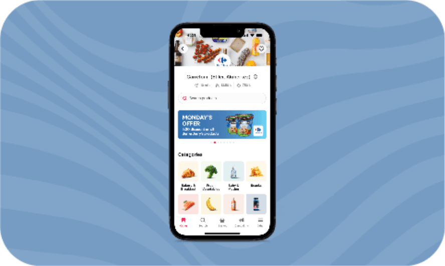
Home Screen (Launcher)
To design an effective home screen, I started with a clear objective: to showcase the platform’s three verticals—Food, Grocery, and Local Stores—in a way that felt intuitive and user-friendly.
Based on market research, Phase 1 prioritized deals and promotions to engage deal-seekers and drive initial adoption. For Phase 2, we planned to test a vendor-focused alternative, designed to strengthen Mahalle’s connection to local communities and cater to users seeking convenience and nearby stores.
Phase 1: Deals-Focused
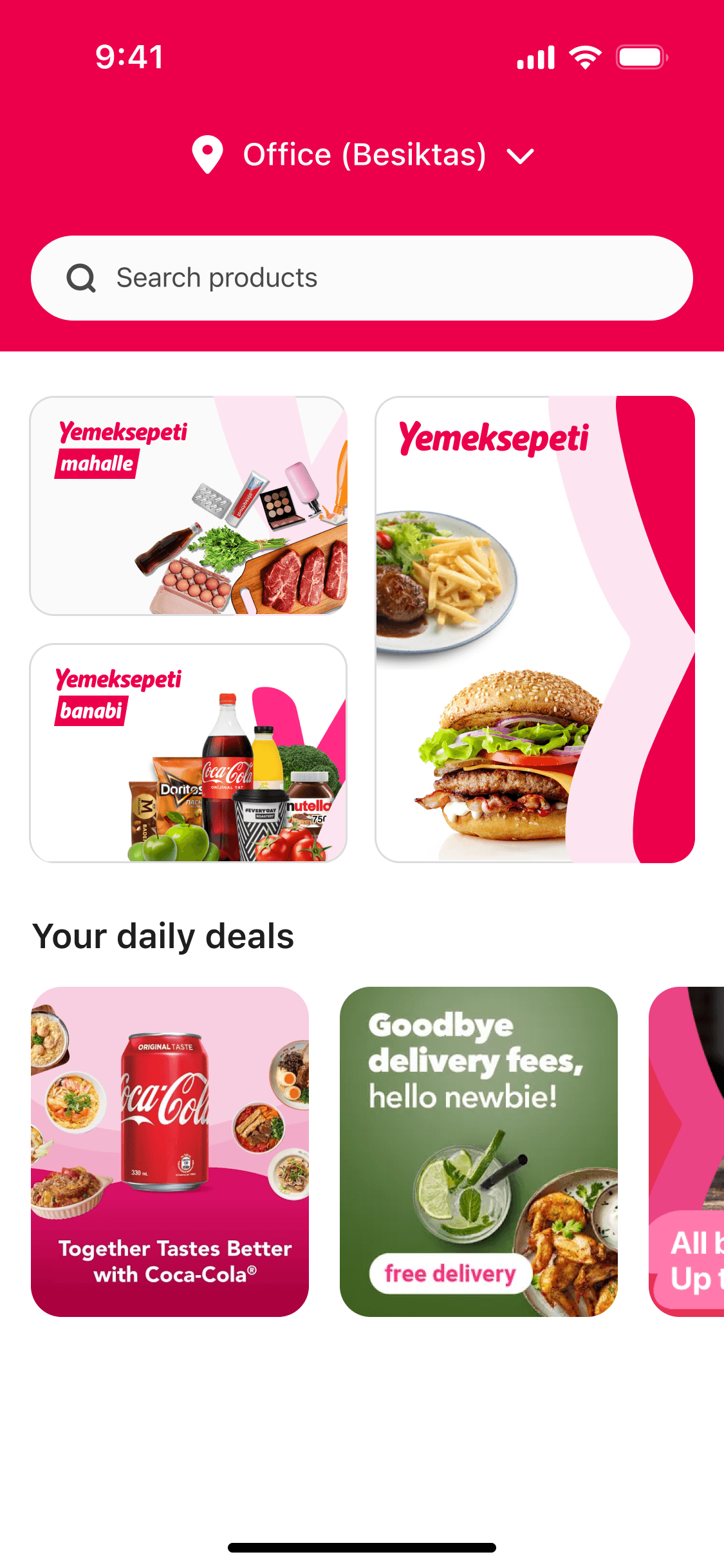
Phase 2: Vendor-Focused

1
2
3
4
1
Delivery Address
Allows users to confirm or change their location, ensuring accurate results.
2
Vertical Entry Points
Food, Grocery, and Local Stores are prominently displayed to simplify navigation.
3
Deals Section
Highlights campaigns and discounts, catering to users motivated by savings.
4
Local Store Highlights
Highlights nearby stores based on the user’s location, providing quick access to favorite vendors.
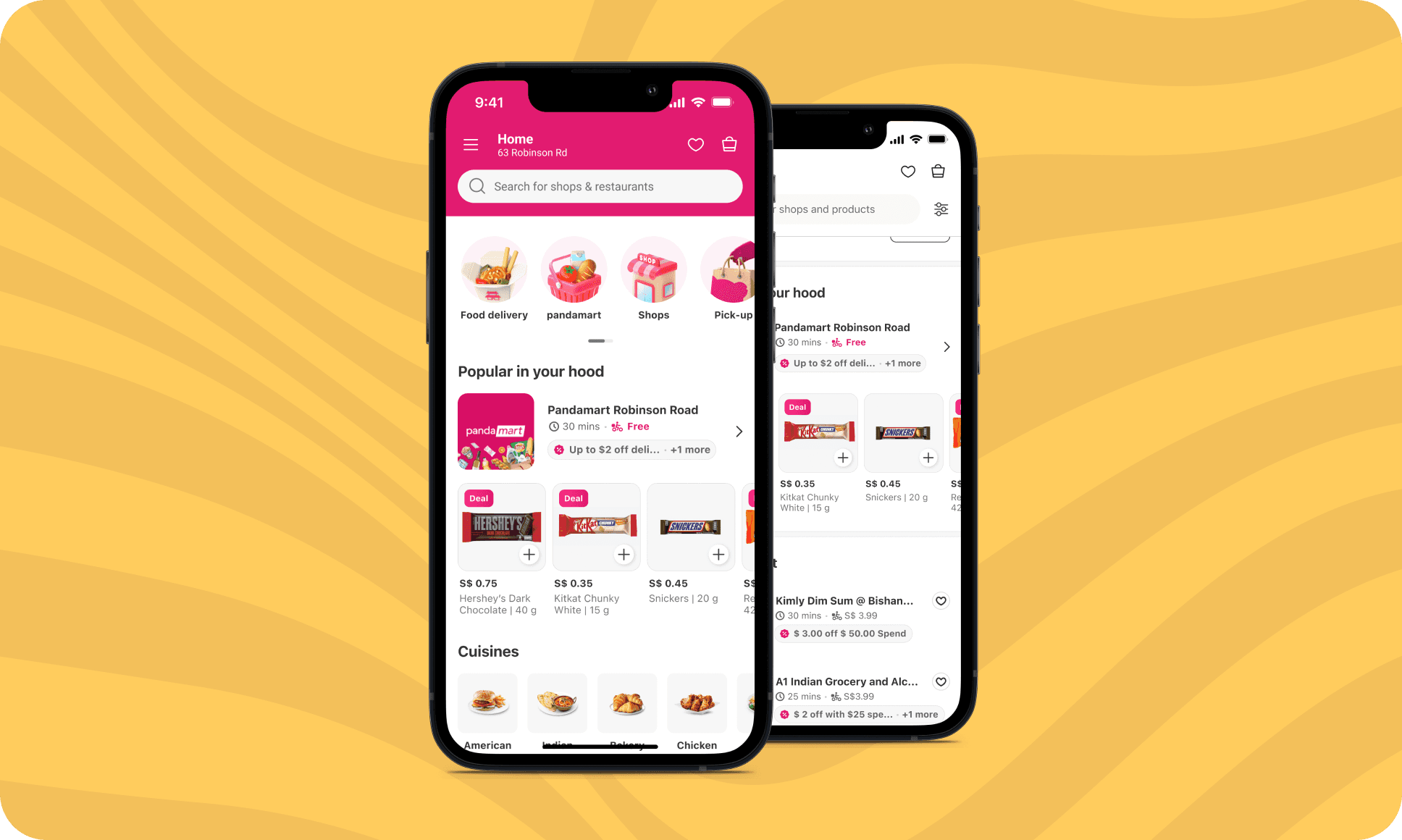
vendor listing
To create an effective vendor listing experience, I designed two phases:
Phase 1: The focus was on highlighting vendors, making it easier for users to explore nearby stores. I included an exposed filter at the top to help users quickly narrow their search based on categories.
Phase 2: Building on Phase 1, I aimed to streamline decision-making by simultaneously showcasing both vendor and product listings for a specific store. We anticipated this approach would improve decision-making speed by reducing navigation steps, allowing users to find what they need faster and with less effort.
P1: Vendor-Focused Listings
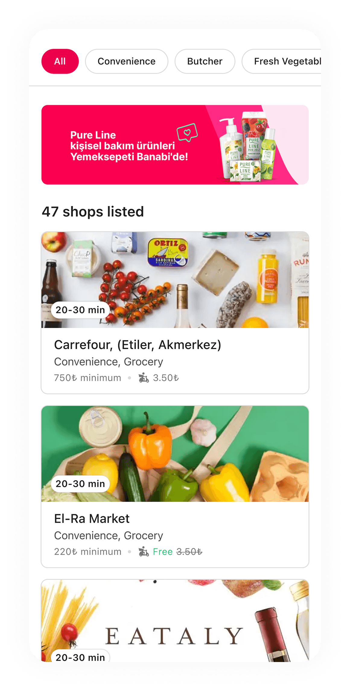
P2: Vendor and Product Focused

1
2
3
4
1
filters
To simplify browsing and reduce time spent finding specific vendors or items, I designed exposed filters to help users narrow their search .
2
marketing banners
To encourage interaction with featured offers, I placed banners at the top of the page to highlight deals, promotions, and campaigns.
3
vendor card
I designed vendor cards that highlight the
under-30-minute delivery promise, addressing user needs from market research.
4
vendor and product showcase
To help users decide faster, I combined vendor details and product listings into a single view for seamless browsing.
vendor Detail
The vendor detail screen is designed to help users explore a vendor’s assortment and quickly navigate to key items or specific categories they’re looking for. To enhance familiarity and ease of use, I highlighted essential vendor details—such as delivery time and fees—alongside previous orders, leveraging familiarity bias to simplify decision-making.
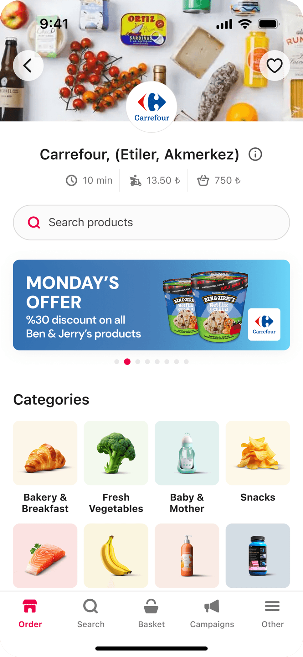

1
2
3
4
1
Vendor detail
Displays key vendor information such as name, delivery time, fees, and minimum order requirements, giving users clarity about the store they’re browsing.
2
marketing banners
Highlights current promotions, deals, or special offers to drive user engagement and encourage purchases.
3
categories
I placed categories above the fold to provide users with a faster, more intuitive way to find products and enhance their browsing experience.
4
order again
Since reordering on food platforms has a 9% conversion rate, I included this section to let users quickly reorder their favorites.
product listing page
The product listing page helps users easily navigate and discover items from a vendor’s assortment. With main category filters and subcategory filters, users can quickly narrow their search and find specific products. The simple layout and intuitive design make browsing effortless and efficient.
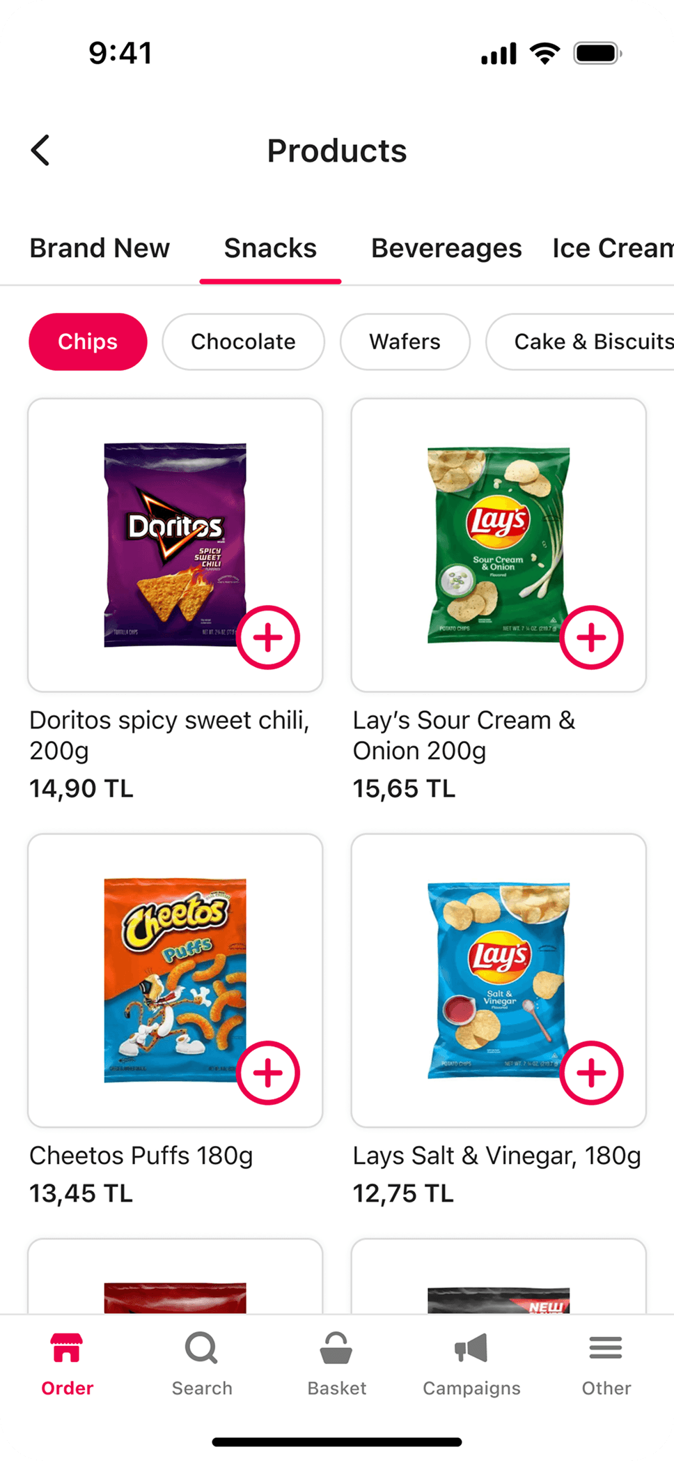
1
2
3
1
main category filters
Enables users to browse broad product categories, such as Snacks, Beverages, and Ice Cream, ensuring quick access to relevant groups of items.
2
subcategory filters
Provides additional filtering options within each category (e.g., Chips, Chocolate, Cake), allowing users to refine their search and find products faster.
3
product cards
Each product card shows essential details like the product name, image, price, and an “add to cart” button, making it easy for users to browse and add items quickly.
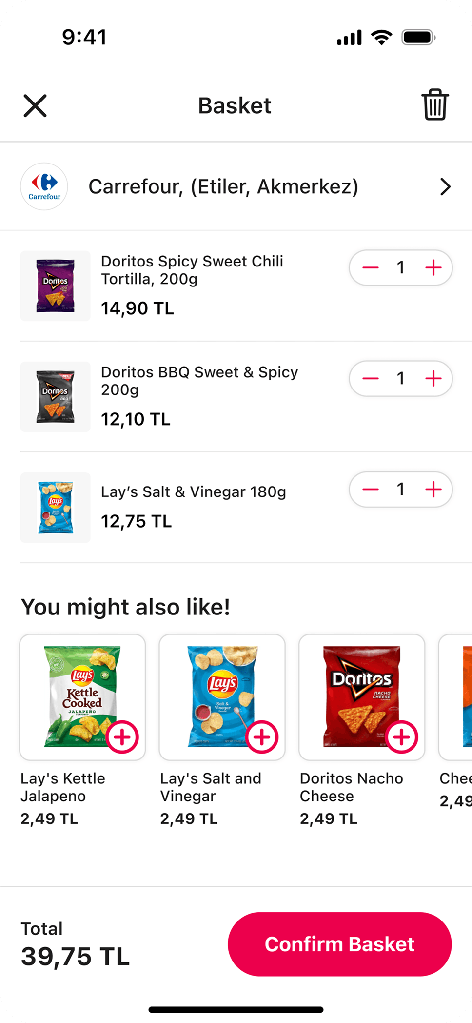
Basket
The basket page gives users a clear overview of their selected items while making it easy to discover additional products. With features like vendor details, product summaries, and personalized recommendations, it creates a smooth and effortless checkout experience.
1
2
3
1
vendor tile
Displays the vendor name and logo, helping users stay aware of which store they are purchasing from.
2
product summary
Lists selected products with their names, prices, and quantity controls, allowing users to easily review and adjust their basket.
3
cross-sell
Offers personalized product recommendations (“You might also like”) to encourage additional purchases and enhance the overall shopping experience.
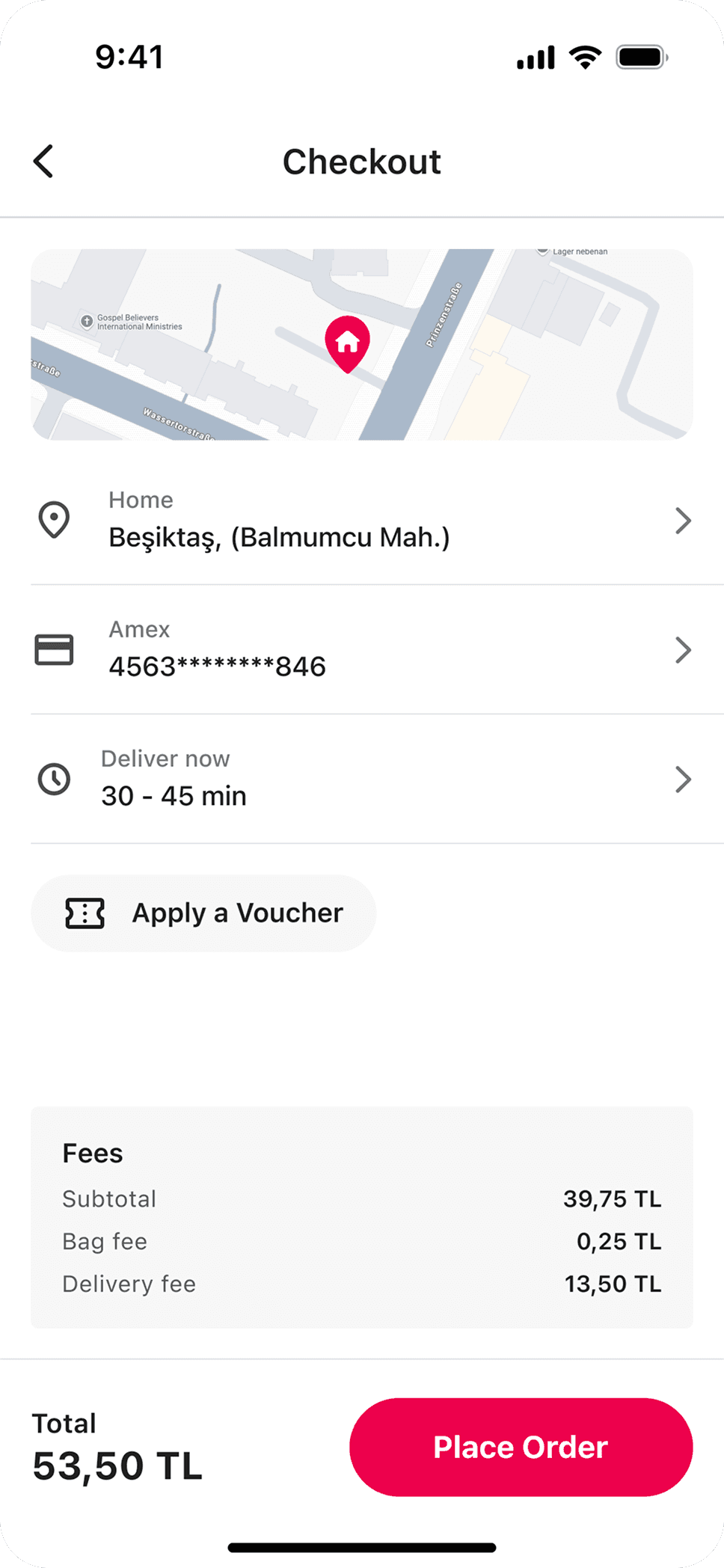
Checkout & Checkout info
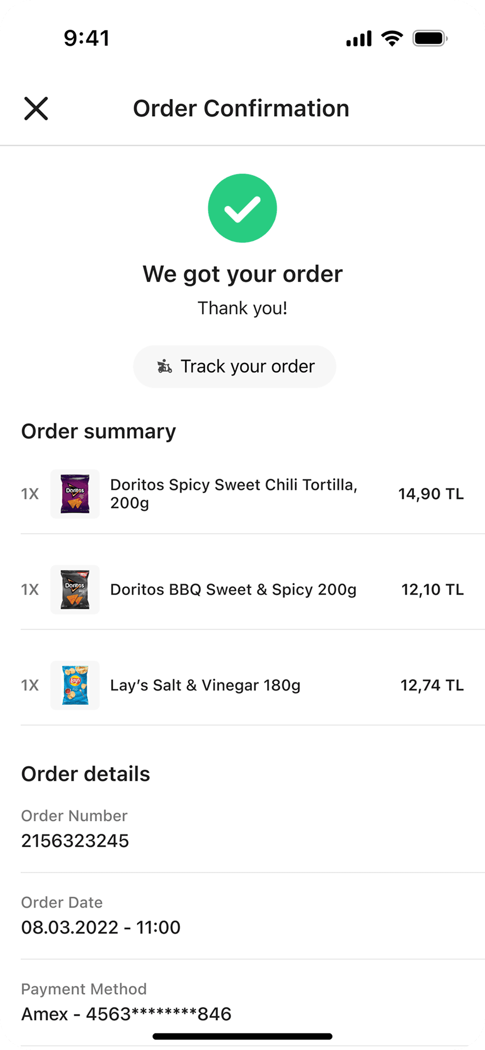
The Checkout page ensures a smooth and intuitive purchasing process, with clear payment and delivery options. Once the order is placed, the Checkout Info page provides users with detailed order information and real-time tracking to keep them informed every step of the way.
4
1
2
3
1
delivery details
Displays the selected delivery address, payment method, and estimated delivery time to ensure users have all key information at a glance.
2
voucher
Allows users to apply discounts or promo codes, making checkout more rewarding and cost-effective.
3
order summary
Provides a clear breakdown of items, quantities, and fees, helping users review their purchase before placing the order.
4
order tracking
Offers a quick way to track the order status post-checkout, giving users peace of mind and real-time updates.
Next Steps
To take ‘Mahalle’ to the next level, we have two key goals:
Implement Phase 2 Features: Building on the foundation from Phase 1, we will introduce features designed to enhance product discovery and streamline the shopping experience.
Conduct Usability Testing: Observing real users will allow us to identify strengths, uncover areas for improvement, and gather actionable insights.
Learnings
Leading this project strengthened my skills in balancing strategic decision-making with hands-on design. I honed my time management by delivering high-quality work under a tight timeline and improved my communication through collaboration with cross-functional teams and stakeholder presentations.